You are using an out of date browser. It may not display this or other websites correctly.
You should upgrade or use an alternative browser.
You should upgrade or use an alternative browser.
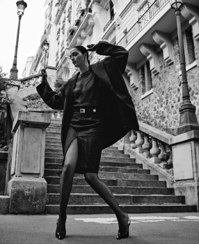
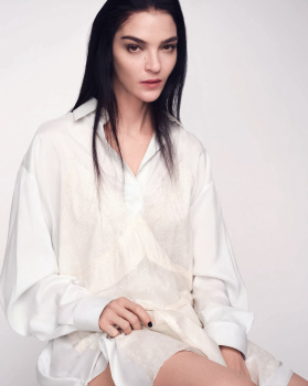
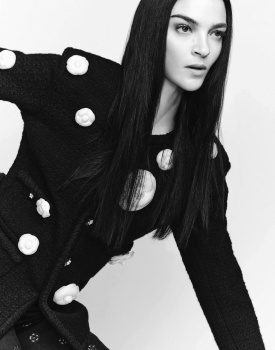
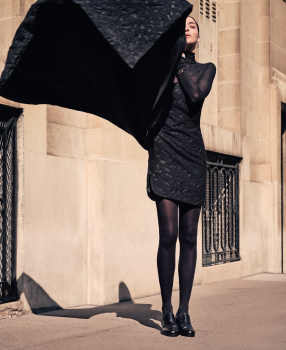
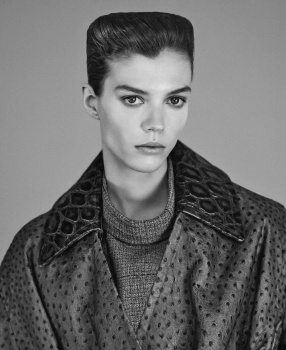
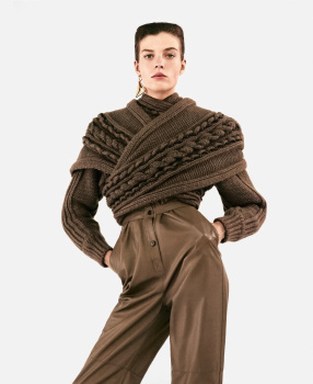
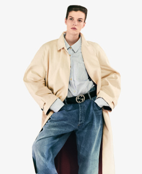
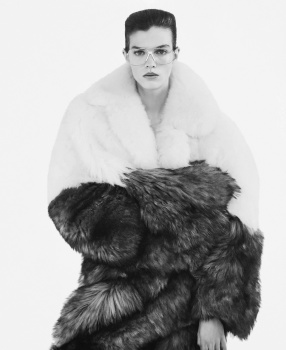
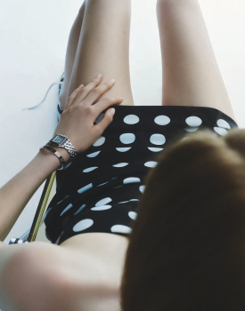
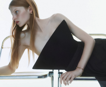
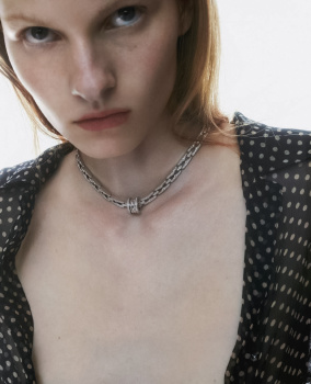
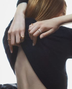
Harper’s Bazaar Italia September 2023 by Nathaniel Goldberg & Mark Kean
- Thread starter vogue28
- Start date
GivenchyAddict
Well-Known Member
- Joined
- Feb 5, 2012
- Messages
- 2,167
- Reaction score
- 5,119
The Mark Kean's cover was enough. Mariacarla lately is really not good...
And please don't tell me they don't have any icons in Italia. Would have been grandiose to have Miuccia wearing Prada/Miu Miu.
And please don't tell me they don't have any icons in Italia. Would have been grandiose to have Miuccia wearing Prada/Miu Miu.
kokobombon
Well-Known Member
- Joined
- Oct 7, 2007
- Messages
- 18,647
- Reaction score
- 2,008
I can´t think of anything positive to say with either cover :/
Bertrando3
Well-Known Member
- Joined
- Mar 22, 2010
- Messages
- 5,462
- Reaction score
- 2,129
NOPE. Yet again boring covers which have no flavour.
I watch this and compare to Dua Lipa's Vogue France and I know french Vogue did better.
I watch this and compare to Dua Lipa's Vogue France and I know french Vogue did better.
Xone
Well-Known Member
- Joined
- Sep 1, 2004
- Messages
- 4,392
- Reaction score
- 2,696
instead of "striking" they should have put "strike" We don't wanna try" or "stroke" which is what we felt at seeing this. Terrible covers...
When it'll be on newsstands i can try to shot some pages....but it doesn't look promising...
When it'll be on newsstands i can try to shot some pages....but it doesn't look promising...
FashionFanatico
We are the World
- Joined
- Jun 5, 2011
- Messages
- 1,646
- Reaction score
- 2,163
MC (as much as i admire her) needs to take a break.
Lola701
Well-Known Member
- Joined
- Oct 27, 2014
- Messages
- 11,487
- Reaction score
- 24,636
I like the second cover.
I actually like Bazaar Italia. I think that they missed an opportunity here…
Marc Ascoli can get who ever he wants in the industry and he could have had major Italian icons so it’s a pity to have such a boring offering.
I actually like Bazaar Italia. I think that they missed an opportunity here…
Marc Ascoli can get who ever he wants in the industry and he could have had major Italian icons so it’s a pity to have such a boring offering.
D
Deleted member 1957
Guest
I dont think MCB is to blame for the first cover, its the photographer and most importantly the team that picked that aprticular shot as the cover. The second one has a nice retro feel due to the croppping and styling though the model isnt giving that extra effort that would make it pop. It looks more like a nicr editorial pic.
- Joined
- Jul 14, 2017
- Messages
- 14,564
- Reaction score
- 20,824
Rather disappointed in Goldberg. What a waste of potential! Washed out colors with red tones just don't work for me, it looks very dated and that big chunk of black that I suppose is some part of the dress... It's very random and quite ugly, disrupting the entire composition of the cover.
Kean sort of saves the day with an uneventful, but rather effective cover. I've come to appreciate simplicity when it comes to magazine covers and a clean studio shot with great layout does wonders for me. I much prefer this cover and I like that it continues the theme of their previous covers - I do respect consistency. Love what the model is wearing and I like the pose. It's no September worthy extravaganza, but that's not what fashion is about anymore anyway.
Kean sort of saves the day with an uneventful, but rather effective cover. I've come to appreciate simplicity when it comes to magazine covers and a clean studio shot with great layout does wonders for me. I much prefer this cover and I like that it continues the theme of their previous covers - I do respect consistency. Love what the model is wearing and I like the pose. It's no September worthy extravaganza, but that's not what fashion is about anymore anyway.
Xone
Well-Known Member
- Joined
- Sep 1, 2004
- Messages
- 4,392
- Reaction score
- 2,696
Thanks dear @Zorka for sharing...
Mariacarla looks bad....if you compare her on the DG windows in Milan she looks amazing under Meisel in bw photos..but here she looks lifeless(specially on the studio ones), i only like picture 3 and picture 10...the rest worthless, too bad...
and you see same stylist on the second story and looks much better, im not dying for but it's better...
third story...cute
Zorka
Well-Known Member
- Joined
- Jan 29, 2014
- Messages
- 16,511
- Reaction score
- 14,483
Only two fashion editorials and one jewel story for a September issue?
Yes, the rest is a shared/reprinted content with/from US Harper's Bazaar.
Similar Threads
- Replies
- 50
- Views
- 12K
- Replies
- 77
- Views
- 14K
Users who are viewing this thread
Total: 2 (members: 0, guests: 2)


