La bordélique
earthbound
- Joined
- Mar 2, 2006
- Messages
- 4,704
- Reaction score
- 8
men.style.com
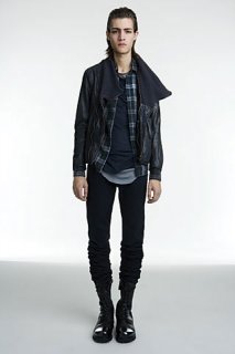
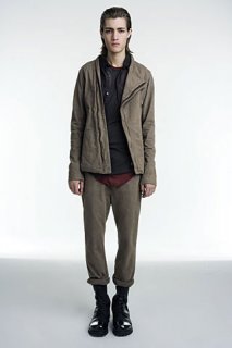
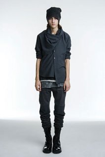
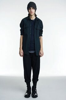
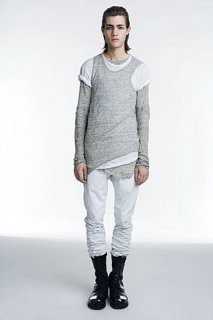
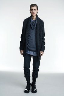
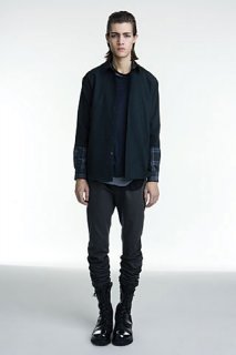
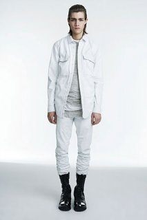
Photos: Courtesy of Helmut Lang
February 18, 2009
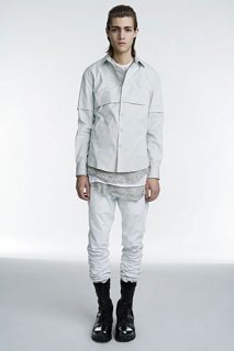
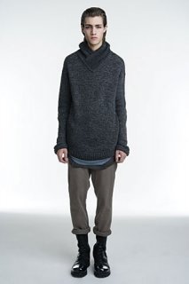
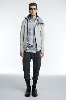
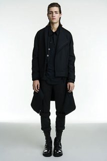
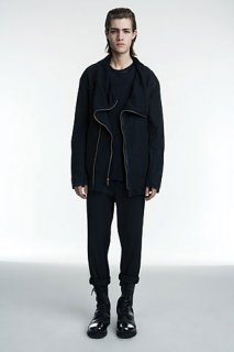
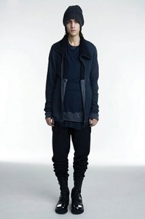
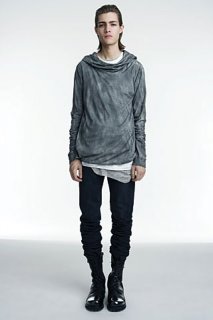
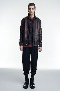
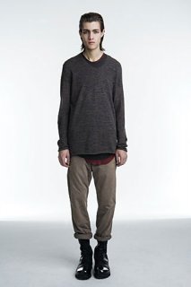
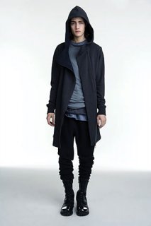
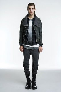
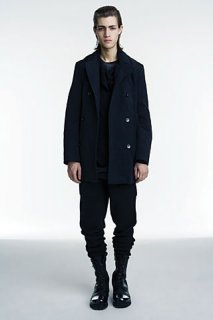
The latest offering from Michael and Nicole Colovos, who've designed Helmut since its 2006 relaunch, was more along the lines of avant-garde collections like Julius (of Japan) or Rick Owens (of Paris by way of Los Angeles) than most of what's shown on New York runways. While others seem fixated on a gauzy ideal of the American manhood (or maybe it's boyhood), the Colovoses cloak their guy in gauzy jersey knits. And dropped-crotch, pegged-leg trousers. And chunky boots. "It's about seasonless dressing," said Michael backstage. "In the winter you wear three T-shirts instead of one." So the collection was a series of single pieces. Highlights included garment-dyed button-fronts, hand-burnished leathers with asymmetrical seams, and raw-edged sweaters with a worn-in feel. Colovos insists this version of Helmut would be just as at home uptown or down, though it felt more downtown to me, and served as a welcome complement to the Americana-heavy propositions shown elsewhere. "There's been a preppy, kind of country look that's that's been big on the runway," Colovos said backstage, "and this is definitely not preppy. It's a classic, timeless wardrobe for the guy who doesn't wear Top-Siders." It's enough to make one reconsider his Fall footwear strategy.
— Josh Peskowitz
Photos: Courtesy of Helmut Lang