You are using an out of date browser. It may not display this or other websites correctly.
You should upgrade or use an alternative browser.
You should upgrade or use an alternative browser.
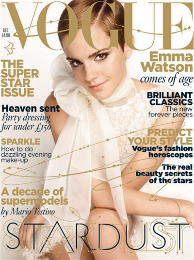
UK Vogue December 2019 : Emma Watson by Alasdair McLellan & Lizzo by Kloss Films
- Thread starter vogue28
- Start date
LastNight
Well-Known Member
- Joined
- Nov 11, 2013
- Messages
- 814
- Reaction score
- 870
I think I like it. I might prefer it if it was the January cover though - it would still be festive enough to hit the shelves in December with all the red, but the outdoorsy background feels like a fresh, new year type setting.
Something totally glamorous, festive and over the top would have been my preference for this month.
Something totally glamorous, festive and over the top would have been my preference for this month.
caioherrero
Well-Known Member
- Joined
- Sep 2, 2017
- Messages
- 2,938
- Reaction score
- 1,492
I love her.
Benn98
Well-Known Member
- Joined
- Aug 6, 2014
- Messages
- 42,530
- Reaction score
- 20,571
Don't like it. What's with the cabbage/poufy shoulder pads? Is this 1989?
I think the shot had promise and maybe her edit will be better, but despite the blinding red this still looks very clinical. Far worse than Kate/Gisele/Lara/Natalia's Christmas covers under Alexandra.
I think the shot had promise and maybe her edit will be better, but despite the blinding red this still looks very clinical. Far worse than Kate/Gisele/Lara/Natalia's Christmas covers under Alexandra.
JPineapple
Well-Known Member
- Joined
- Jul 1, 2018
- Messages
- 2,760
- Reaction score
- 3,862
What a beautiful tribute to Celia Cruz! jk
With all respect to Celia.
With all respect to Celia.
JPineapple
Well-Known Member
- Joined
- Jul 1, 2018
- Messages
- 2,760
- Reaction score
- 3,862
Btw, I can't believe Edward killed a Steven Meisel's festive extravaganza cover for this.
Benn98
Well-Known Member
- Joined
- Aug 6, 2014
- Messages
- 42,530
- Reaction score
- 20,571
What a beautiful tribute to Celia Cruz! jk
With all respect to Celia.
Lol! Now I need Carlyne Cerf Du Dudzeele to do an epic hair and beauty tribute to Celia Cruz! Only she would do her justice.
Anyway, that dress is in dire need of some drama à la Iman for Oscar De La Renta! It's Christmas, for Chrissake.

honeycombchild
Well-Known Member
- Joined
- Jan 22, 2009
- Messages
- 8,841
- Reaction score
- 727
Always loved Emma and I’m a big fan of this cover!
tigerrouge
don't look down
- Joined
- Feb 25, 2005
- Messages
- 18,315
- Reaction score
- 8,133
Dress up... then sit down outdoors in a smoking area and look unhappy.
MON
Well-Known Member
- Joined
- Jun 20, 2009
- Messages
- 12,635
- Reaction score
- 5,184
This is US InStyle level at best.
Will never really get nor appreciate the Art Direction. Can’t believe that amateur font is used in Vogue.
but hey its an outdoors cover so maybe thats a redeeming factor.
At this point, Edward should stick with STUDIO Portrait covers. The outdoors covers were all subpar compared to the portraits
Nicole
Madonna
The one in the Telephone booth
This
lastly, notwithstanding the colors, there’s something about this that feels JANUARY.
Miss Dalloway
Well-Known Member
- Joined
- Mar 3, 2006
- Messages
- 25,704
- Reaction score
- 997
What a beautiful cover, that McQueen dress is so bold, and her demeanor is calm, yet it still doesn't wear her! Emma just has that innate chic that can pull it off in a totally easy way.
Edward just understand's what makes for an appealing cover, and how nice to see more of these outdoor images being used.
Edward just understand's what makes for an appealing cover, and how nice to see more of these outdoor images being used.
KoV
Well-Known Member
- Joined
- Sep 17, 2009
- Messages
- 5,759
- Reaction score
- 8,224
I like Emma, but don’t like this cover and her expression looks like a disingenuous smile. The slicked back hair feels at odds with the mood/setting/styling, the image itself is over saturated, she looks like she’s sat at a... picnic table? It’s not horrendous but it seems like a wasted opportunity for something more festive and glamorous.
Blayne266
Well-Known Member
- Joined
- Jul 19, 2018
- Messages
- 361
- Reaction score
- 440
Btw, I can't believe Edward killed a Steven Meisel's festive extravaganza cover for this.
Same, I was so exciting for some Festive Glamour by Meisel like the previous December covers!
phungnam96
Well-Known Member
- Joined
- Jul 7, 2011
- Messages
- 1,131
- Reaction score
- 762
Similar Threads
- Replies
- 16
- Views
- 5K
- Replies
- 44
- Views
- 9K
- Replies
- 42
- Views
- 14K
- Replies
- 22
- Views
- 3K
- Replies
- 105
- Views
- 37K
Users who are viewing this thread
Total: 2 (members: 0, guests: 2)
New Posts
-
-
Dolce & Gabbana x Skims 2024 : Kim Kardashian & Kourtney Kardashian by Nadia Lee Cohen (9 Viewers)
- Latest: creationmade14
-
US Marie Claire ‘The Age Issue’ 2024 : Eva Longoria by Félix Valentine (6 Viewers)
- Latest: Toni Ahlgren
-
-


