You are using an out of date browser. It may not display this or other websites correctly.
You should upgrade or use an alternative browser.
You should upgrade or use an alternative browser.
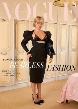
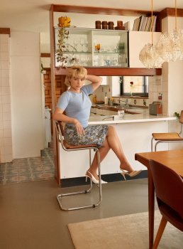
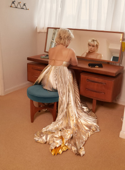
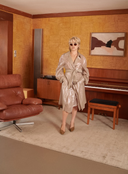
UK Vogue October 2024 : Florence Pugh by Venetia Scott
- Thread starter DK92
- Start date
honeycombchild
Well-Known Member
- Joined
- Jan 22, 2009
- Messages
- 8,868
- Reaction score
- 784
What an awful use of someone so beautifully photogenic. The pose, the bag, the expression? So odd to me.
Deleted member 116957
New/Inactive Member
- Joined
- Apr 4, 2009
- Messages
- 13,752
- Reaction score
- 15,825
Ever since Chioma's first issue, when I go to open a new Vogue UK thread, I think "maybe this one will be ok." Nope!
- Joined
- Jan 9, 2008
- Messages
- 36,912
- Reaction score
- 24,826
Chioma Nnadi has become the Samira Nasr of British Vogue, and continues to suck the absolute life out of the magazine. Another cover of British Vogue that is lifeless, static, and devoid of energy. I'm just numb... and so unmotivated to renew by subscription come December.
tigerrouge
Well-Known Member
- Joined
- Feb 25, 2005
- Messages
- 18,953
- Reaction score
- 9,898
This is why I find solace in UK Bazaar, where there's no shame in making everything look beautiful.
The only thing I like about this cover is the door that's slightly ajar, as if a skeleton in the closet is about to make itself known.
"There's no insecurities anymore"... free yourself from formal rules of grammar and the oppression of the correct use of is/are.
The only thing I like about this cover is the door that's slightly ajar, as if a skeleton in the closet is about to make itself known.
"There's no insecurities anymore"... free yourself from formal rules of grammar and the oppression of the correct use of is/are.
Kite
Well-Known Member
- Joined
- Jul 12, 2010
- Messages
- 2,295
- Reaction score
- 1,827
if ANYONE had taken this image of me, I would be FURIOUS, let alone putting it on the cover of a Magazine.
She is such an unattractive person at the best of times, let alone this ridiculous get up and filling in the only change to get any type of waist or figure out her with A HUGE HANDBAG!
She is such an unattractive person at the best of times, let alone this ridiculous get up and filling in the only change to get any type of waist or figure out her with A HUGE HANDBAG!
kokobombon
Well-Known Member
- Joined
- Oct 7, 2007
- Messages
- 18,849
- Reaction score
- 2,396
I was looking forward to it when I clicked on the thread... I was so naive 

khoinguyen666
Active Member
- Joined
- Jul 23, 2021
- Messages
- 80
- Reaction score
- 80
tigerrouge
Well-Known Member
- Joined
- Feb 25, 2005
- Messages
- 18,953
- Reaction score
- 9,898
The editorial itself feels very Vanity Fair, with that retro feel of everything being wood panelling and assorted shades of brown.
I don't get what Chioma is trying to make this magazine into. What is her overarching vision? Edward's covers (for all of the problems I had within the magazine itself) were often very, very strong. Chioma's UK Vogue has been a mess so far.
Deleted member 116957
New/Inactive Member
- Joined
- Apr 4, 2009
- Messages
- 13,752
- Reaction score
- 15,825
Nah. Samira's getting there, slowly but surely. Chioma has displayed nothing but a total lack of taste. Period. Samira's Bazaar, as puzzling as some of the choices can be, is not THAT bad.Chioma Nnadi has become the Samira Nasr of British Vogue
Similar Threads
- Replies
- 34
- Views
- 4K
- Replies
- 10
- Views
- 4K
- Replies
- 102
- Views
- 13K
- Replies
- 5
- Views
- 3K
- Replies
- 1
- Views
- 971
Users who are viewing this thread
Total: 1 (members: 0, guests: 1)

 Yes Chioma! Give us nothing
