-
Share with us... Your Best & Worst Collections of Haute Couture F/W 2025.26
-
Xenforo is upgrading us to version 2.3.7 on Thursday Aug 14, 2025 at 01:00 AM BST. This upgrade includes several security fixes among other improvements. Expect a temporary downtime during this process. More info here
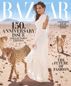
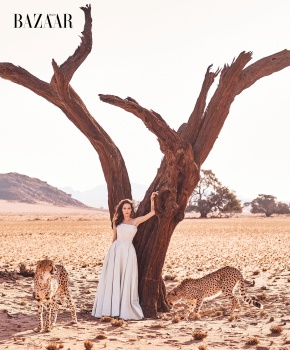
US Harper's Bazaar November 2017 : Angelina Jolie by Alexi Lubomirski
- Thread starter vogue28
- Start date


Similar Threads
Users who are viewing this thread
New Posts
-

-
-

-
 The Devil Wears Prada (2006 Movie) & The Devil Wears Prada 2 (2026 Movie) (12 Viewers)
- Latest: Frederic01
-