Melancholybaby
Well-Known Member
- Joined
- Aug 25, 2011
- Messages
- 14,226
- Reaction score
- 1,446
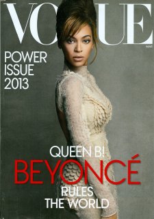
^Indeed, it was the same image but with less text.
Cover and editorial are ridiculously bland. It's weird because dispise all the va va voom in her songs and preformances, Beyoncé always comes down as a very bland person with limited personality and style.
I completely agree, there was a time maybe 4 or 5 years ago, I would wait patiently for the March Vogue issue. Checking daily for cover updates, the revealing of the editorials...models, photographers. And now, I talk a quick look through the pages and move on..And pick up W insteadThis has to be one of the weakest and most lackluster March/spring issues in years.
Also surprised by the lack of M&M, Meisel, Liya, Karen Elson, Natalia, etc.

Edie Campbell's editorial really annoys me.
Maybe it's just me, for some reason I think that On the Prowl looks fine online but it looks absolutely HIDEOUS to me in print.
 too computery looking! ruins the whole thing.

In this issue there's a beautiful photo of Karlie Kloss by Testino in a pink hat.
Does anybody have this photo in good quality please?