-
Live Streaming... The F/W 2025.26 Fashion Shows
Paris Fashion Week F/W 2025.26 Show Schedule
You are using an out of date browser. It may not display this or other websites correctly.
You should upgrade or use an alternative browser.
You should upgrade or use an alternative browser.
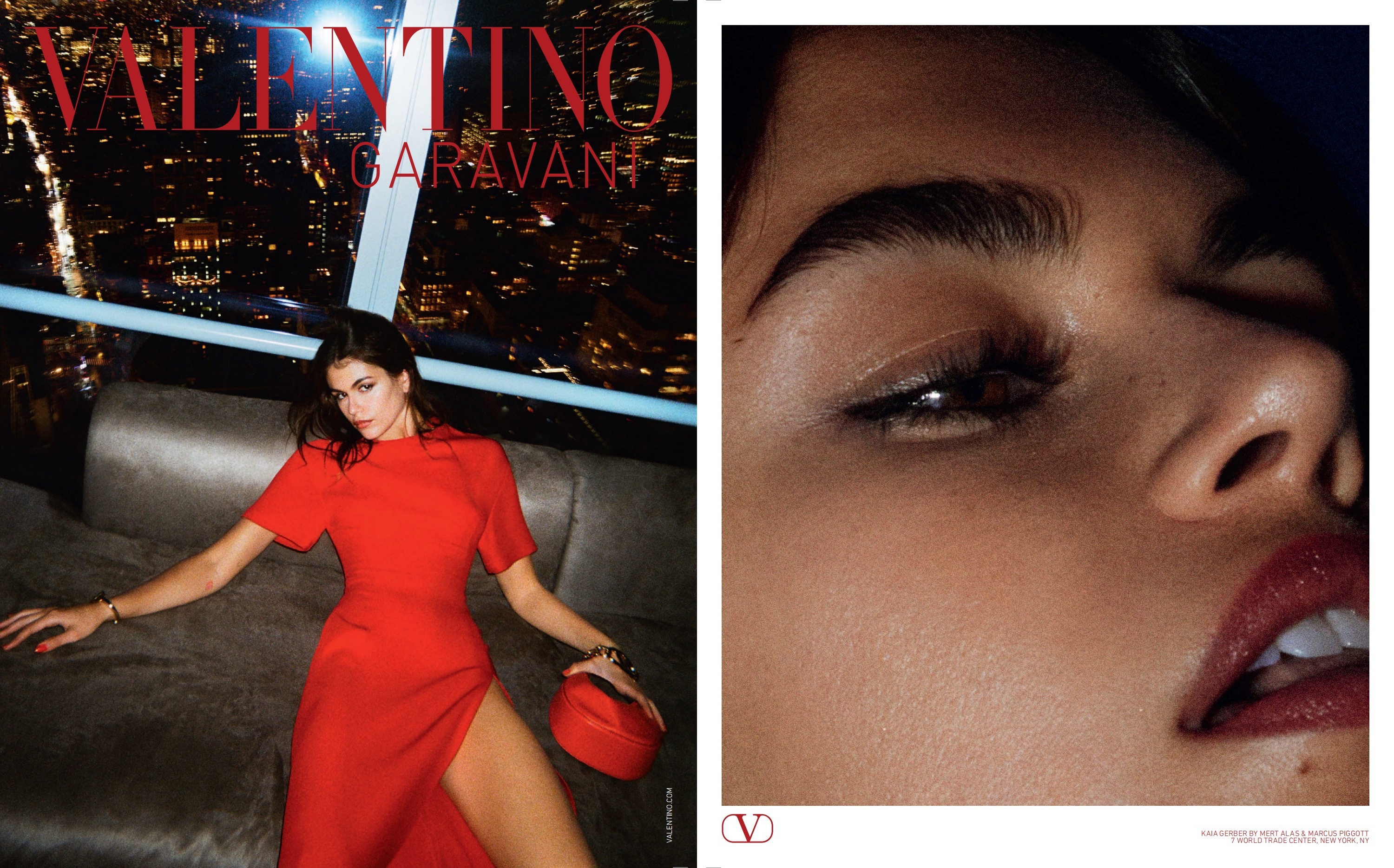
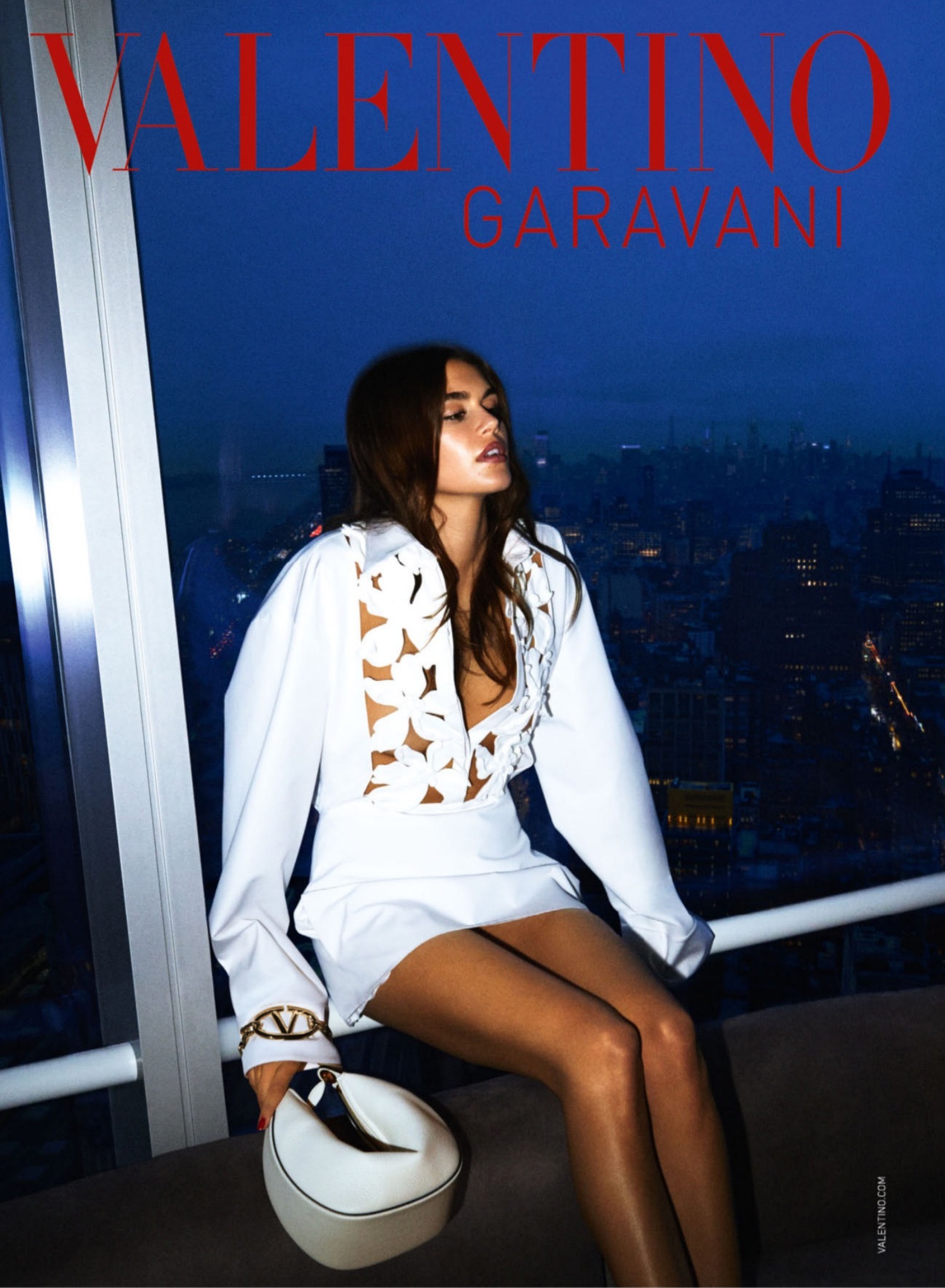
Valentino S/S 2024 : Kaia Gerber, Jolin Tsai & Son Ye-jinby Mert Alas & Marcus Piggott
- Thread starter 9sete
- Start date
GoldenPetals
Well-Known Member
- Joined
- Jul 4, 2020
- Messages
- 837
- Reaction score
- 2,333
LOVE this concept. I just don't know if Kaia is suitable for it.
When did they start putting his last name on ads?
When did they start putting his last name on ads?
- Joined
- Sep 15, 2005
- Messages
- 23,442
- Reaction score
- 287
Big fan of this campaign! Eye-catching and captures the perfect mood.
Fiercification
Well-Known Member
- Joined
- Apr 17, 2008
- Messages
- 6,188
- Reaction score
- 1,154
Decent, although you still get the lazy vibes from their recent photography coming through. We can see M&M haven't changed their inspos; the first shot is clearly a reference to the Newton shot of Charlotte Rampling (I think?) over the Paris skyline.
D
Deleted member 1957
Guest
I love the concept and Kaia is delivering but she's laying abit too flat in the first shot. I wish her arm was resting on theback of the sofa with her body more raised
GoldenPetals
Well-Known Member
- Joined
- Jul 4, 2020
- Messages
- 837
- Reaction score
- 2,333
I hate how photographers don't even care that their work looks no different from a 5 minute smartphone filter job. It's the opposite of glamorous. Where's the uniqueness? The exclusivity
thenewclassic
Well-Known Member
- Joined
- Mar 6, 2013
- Messages
- 680
- Reaction score
- 591
So Marcus is back to work?
paleandcold
Member
- Joined
- Feb 8, 2024
- Messages
- 3
- Reaction score
- 4
Oh, that first white dress is just divine!
Toni Ahlgren
Well-Known Member
- Joined
- Aug 29, 2020
- Messages
- 1,396
- Reaction score
- 4,051
She doesn't look expensive or glamorous, she looks drugged.
Similar Threads
- Replies
- 77
- Views
- 18K
- Replies
- 14
- Views
- 11K
- Replies
- 61
- Views
- 15K
- Replies
- 18
- Views
- 11K
D
- Replies
- 13
- Views
- 4K
D
Users who are viewing this thread
Total: 1 (members: 0, guests: 1)


