Vanity Fair September 2023 : Riley Keough by Mario Sorrenti

The September edition used to be the Style issue. Now the word is relegated to the corner, while they get on with the business of selling sofas.
 
The colours are nice but she looks too severe and tghat slouch is not it.
 
Love Riley but her most recent covers haven't been flattering at all (to be fair I'm only remembering the Vogue Australia one) happy to see her and that she got an Emmy nom though.
 
Considering they’ve taken this at truly the worst angle for just about anyone, she looks good. But still, there are better covers shot to be head than this angle absolutely.
 
Her head looks like it's coming out of the couch and that's just a prop mannequin body


RILEY KEOUGH ON GROWING UP PRESLEY, LOSING LISA MARIE, AND INHERITING GRACELAND
Photography:
Mario Sorrenti
Styling: Nicola Formichetti
Hair: Tomo Jidai
Make-up: Frank B
Model/Celebrity: Riley Keough


vanityfair.com
 
Formichetti's styling is always so... gay. The editorial is actually quite nice, much better than the cover and I particularly like the last photo with several portrait takes - they could've gotten a fabulous cover there, à la AnOther Magazine circa 2007.
 
I quite like it, a little bit old Vogue Paris (by Carine)vibe, pure and fashion-forward.
 
Not a fan of the slouched cover look but I'm a little bit in love with Mario Sorrenti's cover story here, and it's nice to be surprised with a cover subject like Riley Keough for once. She's has photographed rather well before Sorrenti's lens, love the long red hair, the styling and the overall mood of the shoot.

There's far more superior cover-worthy images, however, like the one of Riley wearing the Chanel with her arms crossed or the one where she's sat.
 
the cover is ok, there’s something unbothered about her expression (must be all the billions), which is not necessarily a bad thing. she always had very strong facial features *sighs in genes*

the editorial turned out to be pretty good so ‘good job’ I guess.
 
same old, same old but lazier and sloppier every time
 
The cover is beh, but the edit it's a bit better with that Vogue Paris (by Carine) & Sel Service's style from the 2000's.
 
I was reading Tina Brown's VF from more than 30 years ago and find a lot of the articles really entertaining and juicy, sometimes it leaves my mouth open with how insane the story is lol even though a lot of it is about socialites and people I don't know about. The articles were long but reading it doesn't feel like a chore. And then flicking through this issue... none of the article interests me.. it seems incredibly boring and "serious", like the editor is too afraid to put entertaining, scandalous and controversial articles...
 
No subscription copy yet, looking online, the UK version has 144 pages.
 
And then flicking through this issue... none of the article interests me.. it seems incredibly boring and "serious", like the editor is too afraid to put entertaining, scandalous and controversial articles...

Quoting Phoebe Waller-Bridge from her own VF interview: "There's nothing worse than feeling like you're being lectured when you were promised a party."

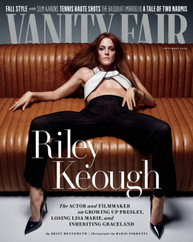
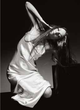
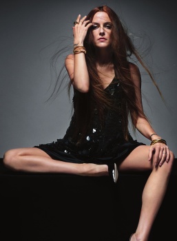
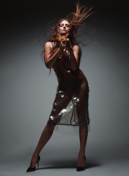
I've got the issue now - 136 pages in the UK print issue. The cover looks better in person, the masthead is reflective silver. The digital image looks dreary, but there's more of an autumnal, retro feel about the real one.

I'm not a fan of the cover pose, but looking at that sofa, I can imagine a TV-themed cover shoot, where a couple of celebrities are sitting together, with the masthead 'hiding' behind the sofa, as if everyone's watching a horror movie.

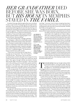
I like that something different has been done with the cover, but I will definitely pass on the crotch shot as a keeper in the collection.

The Slim Aarons feature is probably the only style-related content in what used to be the Style Issue. There's a portfolio of the next generation of tennis stars, but it's more of the same uninspired, pointless photography that plagues most magazines at the moment.

There's a look at the group of actors who starred in the 2013 movie Short Term 12, and how many of them went on to bigger things (e.g. Brie Larson, LaKeith Stanfield, Rami Malek).

To tick some boxes for typical VF content, there's an art forgery article, and a true crime piece about the strange relationship that sprung up between Margy Palm and the serial killer who kidnapped her in 1981.

The Doppelganger Effect is a personal account by Naomi Klein on what it's like to be constantly mistaken for Naomi Wolf, which has the potential to be interesting, but I wonder whether it'll go down the same old avenue of VF taking the opportunity to demean any person who doesn't share the same opinions as they do. As seen best in those articles where a VF journalist travels through an American state and marvels at the primitive beliefs of the people they find there.


Life of Riley
Photo Mario Sorrenti
Stylist Nicola Formichetti
By Britt Hennenuth
Subject Riley Keough
Hair Tomo Jidai
Makeup Frank B


vanity fair
 
Vanities
Photo Nick Riley Bentham
Stylist Jason Rembert
By Britt Hennemuth
Subject Lewis Pullman
Grooming Ericka Verretti


vanity fair
 

Users who are viewing this thread

New Posts

Forum Statistics

Threads
211,956
Messages
15,168,707
Members
85,815
Latest member
famfaluca
Back
Top
monitoring_string = "058526dd2635cb6818386bfd373b82a4"
<-- Admiral -->