Vogue Australia June 2018 : Rebel Wilson by Nicole Bentley | the Fashion Spot

Vogue Australia June 2018 : Rebel Wilson by Nicole Bentley

So depressing... even for winter. Mags never know what to do with women who don´t have a model body imo.
 
Most people don't have a model body, yet social media has proven there are innumerable ways in which people with different body types can dress (up and down) and look amazing.

But despite the endless oceans of inspiration available online, print magazines seem to cling to the old, tired methods of how they present different body types.
 
I hope Bentley just took this shot from afar and that they didn't slim her down. But even that aside, it's quite disappointing. Pose is not confident, styling is too much, and I don't like the composition. As a hardcore Bentley fan, I'm quite frankly underwhelmed.
 
I think this is just gorgeous! Doesn't look to me like they changed her body, but more down to how they styled her, not outraged by it. It looks so beautiful, she is giving a great energy, and the white background works. Will pick it up, so cool to see Rebel as the cover girl.
 
So depressing... even for winter. Mags never know what to do with women who don´t have a model body imo.

They know damn well they’re gonna be called out for this on social media... they did it on purpose to creat publicity and then will deny it by saying its a winter cover.
 
What a shame. Rebel is quite pretty imo and they could have done something great if they tried...
 
If only they did a better job on her face, she looks deranged.
 
At least it's a full body shot, too bad she's drowning in fabric. I guess you can't have your cake and eat it too. All this talk about body acceptance, and magazines are still featuring full figured actresses in closeups or in big baggy outfits. Why can't we just see her as she is?
 
Her expression is demented. She looks more like Elizabeth Moss than herself here. The photography is lifeless.
 
The cover is perfectly fine... from afar! Vogue Australia seem to excel at full-length cover images, love the heavy styling here with the white background and black masthead but Rebel's deranged smile does indeed ruin the cover.
 
At least they did not only do a portrait of her face, I was totally expecting that as we all know how magazines usually threat women who are no size two.
 
Vogue Australia June 2018: Rebel wilson by Nicelo Bentley

Photographer: Nicoel Bentley
Styling: Kate Darvill
Hair: Bryce Scarlett
Make-up: Pati Dubroff
Manicure: Betina Goldstein
Set design: Eli Metcalf


Vogue Australia June 2018 Digital Edition
 
Play it as it lays

Photographer: SCott Trindle
Styling: Celia AZoulay
Model: Julia Bergshoeff
Make-up: yacine Diallo
Manicure: Yukie Miyakawa
Production: 360pm


Vogue Australia June 2018 Digital Edition
 
Vogue Point of view

Photographer: Jake Terrey
Styling: Petta Chua


Vogue Australia June 2018 Digital Edition
 
Vogue Beauty

Photographed by Nagi Sakai
Hair by Kenshin Asano


Vogue Australia June 2018 Digital Edition
 
Crikey, the cover editorial is really lovely! Such effortless glamour, and so synonymous with Edwina McCann's era. This is what made me appreciate her vision. I take back what I said about Bentley. She delivered. So did the styling team. People say VP is mature, nope, this is easily the most mature and sophisticated Vogue edition.

Just as mad about Trindle's edit.....I can somehow picture Irina Lazareanu in it. Great mood.
 
Last edited by a moderator:
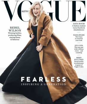
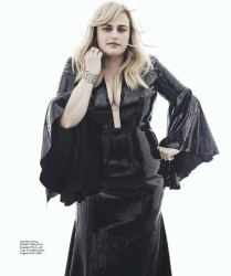
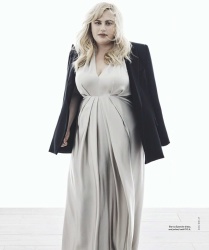
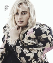
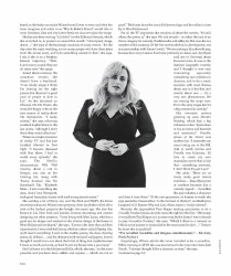
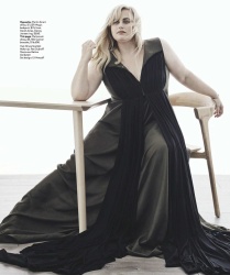
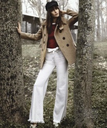
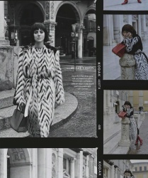
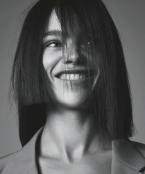
The cover is awful: The big coat or the big gown. Pick one. Her entire shoot is also awful. I don’t understand this lazy styling choice to overwhelm a big woman with even bigger clothes. Take some time and figure out what suits her body best instead of covering it up in an attempt to hide that she’s fat. So much for being “fearless”...

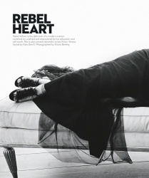
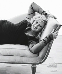
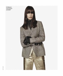
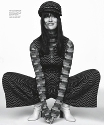
And this weird exectuve-decision to always feature the same coverline layout template is the weakest component of VA. Because the art direction of the magazine is supreme once I get over the cover. Even the one-page feature is thoughtfully laid out and flows to the next page, without ever looking like it’s done by 5 different people, of different skill levels— like Edward’s sloppy Vogue. I liked VA's previous art direction, but I can understand why they went with this more simple, clean and less overpowering rebranding. It’s more sporty, easygoing and non-fussy— much like VA’s spirit. Next to Emmanuelle’s Vogue, VA is my fav of all the Vogues. Not that they’re both always outstanding, visionary etc etc. Just that they’re always so confident and possess of a strong identity and stick by it.
 

Users who are viewing this thread

New Posts

Forum Statistics

Threads
214,474
Messages
15,263,092
Members
88,494
Latest member
aparnaappu123
Back
Top