Phuel
Well-Known Member
- Joined
- Feb 18, 2010
- Messages
- 6,149
- Reaction score
- 10,726
^^^LOL Kitty's got claws!
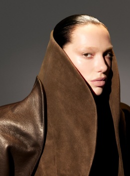
Comparing Carine’s and Emmanuelle’s Vogues to this scraped together excuse for a Vogue just doesn’t seem fair. The 24pg coverstory is as good as it’ll get these days— and seems like such a spurge for what’s become a 3rd-rate budget Vogue, so I’ll take it. The style of photography does seem too schizo, with its 3 different lighting styles and photographic styles LOL Had he just kept to the moodier Paris after dark vibe, that’s a touch Helmut Newton and a dash of Brassai, and for goodness sake, stop with the on-location setting mixed with in-studio shots already… At least it looks and feels like an event of a shoot, because the remainder of the reprints that’s cobbled together for a poor excuse of a September issue is just sad. Doubt there will be anymore 24pg coverstory by a strong, competent name shooting for this Vogue for a while.
The art direction is the most offensive component of this Vogue. UK/US and even Italia never had strong art direction. But Paris… from Carine’s to Emmanuelle’s, was such a glorious, glamorous and outright gorgeous era of skilled art direction that flowed from page to page so seamlessly. Whatever this pathetic attempt at art direction just resembles the picked over bin of the discount section of the outlet store. It’s so sad and so incompetent.
Seeing Mert Alas' name attached to a September issue of Vogue Paris instantly took me back to the cover from 2008 with Anna Selezneva, which remains just as fierce and fabulous today, as it was back then. M&M have given us some truly terrific covers of French Vogue over the years (like Lara Stone for March 2008) but this ain't one of them...
I don't mind Dua Lipa, love me some Alaia but those bleached eyebrows do not do Dua justice and the lighting is horrific! Those bleached eyebrows practically make Dua unrecognizable, no wonder Juan Costa Paz had to type her name as large on the cover.
Comparing Carine’s and Emmanuelle’s Vogues to this scraped together excuse for a Vogue just doesn’t seem fair. The 24pg coverstory is as good as it’ll get these days— and seems like such a spurge for what’s become a 3rd-rate budget Vogue, so I’ll take it. The style of photography does seem too schizo, with its 3 different lighting styles and photographic styles LOL Had he just kept to the moodier Paris after dark vibe, that’s a touch Helmut Newton and a dash of Brassai, and for goodness sake, stop with the on-location setting mixed with in-studio shots already… At least it looks and feels like an event of a shoot, because the remainder of the reprints that’s cobbled together for a poor excuse of a September issue is just sad. Doubt there will be anymore 24pg coverstory by a strong, competent name shooting for this Vogue for a while.
The art direction is the most offensive component of this Vogue. UK/US and even Italia never had strong art direction. But Paris… from Carine’s to Emmanuelle’s, was such a glorious, glamorous and outright gorgeous era of skilled art direction that flowed from page to page so seamlessly. Whatever this pathetic attempt at art direction just resembles the picked over bin of the discount section of the outlet store. It’s so sad and so incompetent.