Deleted member 116957
New/Inactive Member
- Joined
- Apr 4, 2009
- Messages
- 13,697
- Reaction score
- 15,826
Still milking the botched CoolSculpting... is this her identity now? The supermodel with botched plastic surgery?
Announcing... The WINNERS of the 2025 theFashionSpot Awards:
Designer of the YearCongratulations to ALL of our worthy winners! Thank you to our tFS forum members who voted and participated.
I mean, if it saves other models from similar disaster I'm willing to see it as Linda making a sacrifice for the public good (by talking about it that is)Still milking the botched CoolSculpting... is this her identity now? The supermodel with botched plastic surgery?


Oh come on ahhaha goshStill milking the botched CoolSculpting... is this her identity now? The supermodel with botched plastic surgery?
 I laughed because of how your worded it but she truly suffered from this man, therefore I don't think she's ''milking'' it coz it was apparently very painful and truly disfigured her body.


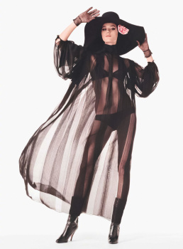


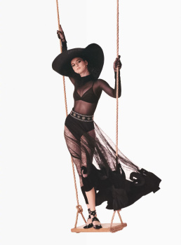
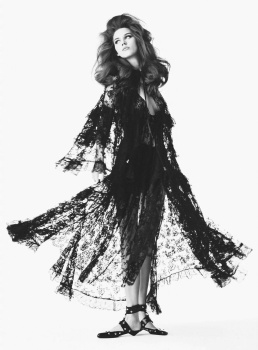



Thanks, my dear! ❤️So far it’s only part of Vogue Espana.
it actually is the cover story!Vivienne' story should have been Vogue France's covershoot for sure, it's much better.
I strongly disagree: the best photo from the strongest editorial becomes the cover image in most cases. That should have been the case here, it's a weak shot for the cover of french Vogue IF we want to go back (one day...) to what Vogue Paris used to be but yeah if we want a Vanilla era then hell yeah this picture is perfect for the cover.I think the cover shot they chose works well for a cover. I'm not seeing what's so bad about it. The best shot isn't typically the best photo in the editorial, anyway.
I strongly disagree: the best photo from the strongest editorial becomes the cover image in most cases.
