You are using an out of date browser. It may not display this or other websites correctly.
You should upgrade or use an alternative browser.
You should upgrade or use an alternative browser.
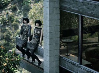
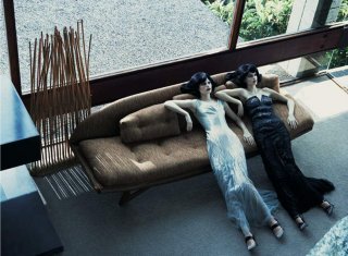
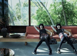
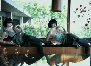
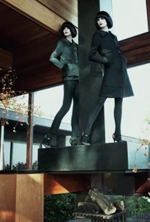
Alberta Ferretti F/W 07.08 : Julia Stegner & Adina Fohlin by Steven Meisel
- Thread starter *Bianca*
- Start date
kissmesweet
Well-Known Member
- Joined
- Dec 26, 2005
- Messages
- 19,675
- Reaction score
- 338
Amazing. I love how Meisel can always work out a concept and make it innovative and original.
I don't even like Adina, but she looks beautiful here.
I don't even like Adina, but she looks beautiful here.
modelhistory
Member
- Joined
- Feb 22, 2005
- Messages
- 229
- Reaction score
- 1
seanutbutter
the crying of humanity
- Joined
- Mar 15, 2006
- Messages
- 24,388
- Reaction score
- 6
I think they highlight everything BUT the clothes
Now that I have seen the advertisements in their entirety, I completely agree. The location is so incredibly gorgeous and vivid it grabs your attention from the clothing itself.
Not a very good marketing scheme, if you ask me!
It's funny because i'm not sure high fashion brands really need to highlight the clothes in their ads... I mean for it's more like "oh look, alberta ferretti's got a cool and interesting campaign this season" than "oh i just saw that alberta ferretti dress in an ad and i want to buy it"... high fashion clients most likely see the collections during shows, on the internet or directly in the shops... i'm not sure how many women actually decide they want one particular Dior dress because they saw it on Stam on the back cover of French Vogue... So it's more an image thingy than a marketing one IMO  Dunno if that makes sense though
 Dunno if that makes sense though
_incognito
Active Member
- Joined
- Jun 5, 2007
- Messages
- 1,787
- Reaction score
- 3
This is definitely my favourite campaign of the season. Love the mansion and styling, though I do agree that there is little focus on the clothes...Also, Adina looks amazing, and I don't even like her 

i'm not sure how many women actually decide they want one particular Dior dress because they saw it on Stam on the back cover of French Vogue... So it's more an image thingy than a marketing one IMODunno if that makes sense though

I does make sense but I think that you should always draw the attention to the product, regardless of what the product is.In the particular ads I have to try and find the clothes among all the "background".
I agree with seanutbutter that it's not a good marketing scheme, especially for a competitive feild like fashion.High or not (and however "big" the name of the house) you should always display to the customer what you're selling.
Why pay so much money for advertising othewise?
^ why ? because it's high fashion, and it's made of a lot of unnecessary things. Like the runway shows: they could do presentations on wooden manequins to the press and the buyers, but instead most brands choose to pay top models thousands of dollars to showcase the clothes, because it's prestigious and you don't want to be different from other big high fashion names that do it.
Plus i think that the Ferretti ads are selling a concept: it's expensive, luxurious, sleek and modern. It shows perfectly the image that the brand wants to convey through its clothes, eventhough the clothes aren't the main focus in the ads.
Plus i think that the Ferretti ads are selling a concept: it's expensive, luxurious, sleek and modern. It shows perfectly the image that the brand wants to convey through its clothes, eventhough the clothes aren't the main focus in the ads.
Ferdinanda
lay lady lay
- Joined
- Jul 29, 2007
- Messages
- 3,115
- Reaction score
- 4
The ads are so beautiful and peaceful. I love the way both of the models look. But I agree it doesn't quite highlight the clothes. But I'm not complaining 

- Joined
- Sep 15, 2005
- Messages
- 23,482
- Reaction score
- 411
valleyofdolls
Member
- Joined
- May 9, 2006
- Messages
- 454
- Reaction score
- 4
Similar Threads
- Replies
- 54
- Views
- 11K
- Replies
- 48
- Views
- 9K
- Replies
- 45
- Views
- 11K
- Replies
- 268
- Views
- 54K
- Replies
- 260
- Views
- 58K
Users who are viewing this thread
Total: 1 (members: 0, guests: 1)


 so good to see her in print again


