Why does Lupita's skin look more grey, cool toned in one image then in the very next frame, orange-y for instance, in the cover/editorial photo?
The editorial images are weak. The photo editing is inconsistent. There's no energy, emotion or joy coming from this actress. I don't get the impression even Luptita thinks she looks good.
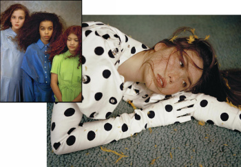
And how or why did that striped dress shot even make it to print?
Editors need to stop re-designing or "refreshing" their editorial layouts and focus on learning to identify meaningful imagery. That is what sets the legendary oft reference magazines of yesteryear apart from the instagram educated, blink of an eye, attention span, mind set of today's editorial teams.
 ), this is gonna be one helluva boring issue.
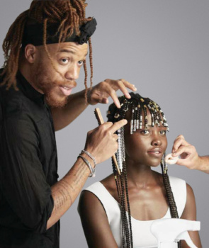


 I´m so so so shocked that Patrick Demarchelier has been accused like Mario Testino, Bruce Weber etc. Have ALL the major photographers done ``it´´ ???