You are using an out of date browser. It may not display this or other websites correctly.
You should upgrade or use an alternative browser.
You should upgrade or use an alternative browser.
Allure March 2019 : Kendall Jenner by Cass Bird
- Thread starter vogue28
- Start date
MON
Well-Known Member
- Joined
- Jun 20, 2009
- Messages
- 12,635
- Reaction score
- 5,188
Is this the redesign? Haha pathetic. People are paid for that?
Blue eyebrows? Not against it, but totally NOT PROPER for this kind of pedestrian styling. Its too extreme for natural makeup!
Also, this looks like an Instagram photo.
James Scully should have waited for this
The shot on Allure’s Instagram where she seems running and smiling would have made a stunning cover
tigerrouge
Well-Known Member
- Joined
- Feb 25, 2005
- Messages
- 18,885
- Reaction score
- 9,713
This magazine's promotion of the 'natural look' didn't last long.
Benn98
Well-Known Member
- Joined
- Aug 6, 2014
- Messages
- 42,582
- Reaction score
- 20,750
I wish the styling and overall execution of this cover lived up to those edgy eyebrows. Because I can deal with the commercial lightness of it all (the first in some time for this magazine), like it's a campaign for an Australian brand. But that garish pink backdrop must go, as well as that cheap-looking top she's wearing.
JPineapple
Well-Known Member
- Joined
- Jul 1, 2018
- Messages
- 2,913
- Reaction score
- 4,073
The new trend is make covers using paint
Morgane07
Well-Known Member
- Joined
- Aug 30, 2018
- Messages
- 354
- Reaction score
- 279
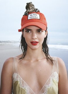
On Allure IG account, we can see a pic of Kendall wearing a hat saying "Blame Kendall"; I don't know but it comes across as quite tone deaf to me. Are we supposed to think she's a victim or am I reading too much into it?
Stylebest
Member
- Joined
- Jan 26, 2019
- Messages
- 10
- Reaction score
- 16
Last edited by a moderator:
Stylebest
Member
- Joined
- Jan 26, 2019
- Messages
- 10
- Reaction score
- 16
Last edited by a moderator:
Benn98
Well-Known Member
- Joined
- Aug 6, 2014
- Messages
- 42,582
- Reaction score
- 20,750
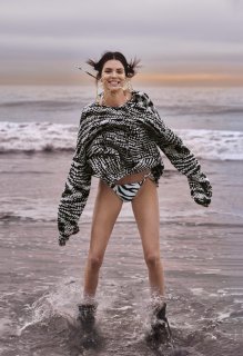
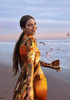
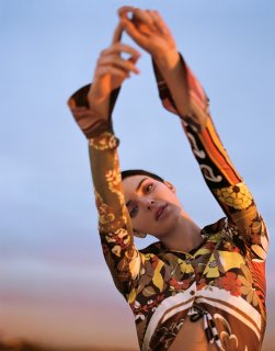
The two middle pictures are great. 4th one could be a cover for Dazed, and I like the third one. She's better at commercial modelling than HF. I don't know what the cap and frog is all about, but then that's Cass Bird for you.
happycanadian
Well-Known Member
- Joined
- Mar 2, 2005
- Messages
- 8,211
- Reaction score
- 277
I actually really like this. There's something a little more organic and natural about her in this shoot. The editorial is really fun!
apple
Well-Known Member
- Joined
- Jun 8, 2016
- Messages
- 2,435
- Reaction score
- 1,110
The cover is not charming at all but I don't blame Kendall for it: in this case the fault is in the photograph and art direction. The editorial is one of my favourite stories of Kendall. She looks so natural. I just don't understand its connection to the Spring goes bold cover line..
Similar Threads
- Replies
- 49
- Views
- 14K
- Replies
- 4
- Views
- 4K
- Replies
- 15
- Views
- 6K
Users who are viewing this thread
Total: 1 (members: 0, guests: 1)


