You are using an out of date browser. It may not display this or other websites correctly.
You should upgrade or use an alternative browser.
You should upgrade or use an alternative browser.
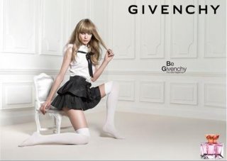
Givenchy "Be Givenchy" Fragrance : Jules Mordovets by Liz Collins
- Thread starter mikel
- Start date
Love it! So simple and sweet. Yay for Jules 
The bottle in the bottom right corner is kind of random, though. Maybe if it was bigger.
It's quite a contrast to his last, dark and strong collection.

The bottle in the bottom right corner is kind of random, though. Maybe if it was bigger.
It's quite a contrast to his last, dark and strong collection.
Last edited by a moderator:
mikel
Well-Known Member
- Joined
- Sep 30, 2005
- Messages
- 26,859
- Reaction score
- 6,200
^All the beauty and fragrance ads by Givenchy are not in line with Ricardo Tisci's vision for the brand.
I think he has nothing to do with the beauty/fragrance part of the Givenchy brand (yet).
It's a nice shot indeed. And you're right about the bottle. It's too small.
I think he has nothing to do with the beauty/fragrance part of the Givenchy brand (yet).
It's a nice shot indeed. And you're right about the bottle. It's too small.
P
pitumpah
Guest
Agree, the bottle totally looks like it hasn't nothing to do with the rest
but I love this ad already!
it makes me buy this perfume for sure
but I love this ad already!
it makes me buy this perfume for sure

CharlottefromCA
User Friendly
- Joined
- Feb 13, 2005
- Messages
- 10,351
- Reaction score
- 8
^All the beauty and fragrance ads by Givenchy are not in line with Ricardo Tisci's vision for the brand.
I think he has nothing to do with the beauty/fragrance part of the Givenchy brand (yet).
I don't think so either.. otherwise the model would be Mariacarla

This is travel-retail exclusive and apparently came out in Jan 2009... anyone smelt it?
more info about the fragrance:
http://forums.thefashionspot.com/showpost.php?p=5114404&postcount=1355
more info about the fragrance:
http://forums.thefashionspot.com/showpost.php?p=5114404&postcount=1355
Ilove Miss JKO
Member
- Joined
- Jun 27, 2009
- Messages
- 62
- Reaction score
- 0
It seems like a chanel ad...
It's pretty.
It's pretty.

wednesdays child
Active Member
- Joined
- Jul 22, 2008
- Messages
- 1,523
- Reaction score
- 1
Gorgeous!
Similar Threads
- Replies
- 4
- Views
- 6K
- Replies
- 78
- Views
- 16K
- Replies
- 91
- Views
- 33K
- Replies
- 25
- Views
- 12K
- Replies
- 9
- Views
- 3K
Users who are viewing this thread
Total: 1 (members: 0, guests: 1)


