Anti-monogamy seems to be the pattern now?First Blazy's white shirt about her love for Boy Capel. Next Margaret Qualley being proposed to by ASAP 🙄
You are using an out of date browser. It may not display this or other websites correctly.
You should upgrade or use an alternative browser.
You should upgrade or use an alternative browser.
Matthieu Blazy - Designer, Creative Director of Chanel
- Thread starter charles01
- Start date
You are not alone.C’est un mal nécessaire!
Drastic but necessary. Less Erica the IG woman.
I’m not at all attached to the image that Chanel has had in the last 5 years at all. It’s great that Virginie sold a lot of clothes but you won’t convince me that it’s not a good thing to move from that.
I also experienced a time when Chanel was less logo-fied and when a good CC button was enough.
This palette cleanser is a win for me. I welcome that with a great joy.
And if they have a little dip in sales because of that? Ok and then!? They will comeback around. Fashion is a cycle anyway.
For the first time in a long time I’m actually interested in going to go to a Chanel store to buy RTW. I couldn’t care at all that some clients don’t like it lol.
The purse forum buyers share your disdain for logos, for the most part. As someone posted earlier, the Dakar collection was the worst in terms of sales. It was obvious from the feedback on tPF. This one, I suspect the same. (Interestingly, the Dakar collection also had a focus on beading and craft, but some were done Temu-like, a total disrespect of the Ateliers.)
We hate logo pieces doesn't mean that we have to subscribe to the new (in reality, old BV/Phoebe), sloppy, and sad looks. The bar has to be higher.
hamburgers
Well-Known Member
- Joined
- Mar 25, 2025
- Messages
- 261
- Reaction score
- 1,141
This sounds like classic JWA, and that may explain why the quality of Dior's red carpet teasers was so terrible. Don't forget Blazy has couture background, and he's much more nerdy when it comes to fabrications and techniques than Anderson. When compared, Anderson's work is superficially nerdy, and he's more of a curator than a real designer. That worked well at Loewe, but the longer he is at Dior, the more I doubt about that approach being the right one. And if anyone lacks technical knowledge, it must be him.
Yeah I'm a fan of them both, but the original commenter clarified it's JW. PvO, who consulted for both Loewe and JW mainline, also being shady in comments unfortunately.
PDFSD
Well-Known Member
- Joined
- Mar 27, 2024
- Messages
- 2,902
- Reaction score
- 10,313
he likes abstracted prolapse flowers in silk or made from straw or other materials there is no inbetween lol...... because god forbid coco chanel has signature flower !!!!! not good enough ...man has to redesign it to be another type of flower because woman didn't know better.The dress he did for Nicole is really mediocre, if not bad. I expect more than sloppy draping from someone whose supposed obsession with craft is his only characteristic.
that's the power of the 3.
the flowers on these dresses he did look like what a 12 year old can make from their bed sheets in 10 seconds
PDFSD
Well-Known Member
- Joined
- Mar 27, 2024
- Messages
- 2,902
- Reaction score
- 10,313
like dont get me wrong i love a helmut lang knot dress 2005 or yamamoto 1998 knot flower dressThe dress he did for Nicole is really mediocre, if not bad. I expect more than sloppy draping from someone whose supposed obsession with craft is his only characteristic.
but that was in concept with a whole research and purpose to those shows and looks.


PDFSD
Well-Known Member
- Joined
- Mar 27, 2024
- Messages
- 2,902
- Reaction score
- 10,313
agree 1000000000000000000000000000% VV did lots of ugly logo prints and basically ugly prints & graphics, blazy does the same even without logoMy problem with logo has less to do with logos themselves than the aesthetic used to sell them.
From the moment I started to buy Chanel RTW to the moment I stopped, there were logos. The Chanel I know has always been very logo-fied, done with more or less success, sometimes with a lot of humor.
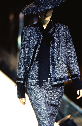
I have said it many times here but unlike a lot of Chanel fans, I despise the SS1995 collection. It’s a fun show to watch but my favorite outfit is probably the look Victoire de Castellane wore closing the show: a Chanel bar suit in tweed with wide leg pants lol.
But for a lot of Chanel fans, that collection, that aesthetic is the kind of epitome of what they likes or would like to recapture from Chanel. And in some ways, Virginie tapped into that.
Virginie was capable of that:
Modern and timeless, rather chic
View attachment 1427219
But she was also capable of that, which in return was a lot more commercially successful:
View attachment 1427220
I think there are more interesting ways to do logos au demeurant…
The reality is that, this is Chanel. You can’t remove logos. There are everywhere. I have a lot of blouses with seasonal prints and there’s a CC in them in between the prints. You can also elevate the exercise.
But I agree with the idea of frumpiness. I almost think that it’s something that goes with Chanel whenever volumes and the lineance to the very bourgeois (and conservative) side of Chanel are involved.
There were moments when Chanel was truly modern. When it was sexy and young. Karl did that perfectly in moments during the 80’s,90’s,00’s and 2010’s and there were moments where no matter how new he tried to be, the clothes looked like they were coming straight from Bernadette Chirac’s wardrobe.
I love the Tour Eiffel in the Grand Palais couture collection. But that collection would only work on someone with heavy modifications and great style.
The frumpiness with Blazy was more with the length of the skirt. It’s very Coco. That length only works with sexy shoes. And the classic Chanel slingbacks aren’t sexy.
Maybe that’s what is needed back. A kind of tacky sexiness to balance the whole thing. Blazy’s collection would look even more good with some tacky sex Christian Louboutin heels. The So Kate are too obvious..So the Cassia would do the job well lol.
Hidden logos or prints with a CC in between the prints is normal and its a normal thing in silk prints even hermes signs of each print or play s with h or full name or horse,every brand with some print or logo plays with this some better than others sure etc and all brands do it its expected play of branding designs, i think nobody has an issue with this logo lover or not and to expand on it in other categories its fine sure.
this is not the issue logo or no logo when the complete vision or lack of it is the main issue.
Frumpiness with Blazy is not just skirts lengths be it Chanel or not, it has to do with all proportions and volumes and color choices and bulkiness and overall lack of sharpness in cut and silhouette and rigor and edit and concept.
Same as VV it was not just her use of white stocking or skirt length or drop waist ...its was a list of design choice...she is 63 years old , blazy 40 you would expect more modernity in cut and position then just copy trace of Phoebes work. badly done.
Even Phoebe has better cuts, even when she does drop waist peplum silhouettes etc that can be tricky, or grandy stuff in boring colors thees is a balance of risk and proportions to make something feel modern and fresh again.
We are not measuring with same parameters as VV got criticized etc when it comes to any critic of Blazy´s crafty work.
tricotineacetat
Well-Known Member
- Joined
- Apr 3, 2005
- Messages
- 3,233
- Reaction score
- 4,682
Call me a millenial with an outdated sense of taste, but I will always prefer the trim cut of Karl's early 2000s Chanel jackets over the droopy proportions Blazy insists on.
These two RTW jackets from the FW'02 collection are still as good looking today than when they were first presented - Most women would probably prefer to wear them over anything Chanel has shown in recent time.


These two RTW jackets from the FW'02 collection are still as good looking today than when they were first presented - Most women would probably prefer to wear them over anything Chanel has shown in recent time.
PDFSD
Well-Known Member
- Joined
- Mar 27, 2024
- Messages
- 2,902
- Reaction score
- 10,313
it just still looks fresh and timeless even styled on their own no one would know what year these were from if worn today.Call me a millenial with an outdated sense of taste, but I will always prefer the trim cut of Karl's early 2000s Chanel jackets over the droopy proportions Blazy insists on.
These two RTW jackets from the FW'02 collection are still as good looking today than when they were first presented - Most women would probably prefer to wear them over anything Chanel has shown in recent time.
View attachment 1427499 View attachment 1427500
even the hair chain inserts pieces are still cool
jeanclaude
Well-Known Member
- Joined
- Feb 12, 2012
- Messages
- 4,749
- Reaction score
- 13,969
Flattering clothes never go out of fashion. As easy as that.
rip_ian curtis
Well-Known Member
- Joined
- Jul 27, 2008
- Messages
- 678
- Reaction score
- 343
Yes! 100% agree with this and I’m happy I’m not the only one who appreciates this era of Chanel (as it’s always either the early 90s stuff or the 2010s that everyone ever talks about)Call me a millenial with an outdated sense of taste, but I will always prefer the trim cut of Karl's early 2000s Chanel jackets over the droopy proportions Blazy insists on.
These two RTW jackets from the FW'02 collection are still as good looking today than when they were first presented - Most women would probably prefer to wear them over anything Chanel has shown in recent time.
View attachment 1427499 View attachment 1427500
I was actually secretly hoping Blazy would go here instead, to this very sharp, somewhat clean and urban-looking Chanel, to really differentiate from the frumpy and bulky fits Virginie put out.
In my head Karl’s collections from 2001 until maybe 2004 are the blueprint for ”modern” Chanel.
NakedAndAfraid
Well-Known Member
- Joined
- Jan 20, 2024
- Messages
- 155
- Reaction score
- 349
I can't look at those 2002 exits and not see MySpace, The Simple Life with Paris Hilton, emo, scene kids etc. Not saying it's bad, but I see Demna referencing that before MB.
PDFSD
Well-Known Member
- Joined
- Mar 27, 2024
- Messages
- 2,902
- Reaction score
- 10,313
he would highlight the trashy side and still fail but ok :-)I can't look at those 2002 exits and not see MySpace, The Simple Life with Paris Hilton, emo, scene kids etc. Not saying it's bad, but I see Demna referencing that before MB.
FashionPower
Well-Known Member
- Joined
- Jul 7, 2008
- Messages
- 10,474
- Reaction score
- 4,413
Guys, let's be honest, early 2000's CHANEL by Karl was everything. FW03 and SS04 devouring anything from Virginie and MB combined: sleek, sexy, modern, elevated yet wearable, with the right balance between quirkyness and merchandise. MB wishes to release something as iconic and fun as the audio tape Minaudiere from CHANEL SS04.
I don't know what happened from 2005 to 2011 with Karl but his RTW in that period was very matronly and looked very dusty and dated (FW07, FW08, FW09 were such bad collections). He then went back to the top starting from the SS13 and FW13 show...it's been more than a decade since these two shows and I think everyone remembers the jackets with the oversized pearls appliques and the leather chain tigh high boots.
I don't know what happened from 2005 to 2011 with Karl but his RTW in that period was very matronly and looked very dusty and dated (FW07, FW08, FW09 were such bad collections). He then went back to the top starting from the SS13 and FW13 show...it's been more than a decade since these two shows and I think everyone remembers the jackets with the oversized pearls appliques and the leather chain tigh high boots.
Lola701
Well-Known Member
- Joined
- Oct 27, 2014
- Messages
- 13,954
- Reaction score
- 37,491
There’s almost a very paradoxal side to Karl’s Chanel in the early 00’s. The collections were intentionally young and sexy and fresh. In RTW, a bit more mature in Couture but the women who wore Chanel at the time weren’t necessarily that. But the collections were fabulous.
I have to say after acquiring pieces from that time overtime that I much prefer the cut of his jackets from before spring 2002 and from spring 2004.
It’s so obvious with the 2002/2003 collections that he was wearing Dior Homme and that it had an influence on the construction of his clothes. Beyond the fact that his aesthetic became more graphic.
And thinking about that, the aesthetic switches used to do at Chanel were quite strong. There were like 4 different Chanel throughout the 90’s. In the 00’s, he played a lot with a certain conservatism and youth but it also a time when the industry in womenswear at least didn’t necessarily targeted youth. There were diffusion lines for that. So THE WOMAN was in her early 30’s.
Grown yes. Dated…No. But it’s a matter of taste.
Collections in the 00’s were richer in terms of proposition. I love FW08 because it’s just great clothes. There’s no real theme, no real formula, a bit of everything but still focused.
Collections in the 2010’s were maybe more formulatic in their statement. The set kinda put everything in a context but it was really a theme, a set, a cut and everything was much more informed and quote on quote « understandable for the mass ».
The supermarket show was fun and it was glorious thing to witness but for me the best thing about it was that Karl made essentially a RTW version of the Couture with sneakers, something he rarely do. But when I saw the first look walking, I was puzzled.
I have to say after acquiring pieces from that time overtime that I much prefer the cut of his jackets from before spring 2002 and from spring 2004.
It’s so obvious with the 2002/2003 collections that he was wearing Dior Homme and that it had an influence on the construction of his clothes. Beyond the fact that his aesthetic became more graphic.
And thinking about that, the aesthetic switches used to do at Chanel were quite strong. There were like 4 different Chanel throughout the 90’s. In the 00’s, he played a lot with a certain conservatism and youth but it also a time when the industry in womenswear at least didn’t necessarily targeted youth. There were diffusion lines for that. So THE WOMAN was in her early 30’s.
FW07 and FW08 dated? Ok…Guys, let's be honest, early 2000's CHANEL by Karl was everything. FW03 and SS04 devouring anything from Virginie and MB combined: sleek, sexy, modern, elevated yet wearable, with the right balance between quirkyness and merchandise. MB wishes to release something as iconic and fun as the audio tape Minaudiere from CHANEL SS04.
I don't know what happened from 2005 to 2011 with Karl but his RTW in that period was very matronly and looked very dusty and dated (FW07, FW08, FW09 were such bad collections). He then went back to the top starting from the SS13 and FW13 show...it's been more than a decade since these two shows and I think everyone remembers the jackets with the oversized pearls appliques and the leather chain tigh high boots.
Grown yes. Dated…No. But it’s a matter of taste.
Collections in the 00’s were richer in terms of proposition. I love FW08 because it’s just great clothes. There’s no real theme, no real formula, a bit of everything but still focused.
Collections in the 2010’s were maybe more formulatic in their statement. The set kinda put everything in a context but it was really a theme, a set, a cut and everything was much more informed and quote on quote « understandable for the mass ».
The supermarket show was fun and it was glorious thing to witness but for me the best thing about it was that Karl made essentially a RTW version of the Couture with sneakers, something he rarely do. But when I saw the first look walking, I was puzzled.
Kanzai
Well-Known Member
- Joined
- Oct 5, 2023
- Messages
- 1,188
- Reaction score
- 3,230
(Vogue)
This is Yohji paying tribute to Coco Chanel (S/S 1997), a designer that he always admires. It’s the perfect example of how a true master, one of the most radical designers, has a dialogue with a legacy instead of just twisting it. He is clearly the first designer in fashion to question the relationship between the beauty and the imperfection.
The designers from the Japanese avant-garde wave, starting with Issey Miyake in the late 70s,
made Europe realize that fashion doesn’t have to glorify the body or individual identity. Yet for these designers, the body remains the central axis of their creations — not the silhouette or structure. All created their own schools of aesthetic, they didn't need to destroy what came before and most importantly, they didn't jump around as creative directors, they just focused on doing their sh*ts.
Personally, I don’t see Matthieu as pushing fashion forward or making it any more modern.
Ppl may say he doesn't have a big ego, but I don't buy it. To me, he’s desperately trying to prove himself by turning Chanel upside down. Not a fan!
I don’t see Matthieu as a designer who pushes fashion forward. Those designers are few and far inbetween. The last designer that did that is demna (sadly). For me someone like Matthieu actually seems to lack ego, or he disguises it behind virtue signaling and this smoke screen humbleness that is all the vogue currently.
I expected quite a lot from him actually, I found his range from Margiela to BV quite diverse, but his Chanel seems messy, meek and uninspired. For fashion to move forward he needs to produce collections with way more focus and aspirational propositions. Furthermore I don’t think Chanel is the house to push fashion forward anymore, coco obviously pushed, but right now the codes are so rigid and recognizable it’s indeed Coca Cola. That’s why Karl was so genius, he combined smart design with the zeitgeist in a light and fun way, it never weighed the brand.
Matthieu needs to infuse his collections with way more focus, precision in the fit and a lightness in the theme to balance all the dusty luxury codes of Chanel.
I found also this statement that the archives where overwhelming so lame, like dude, get it together and focus.
A disappointment so far. He and jw need to throw away their phones and get to work.
Kanzai
Well-Known Member
- Joined
- Oct 5, 2023
- Messages
- 1,188
- Reaction score
- 3,230
Matthieu is not even Flemish (he's not from that Antwerp school, except for being mentored by Raf). He's Walloon, French-speaking and graduated from La Cambre, much like Olivier Theyskens (and Theyskens's mother is French, anyway).
I don't think Chanel is a house that promotes experimentation, you shouldn't bring Anvers way of thinking (even Martin understood it when he worked at Hermes). The house has a history of pushing fashion forward, but in a very influential and clear way. I'm not denying Blazy has talent, but he seems to lack a clear vision and even worse – he seems unwilling to understand the mindset of Chanel customers (imo, that's selfish and arrogant).
I don't think Chanel is a house that promotes experimentation, you shouldn't bring Anvers way of thinking (even Martin understood it when he worked at Hermes). The house has a history of pushing fashion forward, but in a very influential and clear way. I'm not denying Blazy has talent, but he seems to lack a clear vision and even worse – he seems unwilling to understand the mindset of Chanel customers (imo, that's selfish and arrogant).
chungkyekye
Member
- Joined
- Jul 4, 2021
- Messages
- 19
- Reaction score
- 61
echo what's mentioned about chanel now being an institution rather than expecting it to be fashion forward. the fact that they are having to make public statements and respond makes them seem quite vulnerable and a bit confused. it's a real contrast to the past where they always seem quite untouchable. Chanel is fashion as much as its not 'fashion,' such a rare business to have like hermes I feel.
i'm rather indifferent about MB, he's a very 'high fashion' runway designer but there seem to be this uncertainty even though the press seems to view him as a stable direction(?). he definitely has a 'look' and his debut collection looks very 'him.' but like many of you has mentioned - i still don't know what he's about, it seems to be about something well-made with an 'artistic modern flair.' i thought he was much more suited to BV where the identity is more non-descript and can be marketed as 'modern art.'
this discussion is interesting since i always thought chanel at it's core is that kind of really stable, safe brand for more mature women and their daughters when they come of age. every dept store in the world (high-end, mid, mass) has these types of brands that serve these clients - the only difference was in price (there doesn't seem to be much difference in taste). any change in creative direction and the way the garments are cut can be very drastic for their customers.
i did not like VV's chanel at all and was really looking forward to change, but it still looked 'stable' enough and the type of clothes she was putting out were exactly the type of clothes that could be consistently pushed year after year to the missus dept and perform. Even with a sales dip they are relatively stable most of the time. when i entered retail and saw what was selling it was actually really horrifying - like what really?? why did i go to fashion school for??? do customers really want all 'this'?? what a humbling experience.
chanel did have an incredible fashion edge with novelty when karl was there - again, like you all have mentioned was part of karl's genius. it was to a level where the average consumer could still 'understand' and accept and i feel that that was part of VV's strength when she was there, she provided a stability which shows how important a boutique designer collaborator is. Compared with many brands, there really wasn't too much discrepancy with the boutique collections and the runway.
MBs take on chanel hit items do look more modern but there's something about it that makes it not so easily digestible for some reason 😅
this whole thing about chanel needing a new direction - i'm unsure, i don't actually think they needed it as much as people think. But at the same time they do need a CD
to me, the main issue around all their 'problems' (if we can call it that) seem to stem much more from their ridiculous price increases and atrocious fall in quality rather than the 'fashion' they were putting out. chanel looks kind of mismanaged albeit in a more low-key way. at least they can ride on the success of the chanel 25, sales were not encouraging until they pushed it with jennie. what i did find a bit strange in their brand communications is that she was wearing vintage chanel when there is the 'new' chanel(?).
This reset now feels a bit nervous, I wonder how it will all unfold
PDFSD
Well-Known Member
- Joined
- Mar 27, 2024
- Messages
- 2,902
- Reaction score
- 10,313
You don't have to be Belgian (Flemish) design minded to go to Antwerp Academy.Matthieu is not even Flemish (he's not from that Antwerp school, except for being mentored by Raf). He's Walloon, French-speaking and graduated from La Cambre, much like Olivier Theyskens (and Theyskens's mother is French, anyway).
I don't think Chanel is a house that promotes experimentation, you shouldn't bring Anvers way of thinking (even Martin understood it when he worked at Hermes). The house has a history of pushing fashion forward, but in a very influential and clear way. I'm not denying Blazy has talent, but he seems to lack a clear vision and even worse – he seems unwilling to understand the mindset of Chanel customers (imo, that's selfish and arrogant).
His design sensibilities is ultra Belgium (dutch french makes no difference) as much as Raf and Pieter even if he would be born in the middle of the Place de Vendome or the Ritz hotel in Paris would not make him an french designer today.....like a Phoebe born in Paris as well, but we don't see her as a French designer either for her design sensibilities regardless if both her parents are British.
I think you mixing things up :
Karl did experiment at Chanel both in a modernist abstract way and pop way.
Margiela did bring his experiments to Hermes with in Hermes craft & high quality context (what seem normal now was not back then) does not mean he had to do extreme or obvious stuff for it to be experimental it was in a more subtle way and at the time not always well received either.
For context :
Matthieu Blazy is a French-Belgian designer who was born in Paris to a Belgian mother and French father. He studied fashion at the La Cambre art school in Brussels, which is in Belgium, and began his career with Belgian designer Raf Simons
Belgium is divided into two main linguistic-based regions: Flanders, which is predominantly Dutch-speaking, and Wallonia, which is predominantly French-speaking. The capital city, Brussels, is a bilingual territory where both Dutch and French are official languages. A small German-speaking community also exists in the eastern part of the country.
Fantastic man interview :
He was born in Paris in 1984, along with his twin sister, to a Belgian mother and French father. “My dad is an art expert. And my mom, she’s an historian, and also fun.
He chose to study at La Cambre in Brussels; not the Antwerp Academy, Central Saint Martins, or any of the French schools which focused solely on fashion education. That was the first of his life decisions that, looking back, helped determine his destiny: the structure of La Cambre’s five-year liberal arts course was the ideal deep prep for the complex role of a modern creative director – a job which now demands fluency in the intellectual and visual communication of fashion through everything from photography to interiors to knowing who to collaborate within the arts. “You had history of art, history of music, scenography. You’d sketch, do painting classes,” he says. “Then in the afternoons, you could do stitching and atelier workshops. So there was something slightly more generous on offer. And I also love Brussels.”
jeanclaude
Well-Known Member
- Joined
- Feb 12, 2012
- Messages
- 4,749
- Reaction score
- 13,969
Yeah, so fun! We can already feel all that fun oozing from your clothes...“My dad is an art expert. And my mom, she’s an historian, and also fun."
Similar Threads
- Replies
- 1K
- Views
- 174K
- Replies
- 64
- Views
- 15K
- Replies
- 2
- Views
- 3K
- Replies
- 11
- Views
- 6K
- Replies
- 266
- Views
- 43K