Prada F/W 2016.17 by Steven Meisel

The campaign looks like this.

tumblr_mav6on8RZa1rse3c2.jpg

pikdit.com
 
+ Freja and Angelica Erthal

 
^That's why I say Prada killed their own hype... Their castings are trying to WOW people so desperately and you can tell it... But we are so used to them that they don't affect me anymore. Such great news as having Freja and queen Raquel back in Prada doesn't even excite me... I'm just DONE.

The images themselves are beyond ugly.
 
I personally think Freja's shot is great! It reminds me of her Balenciaga fall 2010 campaign. The colors and attitude are great.
 
Last edited by a moderator:
Freja and Angelica's shot is actually pretty nice. Well - I should say the photographs of them alone...the lighting is beautiful and I like that they're looking in two different directions...has some dynamism. BUT.....that collage effect and background is so annoying.

Quite frankly, with how much is going on in this collection, it almost would have been better to just have a white or grey seamless background.
 
OMG Angelica :woot: So happy for her. I'm sure Lorena is in as well.
 
Freja :buzz::buzz:
I still don't understand why they did this awful collage, it ruins everything. For me this collection was not bad and with the great cast they have, they didn't need to do this much.
 
The campaign looks like those tacky magazines that photoshop the models from the runway onto some ugly background.

The casting is doing tooo much. Sasha will probably pop up next.
 
This is sooooo pathetic, not even Gisele showing up next could save this, basic and uninspiring.
 
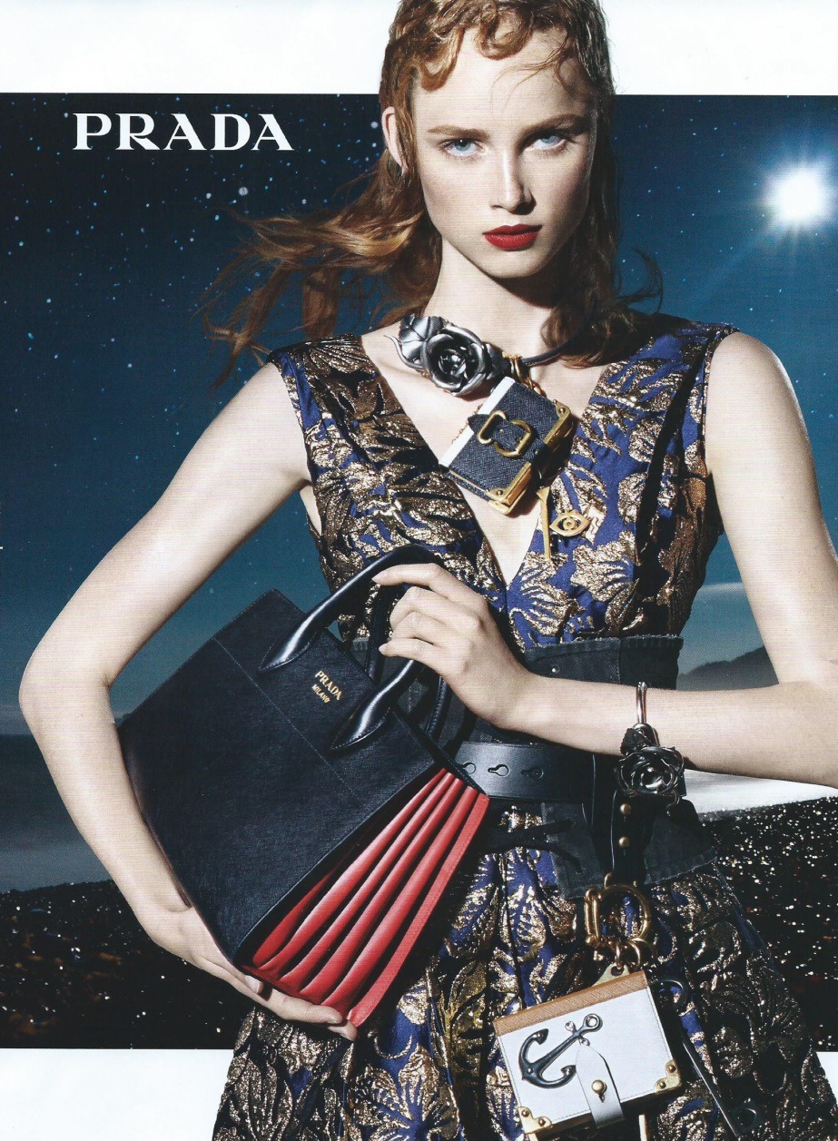
Freja!!! Yet again, stunning walk and stare, but I'm not impressed. I do like what she's wearing, but to me it looks like if you remove the accesories, you're left with a very basic military style coat.
Why didn't Meisel just update the setting he used for Balenciaga's A/W 2010 campaign? This crappy collage effect ruins the images. And the styling is too heavy for this background.

Lol, their desperation is almost funny now. The high and mighty Prada copying Marc Jacobs' trend of releasing a shot a day in order to create anticipation and hype. Only this time around her campaign is far more subpar than Marc's. God, what is this world coming to? They must've known how much fashion people love Raquel and Freja, no wonder why they sat on these images.

Before I get stoned alive, I'm well aware that Marc Jacobs didn't start the trend (I actually think magazines did), but his brand is one of the first who seemed to benefit from it.
 
I agree Benn, the styling is so heavy. The heaviness takes away from the appeal of the clothes. I still don't get the need of the cut out style plus the intergalactic background.

You had an amazing photographer, a stellar cast... and we end up with this.
 
That's the best shot so far. Rianne is so amazing.

Still not worthy of carrying the name Prada on it.
 
The clothes look amazing on Rianne. What a queen!
 
Rianne's shot is easily the best. The background really compliments her eye color.
 
Rianne is a star: she shines in the shot and makes the clothes shine. Wow, what a season for her!
 
Raquel's pic is gone, but i saw Freja's and not even she can save it.
6OvjQIe4.gif
It's just horrible in general. The hair, the darkness, the random cut out. just so bad.
 
Just wait until we see the campaign in full, shots next to each other, then people will see how everybody's got the same expression.
 

Users who are viewing this thread

Forum Statistics

Threads
210,721
Messages
15,125,054
Members
84,420
Latest member
paulpaul
Back
Top
monitoring_string = "058526dd2635cb6818386bfd373b82a4"
<-- Admiral -->