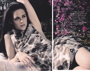
UK Elle June 2012 : Kristen Stewart by David Slijper

Lorraine's editor's letter this month sort of sets out how the magazine is going to run going forward. I think it's clear with this issue and the July issue that they're taking a different approach - telling us who will be on the cover and even with the David cover asking for how it should be shot. Her letter says that from no one the magazine will be truly reflective of what the readers want to see in it, who they want to see on it, she says it's an 'editor's experiment' and she hopes it will work, there's an e-mail address and she'd like ideas for new features and so on.

If they do as they say they plan to then I think that's a really great thing. For me Elle is always the most 'down-to-earth' of the fashion monthlies already.
 
I thought the subscriber's cover will be better than newsstand, but I was wrong. Her pose and face doesn't look good.
 
So, I’m clearly in the minority but I like it, probably because I’m actually a Kristen fan. ^_^

It’s not her best cover that’s for sure, but it is nice to see UK Elle using a non studio shot for a cover..I can’t remember the last time they did that, if ever!

...and like honeycombchild mentioned above the statistics are pretty impressive so I doubt it’s the last time we’ll be seeing a Kristen cover.
 
I'm really not liking this at all, everything is off on both covers and for the hype they created tweeting from the set I was expecting something far better than this. It has completely left me underwhelmed, definitely another issue I'll pass on.
 
HQ Subscriber's Cover:


scan by vogue28


Review

Working Girl
Cover Star: Kristen Stewart
Photographer: David Slijper
Stylist: Anne-Marie Curtis
Hair: Kevin Ryan
Make-up: Jill Dempsey
5 Photos

The Nature Of Things
Model: Martha Hunt
Photographer: Enrique Badulescu
Stylist: Anne-Marie Curtis
Hair: Ward
Make-up: Andrew Gallimore
15 Photos

The Tempest
Model: Gwen Loos
Photographer: Enrique Badulescu
Stylist: Anne-Marie Curtis
Hair: Ward
Make-up: Andrew Gallimore
10 Photos

Style For Less
Model: Emanuela de Paula
Photographer: Lee Broomfield
Stylist: Natalie Wansbrough-Jones
Hair: Tony Collins
Make-up: Lesley Chilkes
6 Photos

Siren Song
Model: Leah de Wavrin
Photographer: Enrique Badulescu
Stylist: Anne-Marie Curtis
Hair: Jonathan Conelly
Make-up: Sharon Dowsett
4 Photos

 
Yikes! She looks like she's snarling on the subscribers cover. Surely they could have chosen a better picture.
 
Her editorial isn't exactly lengthy so I imagine the choices were few and far between.
 
Horrible cover, first it's because of her weird pose, and second that stare like what the **** I'm doing here. The background is fab though. (and I'm talking about both covers here.)
 
Her letter says that from no one the magazine will be truly reflective of what the readers want to see in it, who they want to see on it, she says it's an 'editor's experiment' and she hopes it will work, there's an e-mail address and she'd like ideas for new features and so on.

Ideas for features? That's a good editor's experiment, getting other people to do the thinking for you, unpaid and uncredited, under the guise of 'listening to readers'.
 
Style For Less
Model: Emanuela de Paula
Photographer: Lee Broomfield
Stylist: Natalie Wansbrough-Jones
Hair: Tony Collins
Make-up: Lesley Chilkes
6 Photos

Christ on a bike, she's still working??:ninja:
 
thanks for the review, vogue28! big issue for Anne-Marie Curtis, sounds pretty hefty for a June issue too.
 
I don't know about anyone else who has the issue but 'The Nature Of Things' is an absolute eyesore of an editorial to me.
 
I agree that background is great. The pink Elle logo doesn't go with it....So bad comparing to newsstands' cover. Welcome back old Kristen :o
 
Working Girl
Star: Kristen Stewart
Photographer: David Slijper
Stylist: Anne-Marie Curtis
Hair: Kevin Ryan
Make-Up: Jill Dempsey


sil85 @ celebutopia
 
Well, as if the newstand cover wasn't bad enough, the subscriber's manages the virtually impossible, by trumping it royally in it's awfulness.
One of the most uncomfortable/awkward looking covers I've ever laid eyes on.
 
I couldn't care less about Kristen Stewart covering the magazine. And after unwrapping the issue I was stunned at how disgruntled her face is. It's blatant that Kristen does not photograph well, whether she's uncomfortable or what.. the photos are dreadful. The entire shoot feels out of character for Elle.
 
It's all about the money she'll bring in. It's not the usual Elle reader who gives two hoots about Kristen I'm 99.9% certain, it's about all of those issues they'll sell by other people buying it. Which is a little sad.
 

Users who are viewing this thread

New Posts

Forum Statistics

Threads
212,534
Messages
15,188,248
Members
86,418
Latest member
spiralgirl1212
Back
Top
monitoring_string = "058526dd2635cb6818386bfd373b82a4"
<-- Admiral -->