The black and white picture of Cameron really reminds me of that Vogue Italia Beauty editorial Kate Bosworth had a few years ago. The cover also reminds me of the type of covers they were doing in 2007/2008.
When is Lucy Yeomans' last issue? Because I don't feel her presence this month. And I'm sure I read online that green isn't a colour used often on magazine covers, due to its apparent failure to attract readers. Although I admire the composition of the newsstand cover. But the cover for subscribers is a washout.
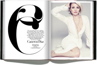
I had much highe expectations from Cameron and Bazaar but unfortunately, upon seeing the covers I was so disappointing. The lighting, the pose, Cameron's face and that horrid green lettering are all kinds of wrong. The subscriber's cover is a bit better. Also, so sad to see Lucy leaving the magazine, after all the great things she has done for it.
The subscriber cover is similar to the US Bazaar covers in the mid-90s, specifically Madonna's 1994 cover and Drew Barrymore's 1996 cover. I'm not saying that because they're all bw close-ups. They have the same appealing quirkiness. I like it.
Do away with the formula of the country house, the sensual landscape or the city at night, and this is the type of Bazaar editorial you're left with. Nothing worth mentioning. As much as people might tire of seeing those types of shoots, they were the magazine's signature, and it did them bloody well. This cover story has all the glamour and power of a puddle of grey water.
^ The subscribers cover is slightly worse in my opinion if that's possible haha, the shot is out of focus, I mean was there a reason for that? UK HB need to ditch Tom Munro, that's poor photography in my eyes. I'm worried about the direction this magazine is going in lately, it's normally so consistent.
This site uses cookies to help personalise content, tailor your experience and to keep you logged in if you register.
By continuing to use this site, you are consenting to our use of cookies.