UK Harper's Bazaar March 2009 : Emily Blunt

it looks like a good cover. i like emily blunt. :wink: love the cuff that she's wearing in the cover. :smile:

can't wait to see the contents (editorials!!!). :smile: i hope this issue won't disappoint us unlike the feb issue w/ jennifer conelly which was a great one. :smile:
 
Love it!

This is the full cover - I think she looks amazing. That blue really pops out and the lettering is really chic. Can't wait to see it supersized - what a landmark.
 

Attachments

  • march cover_emily.JPG
    march cover_emily.JPG
    409.8 KB · Views: 71
Does anyone know where that gorgeous dress is from?! I think it might be Gucci, thoughts anyone?!?!
 
I love Emily, so excited to see her on the cover. As for the photo itself, it's nice but I'm not a huge fan of the gold textured lettering. Cant wait to see her ed. Thanks for the pictures!
 
I think Emily Blunt is a phenomenal actress, but she doesn't always photograph well. The straight-on photo isn't her most flattering angle. I like the contrast between the color of the text and her dress though.
 
The colour combinations on the cover is all wrong :rolleyes:
 
i agree, the gold text and the blue dress makes a funny combinations, it makes emily blunt's skin look lacklustre too. But she still looks great afterall.
 
I think the colour combi is alright but a brown or green dress would have worked better,
the problem lies in the photography
 
Last edited by a moderator:
I like the photogrpahy, and think its a good shot of Emily. But the gradient is tacky :yuk:
& it doesn't go with the Gucci dress either...
 
Hmm, I don't find the gradient tacky, but Emily's face look lifeless
and her mouth looked like she had something in her mouth, it doesn't show the
contours of her face well, she looks very flat.

Blunt is a much more beautiful girl :blush::heart:
 
Last edited by a moderator:
Oh ya now that we have the full cover, i have to say i dont like her face expression, and the fonts are not cool either, still seen worse HB covers though. :lol:
 
I'm not keen on the whole effect on the logo personally... I feel gold's a nice idea to constrast the blue, but why that weird effect on it...
 
she looks afraid or something...like there's a tiger there forced her to pose
 
I kinda like it :P 
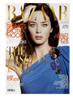
Never really thought of her as a fashion girl but she looks a bit more fashiony than normal here, think they've done a v cool job. :P
 
I'm looking forward to the subsciption copy of it, without all the text on it. I think it'll be a really nice cover.
 
I'm looking forward to the subscribers cover too ^_^
 
I like this system they have going for removing the text for those copies... although I have to say, I'm a fan of Elle using different images too for their subscription copies. The subscription Mary-Kate cover last year was brilliant.
 
Emily looks OK to me, but I don't like the cover itself. I think blue and gold could have made good combination, but the red/orange little text ruins everything.
 
Inspired cover choice......but uninspired choice of picture:(
Although it's a bit of a mish-mash colour and font wise I really like the gold fonts.:shock: Surprisingly.
 

Users who are viewing this thread

Forum Statistics

Threads
210,711
Messages
15,124,649
Members
84,414
Latest member
NavidNoor
Back
Top
monitoring_string = "058526dd2635cb6818386bfd373b82a4"
<-- Admiral -->