-
Live Streaming... The F/W 2025.26 Fashion Shows
Milan Fashion Week F/W 2025.26 Show Schedule
You are using an out of date browser. It may not display this or other websites correctly.
You should upgrade or use an alternative browser.
You should upgrade or use an alternative browser.
UK Vogue 'Digital Edition' August 2024 : Katarina Johnson-Thompson by Delali Ayivi
- Thread starter vogue28
- Start date
tigerrouge
Well-Known Member
- Joined
- Feb 25, 2005
- Messages
- 18,459
- Reaction score
- 8,501
I know I can just scroll past the posts, but I have no interest in seeing digital covers - it's not like something you can hold in your hands, have in your collection, go online in the future to buy a vintage copy... Its just an image floating about on the internet.
And because it's just an image with a masthead placed on it, even less effort goes into the making of it.
So posting unique threads for digital covers just seems like clutter. Some magazines pump them out constantly when there's an event on. Why not post every single one of those?
The compromise would be, if they were posted under the same thread as the actual print issue.
Are we here, on this particular section of the forum, because we're interested in print first and foremost - or are we here to consume any half-***ed content these companies churn out on their socials?
Alquimista
Well-Known Member
- Joined
- Oct 1, 2023
- Messages
- 771
- Reaction score
- 1,936
I like what she's wearing.
The problem is that the background don't match the dark harsh lighting of the picture.
The problem is that the background don't match the dark harsh lighting of the picture.
blueorchid
you soft and only
- Joined
- Apr 4, 2009
- Messages
- 12,582
- Reaction score
- 12,959
I love it when people try to defend these awful covers by saying things like "could YOU do better?" and, yeah, I can confidently say that I would do better.
tomtakesphotos
Well-Known Member
- Joined
- Feb 21, 2014
- Messages
- 296
- Reaction score
- 410
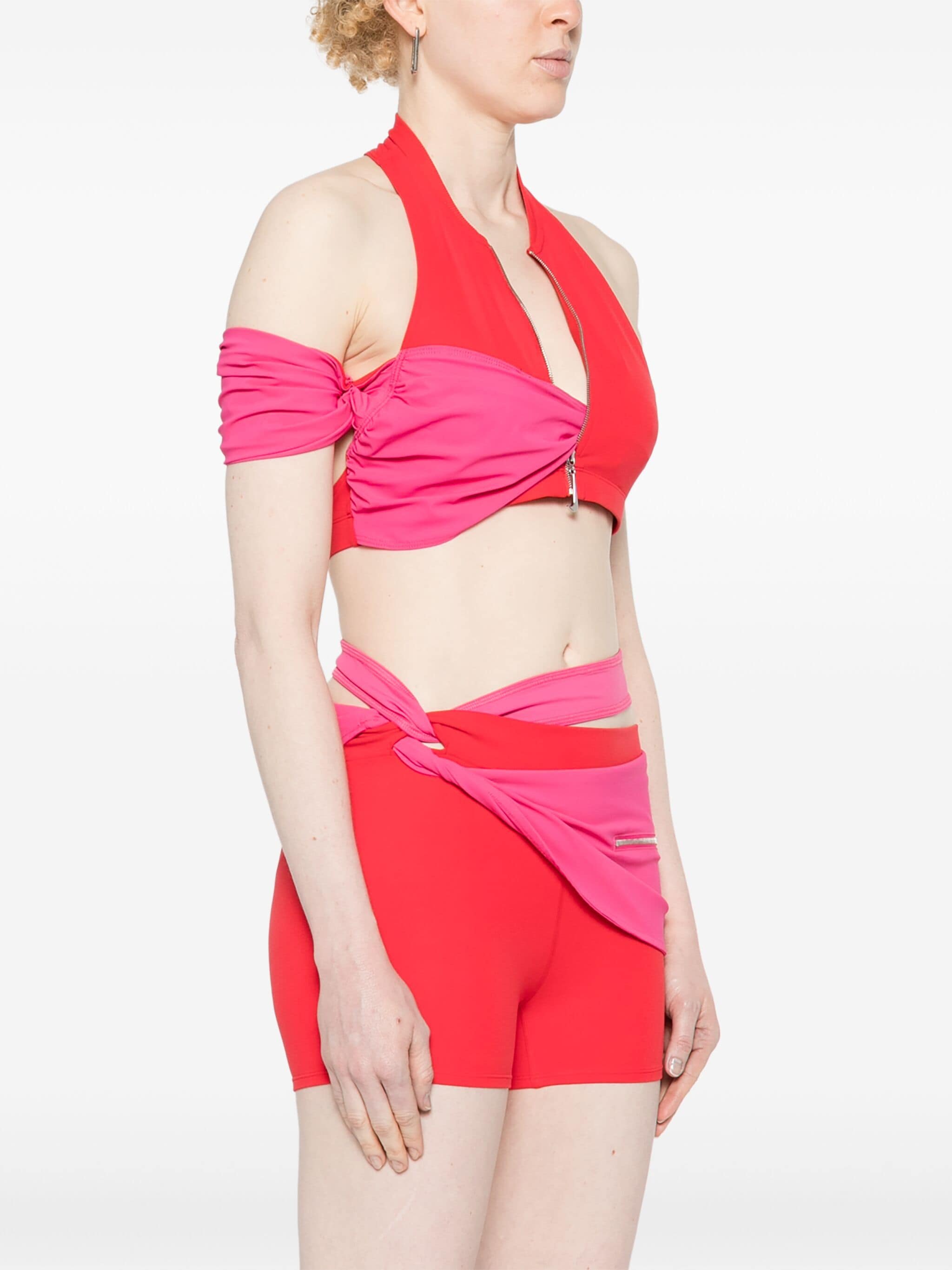
honestly in any other lighting / situation it would be gorgeous, whats your problem with it? it has a cool grecian inspiration and beautiful colors while still being 'sporty' ... would u rather some black lululemon set?? or throw the athlete into some runway sample dress??? then why her over a model?? idkThat Jacquemus look is a Joke.
Kite
Well-Known Member
- Joined
- Jul 12, 2010
- Messages
- 2,179
- Reaction score
- 1,490
Im pretty sure this was made with a Knife and Fork.honestly in any other lighting / situation it would be gorgeous, whats your problem with it? it has a cool grecian inspiration and beautiful colors while still being 'sporty' ... would u rather some black lululemon set?? or throw the athlete into some runway sample dress??? then why her over a model?? idk
It's SO bad. Like a Teenage girl accessorising her Bra with a pair of old pink tights. In any other lighting it would still look like a heap of rubbish. See FarFetch and Hypebeast below.
Who wants to work out in this School Project? Awful!


farfetche.com/hypebeast.com
D
Deleted member 1957
Guest
Athletes look way better on the field after a marathon than they made her look here.
Similar Threads
- Replies
- 0
- Views
- 1K
- Replies
- 155
- Views
- 50K
- Replies
- 2
- Views
- 1K
- Replies
- 4
- Views
- 1K
Users who are viewing this thread
Total: 1 (members: 0, guests: 1)
New Posts
-
Elle Italia February 25, 2025 : Candice Swanepoel by Giampaolo Sgura (9 Viewers)
- Latest: GivenchyHomme
-
-
-
