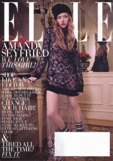
US Elle August 2013 : Amanda Seyfried by Carter Smith

They photoshopped Amanda's leg's so much that they look fake. Seems like this is another cover of 'photoshop gone wrong.' Shame really, because Amanda photographs well, so I don't know what they were thinking.
 
I like it! Probably cause I like Amanda, but it's not bad either way.
 
This is not the best I've seen Amanda look. But I do like the styling and it really fits her here.
 
Wait... they must have missed including more text on the white area around her hand?

I like her but this doesn't do her justice
 
It wouldn't honestly not be too surprising if sometime in the future we see an Elle US cover with just text, it keeps getting worse every month! Does the text overload really help sell the magazine? I think it would be more overwhelming then inticing when stacked up against ten other different text covered issues at the magazine stand.
 
The upper part of that cover looks beautiful, but there's something with the bottom part that looks so fake. And that text, my God that text!
 
Gorgeous shot and love the red Dolce, far more exciting than their usual dull covers, and her edit looks cute too.
 
Hair: Harry Josh
Makeup: Polly Osmond
Manicure: Bernadette Thompson

59tg.jpg

e0nr.jpg


fashionscansremastered.net
 
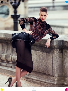
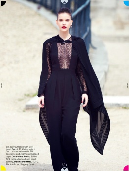
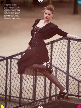
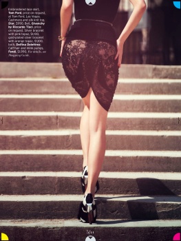
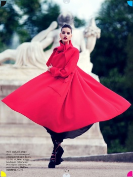
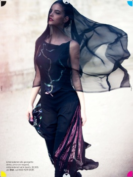
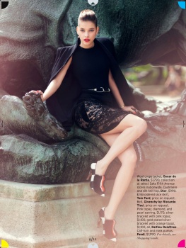
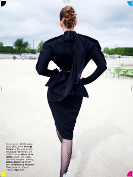
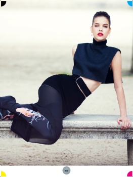
Sheer Audacity
Photographer: David Bellemere
Model: Barbara Palvin
Styling: Samira Nasr


via fashionscansremastered.net
 
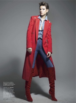
Corps Strength
Photographer: Thomas Whiteside
Model: Jessica Miller
Styling: Joe Zee


via fashionscansremastered.net
 
Quite a departure from Carter Smith's usual aesthetic for an Elle cover shot. I love the colouring of this particular image. The dress/bodysuit, hair and make-up look very nice together and make Amanda look fantastic. The images inside, however, look boring and completely lifeless to me. It resembles a really badly copied Steven Meisel editorial.

I don't know what it is about American Elle but their fashion stories always look the same. They have the resources to produce some great photography and stories for their issues. You have Jessica Miller, Barbara Palvin and David Bellemere within one issue and none of the images stand out. I often question what it is that immediately downgrades the images? The styling? I bet you'd see a difference if the exact same scenario was done at say.. Vogue Paris. David Bellemere's stories for French Vogue have always been attractive. Yet here, Barbara's looks very incoherent and second rate. Joe Zee's styling in Jessica's story just looks as though he's knocking-off Carlyne Cerf de Dudzeele.
 
"Cover Artists"

Photographer: Liz Collins
Stylist: Samir Nasr
Hair: Kevin Ryan for Rsession Tools
Make-up: Maki Ryoke
Manicure: Casey Herman

Model: Tatiana Cotliar

Source: Visual Optimism (visualoptimism.blogspot.com)

 
"Hot Under The Collar"

Photographer: Mariano Vivanco
Stylist: Beth Fenton
Hair: Fernando Torrent
Make-up: Ayami Nishimura
Manicure: Alessandra Falugi
Set Design: Trish Stephenson

Models: Clarice Silva Vitkauskas + Joel Baker at DT Model Management

Source: Visual Optimism (visualoptimism.blogspot.com)


I like Barbi's ed.
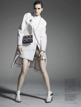
Jessica Miller's editorial is full of bad stylings.
 
My scan of the subscribers cover, horrible
 

Attachments

  • Elle 813s.jpg
    Elle 813s.jpg
    505.9 KB · Views: 4

Forum Statistics

Threads
212,810
Messages
15,199,709
Members
86,817
Latest member
Kiasuppa
Back
Top
monitoring_string = "058526dd2635cb6818386bfd373b82a4"
<-- Admiral -->