MulletProof
Well-Known Member
- Joined
- Apr 18, 2004
- Messages
- 28,896
- Reaction score
- 7,955
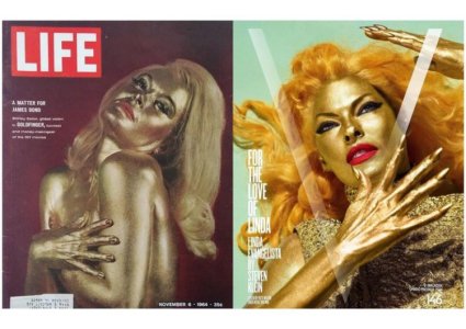
Second cover is more conventional but somehow captures her versatility better and honors her career instead of pushing her to prove what she doesn't need to prove anymore, that first one is ??? and awful, look at those pores and depressing skin texture that looks desiccated by the type of paint they used, she looks like one of those silver-painted beggars, even the tense stare while she's holding that pose for dear life is soo 'come on, just come closer and drop that 20 dollar bill in the basket'.

