Xenforo is upgrading us to version 2.3.7 on Thursday Aug 14, 2025 at 01:00 AM BST. This upgrade includes several security fixes among other improvements. Expect a temporary downtime during this process.
More info here
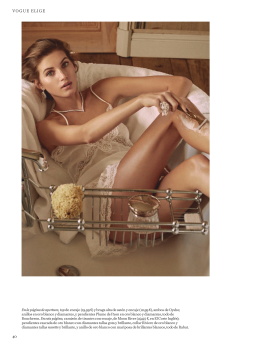
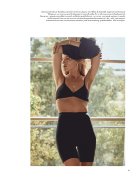
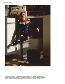
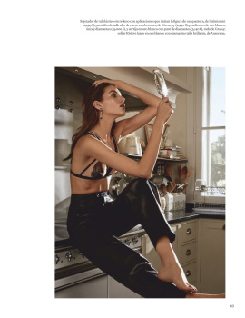
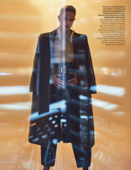
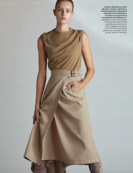
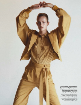
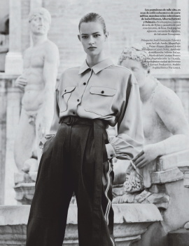
I can't believe nobody on the team thought this cover looks like signpost along a motorway. Especially considering this model just about have the print presence of a scarecrow. That's not even factoring the lack of proper styling or awful art direction.
I can't decide whether it's the ARTE letters (and the idea behind it) or her dull facial expression that I dislike the most. Fashion magazines really need to wake up...
Yikes what a bad cover. Hideous text, mediocre photographer, dull expression (and model, I'm sorry for Yasmin because she's gorgeous and has the best walk at the moment but I can't find any connection with her in print).
I am so sick of this pale, lifeless faces on the covers and catwalk... what happened to colour, glamour, fun... it’s all grim, grim, grim... honestly, does anyone want to look that happy? It’s not even sexy melancholic sadness, it’s just depressing!
Incredibly awful !!!!!!! OMG that is bad on another level !!! The layout is s***, the colors are drab and the whole thing is so dry ! Where has the glamour gone on Vogue covers ?????? I so miss the old Vogue Italia with Meisel !!! Yasmin is a slayer on the runways but she is hideous in print sorry ! NEXT!
This site uses cookies to help personalise content, tailor your experience and to keep you logged in if you register.
By continuing to use this site, you are consenting to our use of cookies.