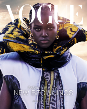
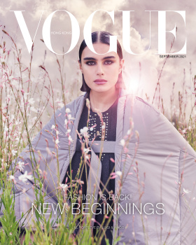
I looked at these covers once more, and now I see even more things that are wrong and bother me here. I thought these were redeemable, but no, and graphic design is partially at fault too.
Graphics are supposed to either complement the concept, the visual, or be so integrated and flow so well that they are unnoticeable, only being the pieces of information and never a sore thumb that sticks out.
1. I can't stand that 'G' plastered over everyone's heads. And once you see it, you cannot unsee it, and somebody got paid for that. Poor Sora with that serif hanging on her eyelid, it nearly stabs her in the eye.
2. The only question I have for the shadow of the coverline is "why", because it does literally nothing here, except looking cheap. Whose idea was it to put white text in thin weight on white clothes that also have print on them?
3. SEPTEMBER 2021 pops out everywhere much more than anything else, because it is black against the light backdrop, but the magazine is called Vogue and not SEPTEMBER 2021?
4. The Vogue title is so low placed you might also just slap it in the middle of the photo.
5. *insert model here* by Luigi & Iango is nearly invisible at all, why bother at all if you are going to make it 4pt size font.
There are so many silly amateur graphic design mistakes here, how they hire their designers, was there a portfolio review at all? Jason Duzansky with his VI under Franca design and Fabien Baron are probably throwing rotten eggs and tomatoes at their screens. Alexey Brodovitch be rolling in his grave.
Vogue Italia is doing silly childish cr*p with Farneti, but at least it is visible and brings out emotion, so sad that the majority of editions completely throw away DECADES of ICONIC typography and design. The level of disrespect towards the huge legacy is unbelievable.


 ),
), - but you are such a
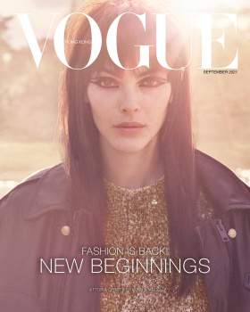


 The Music From Christian Dior Shows (PLEASE READ POST #1 FOR FULL SOUNDTRACK LISTS) (7 Viewers)