You are using an out of date browser. It may not display this or other websites correctly.
You should upgrade or use an alternative browser.
You should upgrade or use an alternative browser.
Vogue Hong Kong September 2021 by Luigi & Iango
- Thread starter TZ001
- Start date
Bertrando3
Well-Known Member
- Joined
- Mar 22, 2010
- Messages
- 5,621
- Reaction score
- 2,362
Adut and Sora's covers are the best yes.
D
Deleted member 141309
Guest
Wow, these covers are sh*t. The styling is so pedestrian and the flare is so Photoshop 101, like a 13 y.o. using the flare effect. Cheap.
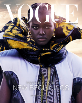
The cast is nice, although Adut should be replaced with Anok, her cover is the worst.
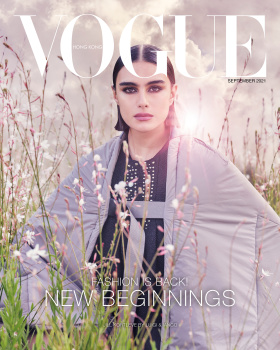
Good to see Jill, her cover sticks out too much though.
Luigi and Iango are not flexible at all. Apart from 2-3 editorials, I cannot tell apart the rest, it all blends into one lifeless endless showcase of Photoshop.
The cast is nice, although Adut should be replaced with Anok, her cover is the worst.
Good to see Jill, her cover sticks out too much though.
Luigi and Iango are not flexible at all. Apart from 2-3 editorials, I cannot tell apart the rest, it all blends into one lifeless endless showcase of Photoshop.
THD96
Well-Known Member
- Joined
- Nov 3, 2020
- Messages
- 1,667
- Reaction score
- 4,604
I love that Nicolas clothes are testing the talents of photographers, stylists and models to see if they able to sell the clothes to the readers. Good models can't save the covers if the photographers and stylist are mediocre.
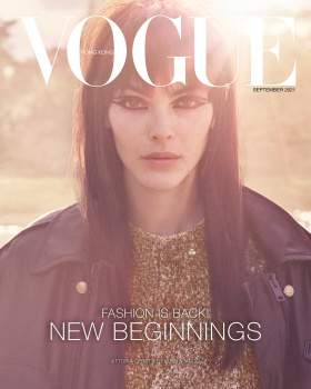
Vittoria cover can be good but the hair ruined. Adut is the only decent one, but the editing make her looks like she has no neck. Sora looks like she being swallow by that coat. And Jill looks good by the styling is messy.
Luigi & Iango have to realize that they are photographers and not photoshopers. You can't save a mediocre picture with an aggressive amount of editing. They need to go back to studio because outdoor is not their forte.
Zorka
Well-Known Member
- Joined
- Jan 29, 2014
- Messages
- 18,628
- Reaction score
- 20,849

D
Deleted member 141309
Guest
I looked at these covers once more, and now I see even more things that are wrong and bother me here. I thought these were redeemable, but no, and graphic design is partially at fault too.
Graphics are supposed to either complement the concept, the visual, or be so integrated and flow so well that they are unnoticeable, only being the pieces of information and never a sore thumb that sticks out.
1. I can't stand that 'G' plastered over everyone's heads. And once you see it, you cannot unsee it, and somebody got paid for that. Poor Sora with that serif hanging on her eyelid, it nearly stabs her in the eye.
2. The only question I have for the shadow of the coverline is "why", because it does literally nothing here, except looking cheap. Whose idea was it to put white text in thin weight on white clothes that also have print on them?
3. SEPTEMBER 2021 pops out everywhere much more than anything else, because it is black against the light backdrop, but the magazine is called Vogue and not SEPTEMBER 2021?
4. The Vogue title is so low placed you might also just slap it in the middle of the photo.
5. *insert model here* by Luigi & Iango is nearly invisible at all, why bother at all if you are going to make it 4pt size font.
There are so many silly amateur graphic design mistakes here, how they hire their designers, was there a portfolio review at all? Jason Duzansky with his VI under Franca design and Fabien Baron are probably throwing rotten eggs and tomatoes at their screens. Alexey Brodovitch be rolling in his grave.
Vogue Italia is doing silly childish cr*p with Farneti, but at least it is visible and brings out emotion, so sad that the majority of editions completely throw away DECADES of ICONIC typography and design. The level of disrespect towards the huge legacy is unbelievable.
- Joined
- Jul 14, 2017
- Messages
- 14,863
- Reaction score
- 22,078
Oooh, I'm always excited for some Luigi & Iango so I don't want to judge this too harshly, but they're producing some of their weakest work this season.
What is that lens flare? God, I wish they'd stop shoving stupid themes down our throats and let each edition do their own thing. No one wants to see 30 f*cking sunsets in a row. These covers could've been cute if it wasn't for that mess. Or maybe not.. we'll never know.
The lighting on Vittoria is incredibly unflattering, in fact it might be one of my least favorite photographs of her ever. Such a shame, considering how incredibly beautiful she is and how well she usually works with Luigi & Iango. Adut's cover is the most captivating for me, she looks stunning but I hate whatever it is that she's wearing (although she looks great against that yellow collar/hood? thing). Sora's face is too obscured by the logo for my taste and that outfit is disgusting, completely ruins the cover. Jill's cover is alright, I guess. I've never been a fan of hers and I hate whatever she's wearing, who makes these clothes? Are they even clothes? Who wears that? So ugly.
I don't even want to talk about their ugly layout.
Zorka
Well-Known Member
- Joined
- Jan 29, 2014
- Messages
- 18,628
- Reaction score
- 20,849
I looked at these covers once more, and now I see even more things that are wrong and bother me here. I thought these were redeemable, but no, and graphic design is partially at fault too.
Graphics are supposed to either complement the concept, the visual, or be so integrated and flow so well that they are unnoticeable, only being the pieces of information and never a sore thumb that sticks out.
1. I can't stand that 'G' plastered over everyone's heads. And once you see it, you cannot unsee it, and somebody got paid for that. Poor Sora with that serif hanging on her eyelid, it nearly stabs her in the eye.
2. The only question I have for the shadow of the coverline is "why", because it does literally nothing here, except looking cheap. Whose idea was it to put white text in thin weight on white clothes that also have print on them?
3. SEPTEMBER 2021 pops out everywhere much more than anything else, because it is black against the light backdrop, but the magazine is called Vogue and not SEPTEMBER 2021?
4. The Vogue title is so low placed you might also just slap it in the middle of the photo.
5. *insert model here* by Luigi & Iango is nearly invisible at all, why bother at all if you are going to make it 4pt size font.
There are so many silly amateur graphic design mistakes here, how they hire their designers, was there a portfolio review at all? Jason Duzansky with his VI under Franca design and Fabien Baron are probably throwing rotten eggs and tomatoes at their screens. Alexey Brodovitch be rolling in his grave.
Vogue Italia is doing silly childish cr*p with Farneti, but at least it is visible and brings out emotion, so sad that the majority of editions completely throw away DECADES of ICONIC typography and design. The level of disrespect towards the huge legacy is unbelievable.
My dear @dontbeadrag (dontbeaBrag
 ),
),In case you haven't noticed, you are by faaaaaar one of my most favourite people here - as a matter of fact, I'm literally obsessed with you!
 - but you are such a nerdview!
The Vogue (including all other fashion magazines, of course!) has only one and solely purpose: TO SELL THE CLOTHES (and some extremely questionable ideas/ideology lately, but that is not the point of what I'm trying to say here).
So, the average Vogue's/fashion magazines' consumer couldn't care less about graphic designers' excellent skills and/or exceptional creativity, models' technical proficiency and/or versatility, etc, etc, etc.
But, given that you and my loves @aracic & @vogue28 are anything but average (on contrary, each and every one of you are so amazing and exceptional individual, that even if I wanted to turn this post into my personal Praising Grace about you, I literally wouldn’t know where to begin!), how could you possibly fathom that?

badgalcrush
Well-Known Member
- Joined
- Mar 2, 2017
- Messages
- 751
- Reaction score
- 426
Adut's cover is the WINNER for me what a gorgeous cover
Luigi & Iango still shooting Jill after her comments about the last cover for Vogue Japan with them , glad there is no hard feelings and animosity
Luigi & Iango still shooting Jill after her comments about the last cover for Vogue Japan with them , glad there is no hard feelings and animosity
- Joined
- Jan 9, 2008
- Messages
- 36,850
- Reaction score
- 24,575
Truth be told, the covers are a little too busy and incoherent but at this present moment in time I'm forced to take what I can get - and at the very least it's models photographed by Luigi & Iango for a September cover of Vogue which just feels right. Adut's cover is the clear standout!
- Joined
- Jul 14, 2017
- Messages
- 14,863
- Reaction score
- 22,078
Luigi & Iango still shooting Jill after her comments about the last cover for Vogue Japan with them , glad there is no hard feelings and animosity
What'd she say? I must've missed that.
badgalcrush
Well-Known Member
- Joined
- Mar 2, 2017
- Messages
- 751
- Reaction score
- 426
I can't really recall but she said something about over "the Luigi and Iango treatment " : retouching and apparently covering up her body next to the others girls on the coverWhat'd she say? I must've missed that.
Zorka
Well-Known Member
- Joined
- Jan 29, 2014
- Messages
- 18,628
- Reaction score
- 20,849
... Adut's cover is the most captivating for me, she looks stunning but I hate whatever it is that she's wearing (although she looks great against that yellow collar/hood? thing). Sora's face is too obscured by the logo for my taste and that outfit is disgusting, completely ruins the cover. Jill's cover is alright, I guess. I've never been a fan of hers and I hate whatever she's wearing, who makes these clothes? Are they even clothes? Who wears that?
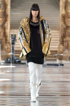
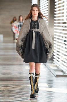
They all wear Louis Vuitton FW 2021 RTW, my love
 :
:

vogue.com
- Joined
- Jul 14, 2017
- Messages
- 14,863
- Reaction score
- 22,078
They all wear Louis Vuitton FW 2021 RTW
I assumed as much... guess that explains it then lol Terrible clothes.
Similar Threads
- Replies
- 15
- Views
- 3K
- Replies
- 10
- Views
- 2K
Users who are viewing this thread
Total: 1 (members: 0, guests: 1)