You are using an out of date browser. It may not display this or other websites correctly.
You should upgrade or use an alternative browser.
You should upgrade or use an alternative browser.
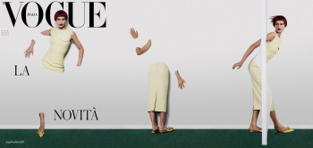
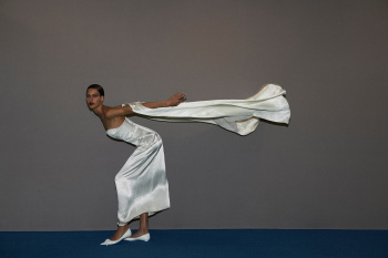
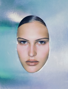
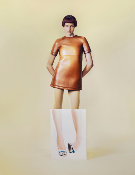
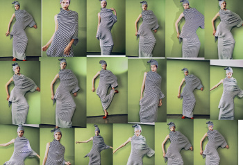
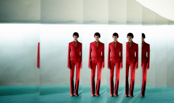
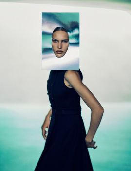
Vogue Italia September 2023 : Angelina Kendall by Carlijn Jacobs
- Thread starter crmsn
- Start date
newton91
Well-Known Member
- Joined
- Aug 28, 2020
- Messages
- 161
- Reaction score
- 105
I find it a really good thing that there's no celebrity on the sept issue!WTF?!!
Zorka
Well-Known Member
- Joined
- Jan 29, 2014
- Messages
- 16,500
- Reaction score
- 14,477
WinstonH20
Well-Known Member
- Joined
- Aug 5, 2021
- Messages
- 241
- Reaction score
- 1,078
The cover is gimmicky and the editorial is a disjointed mess. This feels more Vogue Portugal than Italia.
Carlijn is a technically strong photographer, but she is no visionary image-maker. Imruh is unfortunately just as directionless with his styling and the result, much like the gimmicky AI cover with Bella earlier this year, isn't great. Still, good technical execution lifts the whole thing somewhat, at least more than the awfully saturated and sloppily retouched images of a photographer like Pavarotti, for example.
Carlijn is a technically strong photographer, but she is no visionary image-maker. Imruh is unfortunately just as directionless with his styling and the result, much like the gimmicky AI cover with Bella earlier this year, isn't great. Still, good technical execution lifts the whole thing somewhat, at least more than the awfully saturated and sloppily retouched images of a photographer like Pavarotti, for example.
Bertrando3
Well-Known Member
- Joined
- Mar 22, 2010
- Messages
- 5,462
- Reaction score
- 2,129
It's ridiculous and looks like a mess, indeed it feels very Farnetti's days lol.
NEXT!
NEXT!
Lola701
Well-Known Member
- Joined
- Oct 27, 2014
- Messages
- 11,478
- Reaction score
- 24,623
This subscribes to the superficial idea of what people think VI is/was/can be…
It’s quite mediocre because it’s not daring. It’s gimmicky, there’s no POV and we will forget about it like we forgot about every previous covers.
It’s quite mediocre because it’s not daring. It’s gimmicky, there’s no POV and we will forget about it like we forgot about every previous covers.
tigerrouge
don't look down
- Joined
- Feb 25, 2005
- Messages
- 18,307
- Reaction score
- 8,126
The cover is a concept, but it's downhill from there.
Never mind looking twice, it's not worth looking at once.
The October issue of World of Interiors arrived earlier. It's 416 pgs. FOUR HUNDRED PAGES. It might not be fashion, but it'll have some interesting visual content in there. Why would I waste my time on Vogue Italia with this level of cover story?
AFWQ
Well-Known Member
- Joined
- Apr 5, 2018
- Messages
- 379
- Reaction score
- 211
I find it a really good thing that there's no celebrity on the sept issue!
It's better just to see good side of this.
Not fan of end result. It need more work or diferent guidance.
avonlea002
Well-Known Member
- Joined
- Feb 10, 2020
- Messages
- 2,445
- Reaction score
- 8,500
Already sick of her gimmicky photography. The ed looks like a compilation of photography student's home assignments. This magazine is dead.
D
Deleted member 141523
Guest
Farneti had weird text, the issue word in every cover plus the name of the photographer, quite far from this.
Xone
Well-Known Member
- Joined
- Sep 1, 2004
- Messages
- 4,385
- Reaction score
- 2,682
i like the cover, I don't mind if it's a gimmicky cover, fashion sometimes needs that as well as editorial...the thing is that the editorial is another story, but maybe there are some more images that add something more...have a concept and develop it through the pages/pictures
so 416 pages? let's see what kind of content they deliver this time. HB Italia have half amount of pages and it was a bad issue.
so 416 pages? let's see what kind of content they deliver this time. HB Italia have half amount of pages and it was a bad issue.
Phuel
Well-Known Member
- Joined
- Feb 18, 2010
- Messages
- 5,723
- Reaction score
- 8,706
^^^ 330pg. tigerrouge was referencing World of Interiors with 416pg.
2 original stories. Coverstory “Angelina” and “Spazio e Materia” by Dario Catellani.
5 reprints. Scott Trindles’ Burberry advertorial “En Plein Air”; David Sims’ “Dissolvenza”; Charlotte Wales’ “Tutto In Una Notte” of celebs with the Theatre Royal Drury Lane; Theo Liu’s “La Citta Incantata”; and that Rafael eyesore.
Imagine the worst and sloppiest low-effort issue of Dazed/i-D, and this is that issue.
(I can see why Zorka hasn’t bothered to post any of this. It’s just all so forgettable and a waste of bandwidth.)
Similar Threads
- Replies
- 57
- Views
- 5K
- Replies
- 12
- Views
- 3K
- Replies
- 2
- Views
- 2K
Users who are viewing this thread
Total: 2 (members: 0, guests: 2)


