Vogue Korea February 2022 : Rebecca Leigh Longendyke by Luigi & Iango

Not bad. Not good either. The covers lack oomph. Maybe I was just spoiled by their three consecutive stunning covers from October-December last year.

I think we should edit the title to "Rebecca Longendyke by Luigi and Iango".
 
That Miu Miu collection was seemingly inspired by Meisel's "Shrink To Fit" editorial for Vogue Italia April 2010 (as noted by a TFS'er I believe). L&I seems to have taken it one step further by trying to evoke that editorial but with a lukewarm result.
 
it's ok, i like Rebbeca....too much numbers on the cover...i would like to see the complete editorial...
 
the first cover is great and I don’t mind the full Miu Miu look at all!

it’s very refreshing to see L&I take a different route than their usual glamazon with thick black eyeliner look (it’s kind of their trademark I get it).

it’s sultry, young and cool! very well done IMO

the green on the second cover is absolutely vile and Rebecca’s expression is somewhat off.
 
What is this "Maxim" wannabe styling?!

My beloved @kokobombon :heart:
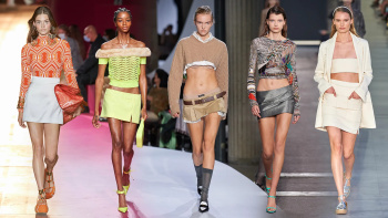
, in case you've missed RTW SS 2022 runways, (micro-)mini skirts are one of the 2022's BIGGEST fashion trends!

From Mini to Micro, Skirts Are Getting Short-Short


P.S. Being aware that it's not gonna be everyone's cup of tea, personally I'm obsessed with Miu Miu and Saint Laurent teeny skirts! Especially since we have to cover our faces in public with masks, what else can we do but show our legs instead? :D

vogue.com
 
Two looks I would never, ever wear myself but I still think Rebecca is selling it here. She has this classic and elegant face to kinda pull it off effortlessly. I'm curious about the editorial now!
 
Just so-so. She seems to not have a lot of expressions, almost always that blue steely stare. But hey, it’s her signature expression.
 
They decided to go with the worst side of the 2000s. The text and colours look very begginer
 
Must confess I love the second cover, and I do love the green too, after all, monochrome shots are the only time we can work bright colours in. First one is too contrived and composed, the second shot is very Meisel, from the lighting to the glimpse of emotion, like he did in 00s indeed. While the first one is too fleshed out, the second one has the imperfections in all the right places (probably what makes me love 90-00s Meisel the most is this exact aspect).

Get rid of Rebecca + L&I words on the cover, get rid of K Bullsh*tquake words, make 20022022 smaller, and I'd probably think someone reprinted VI under Franca by accident. We all attribute it to Meisel mostly, which is totally given and correct, but VI under Franca also had the strongest, most solid and clear graphic design amongst all the magazines at the time.
 
Pros. Cons. Good. Bad. I have thoughts. Who cares. The one thing I have to say is, I am physically incapable of not buying this. Vogue Korea. Miu Miu. Rebecca. Luigi & Iango. Big attention-grabbing font. Not necessarily reasons. Not necessarily in that order. I know myself. I can't walk away from this. It's the way I'm wired.
 
Especially since we have to cover our faces in public with masks, what else can we do but show our legs instead? :D

Epiphanies are rare. I just had one. @Zorka's school of thought makes me a wiser woman every day. I love LOVE this idea! :flower:
 

Users who are viewing this thread

New Posts

Forum Statistics

Threads
212,252
Messages
15,177,533
Members
86,001
Latest member
chanel49
Back
Top
monitoring_string = "058526dd2635cb6818386bfd373b82a4"
<-- Admiral -->