You are using an out of date browser. It may not display this or other websites correctly.
You should upgrade or use an alternative browser.
You should upgrade or use an alternative browser.
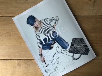
Christian Dior S/S 2018 : Sasha Pivovarova by Patrick Demarchelier
- Thread starter vogue28
- Start date
apple
Well-Known Member
- Joined
- Jun 8, 2016
- Messages
- 2,435
- Reaction score
- 1,109
This is surely an improvement from the other seasons, as at least it has a sort of concept behind it, but what makes the image interesting is Sasha and her art, not the clothes which still look like something I could easily find in any Zara store.
Benn98
Well-Known Member
- Joined
- Aug 6, 2014
- Messages
- 42,530
- Reaction score
- 20,571
Ugh, it's probably Lacombe again. When will this end???
This shot is nothing. Next would scoff at it. Same goes for the clothes. When I look at this I don't think luxury brand at all. I thought we are past the stage where rich people want to look like everyday folk?
This shot is nothing. Next would scoff at it. Same goes for the clothes. When I look at this I don't think luxury brand at all. I thought we are past the stage where rich people want to look like everyday folk?
[Piece Of Me]
Well-Known Member
- Joined
- Dec 29, 2008
- Messages
- 2,770
- Reaction score
- 703
I will always be happy to see the wonderful Sasha, a true star who can even make these clothes look decent.
RedSmokeRise
Well-Known Member
- Joined
- May 31, 2015
- Messages
- 1,730
- Reaction score
- 1,111
ugh. Again with those bags and her fake feminism t-shirts.
Sasha looks great even though she's clearly modelling a Zara outfit.
Sasha looks great even though she's clearly modelling a Zara outfit.
Raf Simons must be so grateful to MCB - she's making his tenure at Dior look great compared to her pitiful offerings...
There is no life, artistry or skill to any of this (bar Sasha's contribution). Its just boring. I'm even longing for the FW16 collection by Lucie Meier and Serge Ruffieux at this point. Yes it was nothing new, but it at least had impact and life than this sad offering.
There is no life, artistry or skill to any of this (bar Sasha's contribution). Its just boring. I'm even longing for the FW16 collection by Lucie Meier and Serge Ruffieux at this point. Yes it was nothing new, but it at least had impact and life than this sad offering.
TaylorBinque
Well-Known Member
- Joined
- Apr 4, 2010
- Messages
- 2,876
- Reaction score
- 1,138
How dare you have Sasha and yet you come out with the most uninspired boring fashion image. If you want to make a feminist statement then go for it. Go big. This is way too cliche and right on the note for a house a prestigious as Dior.
pollyanna90
Active Member
- Joined
- Jan 21, 2017
- Messages
- 416
- Reaction score
- 42
A bit too commercial for my tastes but happy for Sasha P
Benn98
Well-Known Member
- Joined
- Aug 6, 2014
- Messages
- 42,530
- Reaction score
- 20,571
I'm even longing for the FW16 collection by Lucie Meier and Serge Ruffieux at this point. Yes it was nothing new, but it at least had impact and life than this sad offering.
Lucie and Serge's collections was rather unpopular on here, I never thought it was that bad personally. Just got annoyed when Dior seemed to toake too long to annppoint someone. But yes, I'd much rather them than MCB.
Nomar
Well-Known Member
- Joined
- Jan 24, 2015
- Messages
- 2,634
- Reaction score
- 965
I think this is a great shot! A shame about the collection but Sasha looks fantastic. I get the whole irony thing they are doing with the phrase but I'm not sure how I feel about it, I'm interested to see the other images though.
kokobombon
Well-Known Member
- Joined
- Oct 7, 2007
- Messages
- 18,644
- Reaction score
- 2,007
I love the image and the incorporation of her art but this looks too pedestrian for Dior imo... still, very happy to see Sasha 

Happy to see Sasha and her art. Incredibly boring shot. Maria Grazia Chiuri's initials should be MGC, but it's not like her voice matters enough for anyone to remember that.
Haha my mistake! Didn't even realise I wrote that until now. I need to proofread more lol
Royal-Galliano
völlig losgelöst
- Joined
- Nov 25, 2005
- Messages
- 15,943
- Reaction score
- 511
sasha drawing is so 2006. couldn't they think of anyone with a little edge? they also could have played out a bit with the art direction, this is just so lazy, even though i don't necessarily hate it.
Similar Threads
- Replies
- 45
- Views
- 16K
- Replies
- 32
- Views
- 13K
D
- Replies
- 76
- Views
- 27K
Users who are viewing this thread
Total: 2 (members: 0, guests: 2)
New Posts
-
-
Vogue China October 2024 : Joan Chen, Carina Lau, Vivian Wu, Zhao Tao, Yan Bingyan by Trunk Xu (8 Viewers)
- Latest: Phuel
-
-
-


