You are using an out of date browser. It may not display this or other websites correctly.
You should upgrade or use an alternative browser.
You should upgrade or use an alternative browser.
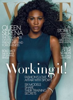
UK Vogue November 2020 : Serena Williams by Zoe Ghertner
- Thread starter vogue28
- Start date
Flamingjune
Active Member
- Joined
- Aug 11, 2020
- Messages
- 72
- Reaction score
- 163
This is just so US Vogue. Can Edward treat this as a British magazine for now at least before he gets Anna's job which I doubt he will get and hope he doesn't? Also, read his editor's note on the website and he is talking about the US election. Can you just focus on the UK, please? Thank you
KoV
Well-Known Member
- Joined
- Sep 17, 2009
- Messages
- 5,729
- Reaction score
- 8,127
The cropping, the way her eyes look nearly closed, the hairstyling, and the overabundance of summery white on a November issue are all not quite working for me. Not a terrible cover, though, and Serena looks beautiful.
Watch everyone in the press and online praise Edward for this, meanwhile Anna already gave her 3 covers, including this stunner:

theguardian.com
Watch everyone in the press and online praise Edward for this, meanwhile Anna already gave her 3 covers, including this stunner:

theguardian.com
bluebanter
Well-Known Member
- Joined
- Feb 1, 2018
- Messages
- 1,132
- Reaction score
- 754
Hmm usually Serena really delivers. Here she looks just ok.
KateTheGreatest
Well-Known Member
- Joined
- Mar 15, 2011
- Messages
- 5,450
- Reaction score
- 831
I thought this was Vogue US and it could've been shot by Annie.
- Joined
- Sep 27, 2010
- Messages
- 18,688
- Reaction score
- 3,019
Pretty cover but so, so tired of seeing her all the time. Is she the only sportswoman who can score a Vogue cover? What about Naomi Osaka?
Took the words out of my mouth. I love Serena, but in the last couple of years she has been so overexposed in magazines. Let's shine the spotlight on others please. Naomi would indeed be a great choice, or Coco Gauff, or even Venus!
We already have an American Vogue Edward and trust us we don’t need another.
Alexandra for all her faults was no dumb cookie, so I’m certain she would have started placing a greater emphasis on diversity, if for nothing more than self survival. I’m curious to know what her very British take on diversity would have looked like.
Alexandra for all her faults was no dumb cookie, so I’m certain she would have started placing a greater emphasis on diversity, if for nothing more than self survival. I’m curious to know what her very British take on diversity would have looked like.
Flamingjune
Active Member
- Joined
- Aug 11, 2020
- Messages
- 72
- Reaction score
- 163
Exactly! I dont even know why they compare him to Anna. It's such an insultThe cropping, the way her eyes look nearly closed, the hairstyling, and the overabundance of summery white on a November issue are all not quite working for me. Not a terrible cover, though, and Serena looks beautiful.
Watch everyone in the press and online praise Edward for this, meanwhile Anna already gave her 3 covers, including this stunner:
View attachment 1158332
theguardian.com
- Joined
- Jan 9, 2008
- Messages
- 35,323
- Reaction score
- 20,333
Zoe Ghertner’s photography here is naff and all I want to do is tilt and shift the cover image, because the cropping is awful. I guess I can appreciate the cover for its minimalism - and nothing else. Overall, the cover is indeed very American Vogue and offers nothing new.
caioherrero
Well-Known Member
- Joined
- Sep 2, 2017
- Messages
- 2,937
- Reaction score
- 1,491
Edward uses UK as resume to become EIC of US VOGUE
D
Deleted member 1957
Guest
I love it, the minimalism and the slight touch of red looks very classic. Its also nice to see a softer side to her though the eyebrows seem a little exaggerated here which throws off the picture a bit.
mepps
Well-Known Member
- Joined
- Mar 31, 2014
- Messages
- 1,588
- Reaction score
- 1,595
Wasn't she just on the cover of American Vogue? Why is she on the cover of British Vogue? It's beautiful tho.
She's so overexposed, and brings nothing fresh to fashion. Do British people even care about her like that?
Anna should put Venus on a cover. I'd love that! Naomi Osaka needs to come through too!
She's so overexposed, and brings nothing fresh to fashion. Do British people even care about her like that?
Anna should put Venus on a cover. I'd love that! Naomi Osaka needs to come through too!
Summer Day
Well-Known Member
- Joined
- May 8, 2020
- Messages
- 313
- Reaction score
- 346
Have to agree with everyone else that it has become rather stale to see Serena on magazine covers, but i can't complain about this image. I think she looks better here when compared to some of her other covers, especially her last cover for Harpers and Vogue.
Benn98
Well-Known Member
- Joined
- Aug 6, 2014
- Messages
- 42,530
- Reaction score
- 20,571
Striking resemblance to US Vogue (image and masthead only!), but I can't say I like it. Looks like a supplement cover, way too little coverlines. Plus the fashion looks basic and I don't like the new art direction.
Similar Threads
- Replies
- 19
- Views
- 5K
- Replies
- 25
- Views
- 7K
Users who are viewing this thread
Total: 2 (members: 0, guests: 2)

