Vogue Paris November 2020 : Rianne van Rompaey by Mikael Jansson

The photography in the issue is very strong, and it's really a relief to see that in these times.

However, this is a fashion magazine (some would argue the fashion magazine, not me) and when the styling is so atrocious across the board, the whole value of the imagery tanks for me. This is particularly the case with the cover story. Bohemian style is often difficult to pull off well, and when you are a stylist as limited as Emmanuelle, well you know that's just not going to work.

Edita looks hot (as usual) in her edit by Purienne, but the clothes are so drab and it makes the whole thing nonsensical. Speaking of which why so many bikinis and short things for November (don't tell me resort collections, LOL it's 2020, not 2010)?

Sacha deserves better than the Sade edit, although I love both the model and the inspo very much. Must suck to be a successful black model these days and not have editorial work that's creative enough/ pitted to a high enough standard for your level of beauty; a bit like how it sucked to be a successful black model ten to fifteen years ago when editors wouldn't even consider you for the best stories!
 
I cannot be looking at the same magazine than the rest of you because I’ve returned to this thread over and over and I find it so mediocre and repetitive that I can’t.

the thing that pisses me off the most about the main editorial is that it’s a complete hippie mess but they called it bohemian - these 2 styles are not the same thing and people at VP should know that. there are some pretty shots of course, Rianne is a beautiful woman, but the styling is terrible.

Edita’s editorial has been done to oblivion and much better. Giles Bensimon must’ve laughed out loud.

the Sade editorial is a great idea but it’s somehow forgettable.

Taylor’s ed is tragic. not a single shot Vogue worthy. maybe the first one.

Imaan’s ed was commissioned by Alexandra Shulman like @Benn98 pointed out so spot on. all the outdoor pics are good but those 3 studio shots randomly put there in between pictures are terrible.

who could replace Emmanuelle Alt at VP?

LOL, there's a 4/6 page spread about retro hippie culture that follows Rianne's edit and it honestly looks like it could be part of the edit. That's how blatant Alt copied the tone.

I never get the praise for her work. She's like fashion's version of the straight white male cliche. She only needs to show up and not do social politics, and watch all the compliments flow. Regardless of how repetitive or referential her work is, or the fact that you'd be hard-pressed to see truly innovative styling or storytelling.

I can tolerate Benarroch's work because it's never trying to be anything it's not. Whether it's Sade, Diana or some obscure French movie nobody knows, you know what you'll get. A service spread. In Alt's case, the standards should be way higher.
 
so who really wants to dress up this winter like an hardcore-hippie, an exhibitionist at the beach, a sade impersonator or an amy winehouse wannabe?

Who wouldn't want to dress up like Sade tho?
 
Who wouldn't want to dress up like Sade tho?
don't get me wrong: i truly love Sade, her music and style.

but come on: Do you really want to be a copycat of a celebrity from top to toe?
personally i think people who dress up like a star lacking charisma and personal style themselves if they do this too literal.

but maybe i am just feed up with this massive retro fascination that VP is promoting for much too long. It's just got dated and a tiring formula imo.
 
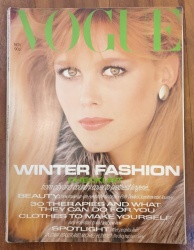
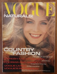
As an aside, now that the excitement of seeing this new issue has calmed down... people talk about that main font on the front of French Vogue as being "very nineties" and I'm usually sat there thinking that I'm old enough to remember that it's a very first-half-of-the-eighties font, but I don't tend to have anything handy to demonstrate this.

Well, here's two UK Vogue covers from 1980, and you'll notice that the font is pretty much what's being used:


(VintageMagArchive on etsy)
 

Users who are viewing this thread

New Posts

Forum Statistics

Threads
212,550
Messages
15,188,735
Members
86,440
Latest member
Hannafransson
Back
Top
monitoring_string = "058526dd2635cb6818386bfd373b82a4"
<-- Admiral -->