W September 2007 : Gwyneth Paltrow by Steven Klein | Page 8 | the Fashion Spot

W September 2007 : Gwyneth Paltrow by Steven Klein

model edits are boring and have no theme whatsoever,i dont understand what they were trying to mke of it.
same with laura dern's and gwyneth's edits(nd i love her!)-i just dont get it,it seems to be trying to pull off a few things(from psycho ward angelina to desperate housewived teri hatcher)and in the end it falls flat on all those attempts.
so far,it seems quite diappointing
 
The cover shot is really unflattering. It's one thing to move away from a "pretty princess in pink" image - and another to make Ms. Paltrow look like a dude in a wig. ... I see what they were trying to do, but IMO they have failed miserably: Gwyneth looks neither cool nor edgy nor interesting.
 
I really thought this ed was clever. It reminded me of being a senior citizen and the point I got from it was that in the Acting World she is considered old and she has to do a lot to make sure she isn't forgotten, like this ed.
 
I quite like the beginning of the Wild Roses editorial. :flower: Lara and Sasha look especially good.

I can't even talk about the cover, however.
 
Wild Roses is genius... I really like it... Some antics neo-pirates coming back from a End of Decadence party...
Saw some influences from Dolce&G. ads campain... and even Ungaro (the one with Kirsten Owen > Suvi(?) with the swan...)

Wall Flower is very good, too... Heroïn-Chic 1990s are back... the styling is good... Alice in Wonderland meets an english pupils...An english girl dreaming of ghosts and prince...
Prada is the real winner of this season's editorials...

Juergen Teller (with Camilla Nickerson???) is typical Juergen T. Lauren looks sooo old on some pictures... Lauren looks a crazy grandmo' who imagines hosting parties...
Actually this is fun... and the styling is good with all the luxurious outfits...
 
:woot: dreamy issue! i love it love love love it ^_^

gwyneth poses too hard but i dont mind it :lol: the rest is to die for. :heart:
i even like suvi :blush:
 
Oh GOD!
The eds are !^$&!^&$(*&.
I can't any word to describe them!
 
I was looking forward to the eds but they are disappointing. Luckily I can save the money this time. -_-
 
another typical juergen ed in W...but i like it;)

btw..glad to see Miss Stone:woot::woot::woot:
 
I feel as if W has mixed up its months. This would have made a better August issue, leaving the Beckham cover to make a big splash for September.

As for the Wild Roses story, fashion editorials love the 'Leda and the Swan' myth, every year there seems to be at least one story that references this rather obscure legend.

A 16th century copy of a Michelangelo image...
 

Attachments

  • Leda.jpg
    Leda.jpg
    13.4 KB · Views: 3
ok, having seen the rest of the eds, i love wild roses

my favorite is the Teller because it really makes me look at the clothes and how they would look on a regular person in non-flattering lighting......and it seems have a sense of a story behind it...

the paltrow spread doesn't seem cohesive to me. i want to like it because she is so often visually interesting (if only she could choose her words more carefully), but it just doesn't hold my attention.....none of the pictures invite me to study them
 
The cover was very promising but the actual ed isn't as good as I expected.
Gwyneth looks dead in most of the photos and the concept is quite stupid.
The Wild Roses ed with the usual suspects is awful
 
Mario Sorrenti's edit has amazing stuff. Not impressed with Wild Roses, it's rather styling that gives the special effect to the pictures than photography itself! Suvi on the other hand is the hottest thing!
 
we could have a fun game inventing a storyline for this one

my attempt:

GP is playing Agnes (I chose this because her dour expression reminds me of Ashley Judd in BUG) who secretly has super curly hair....unfortunately, she went in for the mother of all blowouts and was accidentally shocked by a cord on some device in the salon, rendering her temporarily paralyzed, but with perfectly flat shiny hair.....sulking in her bed, under a portrait of jesus, she has an epiphany when she realizes that her center part matches his.....so she musters up the courage to go to the kitchen, where the voices tell her that rather than be scared of the mouse, she should feed it from a sippy cup (now haven't we all been there?)....once the mouse is satiated, she attempts to walk, but must sit down because she is burdened by the bodice of her dress and the weight of her own fabulosity....then she has another epiphany, while laying on her back (this one has special lighting so you know it's a real epiphany...not some knockoff)....epiphany: Her breasts are small, and she doesn't need the bra that is putting pressure on her back, and so she removes her bra and is able to walk with crutches out the door to freedom from her sulking.

ok, that's my attempt...anyone else?

*Please do not quote images*
style
 
Last edited by a moderator:
I feel as if W has mixed up its months. This would have made a better August issue, leaving the Beckham cover to make a big splash for September.
So true,it does look more like a regular month issue,the edits are so much better in that issue.And i agree if they were smart they should have saved Beckhams for the September cover.Their issue is sold out EVERYWHERE,i can not get it in my country anymore,and my friend in US told me its been sold out everywhere she looked aswell.So i really wonder if Paltrows issue will sell more copies,that would be interesting to see at the end of the year.I think she just might,or come close,she always sold magazines well.^_^

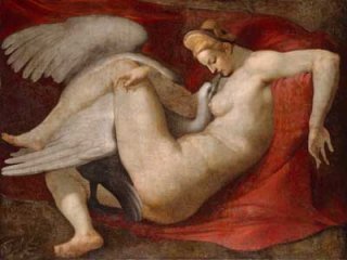
Ok Paltrows edit has good promise but it dosent deliver.I love the shoot of her feeding the rat,thats brilliant.But the picture of her in Pjs with her almost straight chest?I finaly see why people are saying she looked manly on the cover,to me she looks so unfeminine in that picture.I am very happy to see that Klein shot the cover,because i had my money on him when i saw it. :lol:
Overall i am happy what Klein is doing with celebrity editorials.Loved what he did with the Beckahms and how faar he pushes the envelope.I am sick and tired of polished pretty(read:boring)&safe celebrity edits.It was the same thing over and over again!So when Steven Klein decides to photograph David&Victoria Beckham having sex in a dirty hotel and frockling on cars in the deseart defining plastic perfection,Brangelina as dsyfunctional assasins,or Paltrow looking like a she-male gone Catholic;I will not complain,because its different from the generic celeb edits we see all the time.:pSure somtimes it dosent work like here,because a model would make that edit work way better.I am glad he is trying different things.Its one of the reasons i love W!


Fashion Party:Laura Dern&Juergen Teller are a match made in heaven!I would rather pose for Ok magazines photographer then let him(or certain Terry Richardson)photograph me!But since i always thought Teller is like a David Lynch of photography;for him to photograph;Lynch's ultimate muse is absoluotly perfect.So naturally the enitre edit looks like a Lynch movie with Tellers touch.Dern looks like a lunatic character her mother played in Wild At Heart!:ninja:

Wild Roses is such a tired concept,but Mert&Marcus made it work anyway.Love the colour scheme and vibe of the edit.

Wall FLowers is the best edit in this issue,Sorrenti is a genious.This edit is very eery in a poignant sort of way.May favourite!

I have to get the issue to give the final judgment,but it looks like a dissapointment for a September standards!
 
Last edited by a moderator:
wow the ed is unexpected lmao :shock:
i think i love it in general but i don't like what they did with Gwyneth's face
 

Users who are viewing this thread

New Posts

Forum Statistics

Threads
214,738
Messages
15,274,579
Members
88,847
Latest member
gabriellajolie
Back
Top