Calvin Klein Collection S/S 2009 : Anna Selezneva by David Sims | Page 3 | the Fashion Spot
  • The upgrade to XenForo 2.3.7 has now been completed. Please report any issues to our administrators.

Calvin Klein Collection S/S 2009 : Anna Selezneva by David Sims

:( Disappointing indeed. It looks like the 90s CK campaigns, but not in a good way...
 
I think the casting has something to do with it. Angle or no she does absolutely nothing for the dress. They might as well have hung it on a stick because all the elements came together to produce a big blah.
 
100% agreed. Anna's potential was certainly not fully utilized - which is a shame :doh:

it wasn't utilized at all IMO :ninja:

I was expecting so much from this... biggest disappointment of the season...
 
It doesn't live up to the high expectations I had :(
 
Calvin Klein Men S/S 09 : AJ Abualrub by David Sims

4206-500w.jpg

models.com

it's eh..
by the way. should there be a different thread for the mens campaign? they deserve some credit too :heart:
 
^^Like the menswear campaign a lot!

I'm not much of a Selezneva fan myself...in fact, very rarely do I find her appealing.

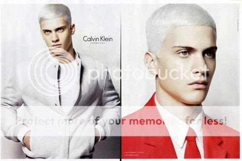
To be honest, I think the casting is just the strangest part of the ad....why Anna? I've always thought her features were kind of messy, mismatched and harsh...not quite the face I would have even thought about for the campaign for the collection. I would have expected someone with a much fresher, youthful appearance. Even if not Natalia, someone like Sigrid, Toni, Ali S, etc. I mean...Anna is just NOT CK....

So for whoever said that the first shot would have been bad with any other model, with the same pose, hair, etc...that's not true. I actually think that first shot, if nothing were changed besides the model, would have been a generally successful image.
 
Last edited by a moderator:
Sorry but the hell were they thinking????????:shock:
The first pic is frankly horrible......the hair:sick:everything in fact.
To be fair I feel sorry for Anna.

Menswear looks much better.........but seriously it couldn't look worse.

If this campaign gets better from here on in, then they made a grave mistake by releasing these 2 pics as their first:rolleyes:
 
so boring, Anna looks weird. Even that campaign with Suvi was better, but I still love CK.
 
i guess im one of the few who actually enjoys it?
i like CK ads. people call them boring, but i dont find that. they are like proverbs, short and to the point. it doesnt have to be lavish to be beautiful. i love the contrast between the strict geometric lines of the clothes and the wildness of her hair.
 
What's with the hair color?
I can't decide which is worse, mens or womens campaign.

Honestly I can't see this getting better, but let's wait...
 
AJ???? Is he the guy that didn't won the VMAN model search???...he looks great........and Peter the guy who won only has JOOP:innocent:

it's much better than the female ads but still not excelent

Anna just looks good in Vogue Paris sorry to her fans but this is a disaster:sick:
 
i always loved natalia's ads...she's the perfect face of ck

She was Perfection. Beautiful and Captivating, and Dynamic when she could have easily not tried and still looked beautiful.CKs gone downhill without her...not to say moving on isnt good, but this...AND SUVI's, and Basically everything Since!!! Yawn Enducing to say the least......

But the mens is at least better.

Madonna better watch out. She has competition for the Worst Campaign of the season.

I think the casting has something to do with it. Angle or no she does absolutely nothing for the dress. They might as well have hung it on a stick because all the elements came together to produce a big blah.

:lol::lol::lol::lol:
 
Oh and I just peeped at the Men's campaign and all I have to say is Village of the Damned.
 
not sure if i get the hair colour, but the ads are nice anyway [i mean for men :D]
 

Users who are viewing this thread

New Posts

Forum Statistics

Threads
214,577
Messages
15,266,894
Members
88,649
Latest member
Branz71
Back
Top