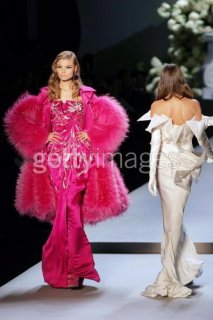
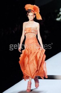
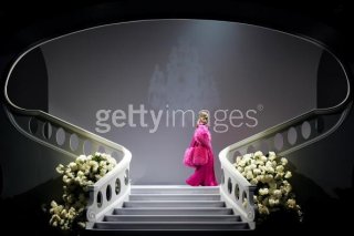
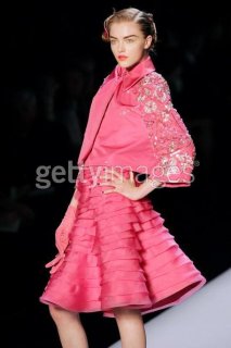
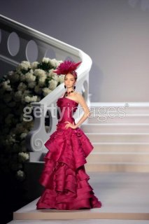
I love it, Im so excited that he continued to do vivid colors and exquisite details for ready to wear, that orange dress is just delicious and how exciting to see Daria on the paris runways again! Cant wait to see the whole show
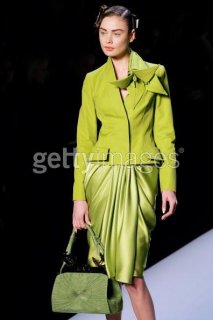
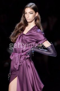
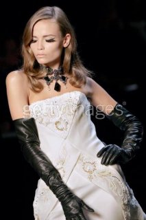
If this is Galliano when he makes Dior "sophisticated", I don't like it. I think he is going to the right direction with the shapes, but that's where it ends. The colours are tacky, the material looks awful... It does not look sophisticated at all to me. I guess I will never like Galliano.
I can't decide on this.
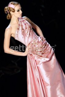
I think I prefered the much more simpler S/S 07 collection. But it was fairly obvious that Galliano would go to the complete opposite of that collection in this one.
that is total DISASTER
IT looks like rejected lousy workmanship pics from previous hc collections
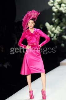
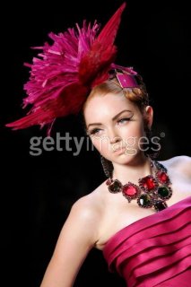
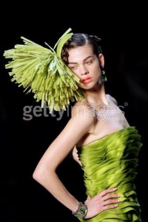
horrible colours. shapes are yucky. omg.
i should not be burning my midnight oil to wait this
This site uses cookies to help personalise content, tailor your experience and to keep you logged in if you register.
By continuing to use this site, you are consenting to our use of cookies.

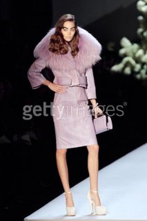
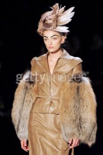
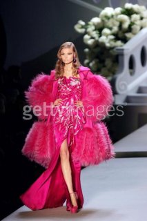
 i just dislike the fur :/