BIRTHOFACULT
Member
- Joined
- Sep 26, 2007
- Messages
- 33
- Reaction score
- 0
KRIS VAN ASSCHE AND JEFF BURTON COLLABORATE ON A VISUAL PROJECT.
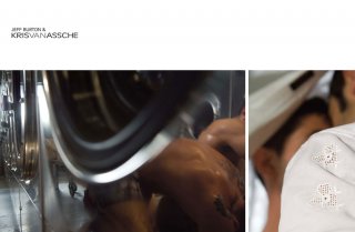
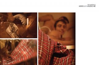
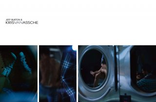
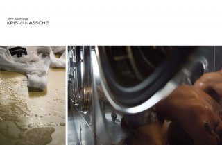
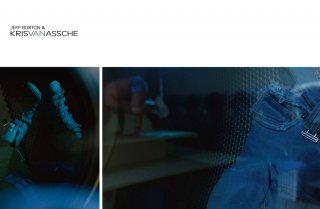
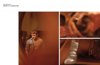
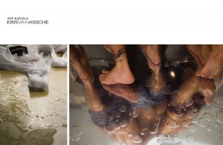
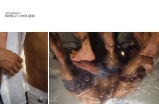
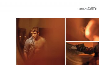
Designer Kris Van Assche and photographer Jeff Burton collaborated on a series of 12 layouts which will run in 12 select, international magazines as a unique advertising campaign for Van Assche’s FW 08.09 men’s collection.
Photographed in Los Angeles in March 2008 in a Laundromat, the series started as an artistic collaboration for A Magazine.
A Magazine is a bi-annual Antwerp-based magazine. Each issue is edited by a guest curator who freely develops the content of the issue. Van Assche is the curator of issue No 7 (on newsstands in May 08). Previous curators include Yohji Yamamoto, Martin Margiela, Martine Sitbon, Haider Ackermann.
The location for the shoot, a Laundromat, was chosen based on the set design of Van Assche’s FW 08.09 runway show, for which vintage washing machines were placed alongside the catwalk.
Typical for Burton’s work, the casting consists of real people and p*rn actors. His photographs capture the idea of seduction and sensuality, without any crudeness. Kris Van Assche, a longtime admirer of Burton, especially appreciates the poetry Jeff Burton pulls from the world of p*rn*gr*phy : a place where it is hard to find.
Beginning with September issues, 12 layouts will run in 12 select international magazines. Each layout will thus be exclusive to the magazine. The full series can be seen on www.krisvanassche.com.
« I did not want to present a classic campaign », says Van Assche. « I wanted people to feel the excitement of this encounter between two creative people who truly appreciate and admire each other’s work. 12 different lay outs in only 12 magazines worldwide is a radically new way of looking at advertising. It is more of an artistic event ».
SOURCE. krisvanassche.com/
Last edited by a moderator:



 horrible, i really don't like these at all