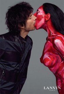
Lanvin Menswear S/S 2010 : Inez van Lamsweerde & Vinoodh Matadin

it's not Lanvin, it's just very Inez & Vinoodh
It's almost identical to their earlier work, I wish they'd have tried a bit harder with this one
 
The second shot is haunting, and looks very effective. The first shot is more realistic though, which is nice.
 
the first show is iconic lanvin. it's quirky. it's drop dead sexy. it's intelligent. and it's so lahn-van
 
I may be the only one to say that but it's so not Lanvin for me, I find the second shot pretty disgusting :unsure: Get the models back.

THIS

Well the first shot looks nice enough but it's a bit too simple and casual and the second one is just really odd :ninja:...I don't see what's relevant about that. My whole problem is it is not finding a link to Lanvin's aesthetic...I know it can be about development, but this is really upheavel IMO. Especially compared with the flawless F/W and S/S campaigns of 2009 :cry:
 
love the first pic. the second one looks like something out of Carrie :ninja:
 
I'm so over I&V. Don't remember the last time I went gaga over their work and I mean that truly. The first shot is fine but that' just because it's so simple, there is nothing more to it for me. The second one is a throwback to some of their older work but I hate it, the reference is misplaced, they're supposed to sell the clothes, non? The shot is peculiar in a way that makes you avert your gaze from the ad, not look for the clothes with a magnifying glass. As predicted, I'm disappointed. -_-
 
Vinoodh looks great but both images are scary. I really don't get the weirdness of the duo. -_-
 
I had no idea the were married!
I love this. The body make up looks creepy though.
 
One page version of the 2nd ad. Kinda NSFW and NSFL :lol:
wwd.com
 

Attachments

  • lanvin01.jpg
    lanvin01.jpg
    41.5 KB · Views: 86
they should have just do the initial kiss portrait ...
the red bodypainting unfortunately catch my eyes more than the outfit.
but i'm sure it doesn't really matter ...

though i feel it's like drink all my life, all my love. i'm offering it all to you !

it's really fresh, indeed !
 
The first photo is very interesting and I love how the outfit is shown.
The second photo is disgusting though
 
yeeeeeeah good !!!!!!! i like it !!!! the second one makes me think a bit to an eastpack add ! anyway verygood work !!!
 
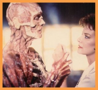
i just can't shake the image of the skinned dr. frank cotton from hellraiser II. obscure reference, i know, but she just looks THAT ghastly. and if i'm not mistaken, they kiss in the exact same way in that movie! :o

(source: http://www.jameshyman.com/blog/archives/2005_03.html)
 

Attachments

  • hellraiserfrank.jpg
    hellraiserfrank.jpg
    26.1 KB · Views: 0
It's very I&V but it's not what I would've like for Lanvin menswear (great to see them in front though). Last season's campaign was spectacular.
 

Users who are viewing this thread

New Posts

Forum Statistics

Threads
212,561
Messages
15,189,055
Members
86,449
Latest member
marqusbermudez
Back
Top
monitoring_string = "058526dd2635cb6818386bfd373b82a4"
<-- Admiral -->