-
Announcing... The WINNERS of the 2025 theFashionSpot Awards:
Designer of the Year
Ready-to-Wear Collection of the Year
Haute Couture Collection of the Year
Model of the Year
Photographer of the Year
Stylist of the Year
Magazine Cover of the Year
Ad Campaign of the Year
Congratulations to ALL of our worthy winners! Thank you to our tFS forum members who voted and participated.
You are using an out of date browser. It may not display this or other websites correctly.
You should upgrade or use an alternative browser.
You should upgrade or use an alternative browser.
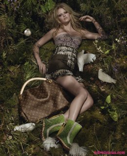
Louis Vuitton S/S 2010 : Lara Stone by Steven Meisel
- Thread starter fierceboi
- Start date
- Joined
- Sep 15, 2005
- Messages
- 23,482
- Reaction score
- 411
Meisel, Lara and co. really made this collection come alive again. Brilliant!
- Joined
- Jan 9, 2008
- Messages
- 36,984
- Reaction score
- 25,140
The forest setting just isn't very Louis Vuitton in my honest opinion. But I think I'm going to like this more and more after each new shot is posted.
The second one is better than the first, Lara looks fantastic. Thanks for posting lucy92!
The second one is better than the first, Lara looks fantastic. Thanks for posting lucy92!
Miss Dalloway
Well-Known Member
- Joined
- Mar 3, 2006
- Messages
- 25,698
- Reaction score
- 1,006
I love that its a bit of a different direction for LV, the second shots is stunning.
I agree with vogue28 . The image of Louis Vuitton isn't the same . I always tough that the Louis Vuitton 'egerie' (The model who makes the ad Sorry but I don't know how to say it in english ) should reflect the Vuitton spirit speacially when you see that for some people (Including me ) Vuitton is the top of the Chic and luxuary
D
Deleted member 1957
Guest
she looks nice but i really hate what shes wearing. Also Vuitton has always been known for its high voltage exciting campaigns....this looks somewhat ordinary
Fiercification
Well-Known Member
- Joined
- Apr 17, 2008
- Messages
- 6,291
- Reaction score
- 1,499
I'm sorry but I love this so far, the collection was pretty disastrous IMO but I like the very basic, natural background, maybe they could've done without the doves. Lara looks gorgeous, she just comes alive to be when she's lensed by Meisel.
MarionasMuse
Member
- Joined
- Sep 26, 2009
- Messages
- 870
- Reaction score
- 0
The first shot is really cool.
helmut.newton
Active Member
- Joined
- Jul 9, 2008
- Messages
- 4,708
- Reaction score
- 6
These advertisements are very Steven Meisel and very Vogue Italia, but I'm not too sure they are very Louis Vuitton.
I love Steven Meisel but I don't love his aesthetic for a house like Louis Vuitton. Mert&Mercus worked because they have an innate sense of the commercial and a sense of vibrancy. This is what Vuitton is all about in a way. They are not toned down the way Meisel is.
I don't understand why she is in a forest lying down on moss with doves? Spring 2007 would have suited this concept, but Spring 2010? Wasn't it about globalization, consumer culture and Japanese style? It's a very strange mixture of aesthetics. To me this campaign is a little confused.
Chanelcouture09
Some Like It Hot
- Joined
- Feb 20, 2009
- Messages
- 10,572
- Reaction score
- 35
the only thing that lets it down are the shoes and bags (i dislike the LV monogram, lets face it we all look at an LV bag and go 'is it real or fake?')
Similar Threads
- Replies
- 45
- Views
- 9K
- Replies
- 52
- Views
- 10K
- Replies
- 214
- Views
- 45K
- Replies
- 47
- Views
- 11K
- Replies
- 80
- Views
- 15K
Users who are viewing this thread
Total: 1 (members: 0, guests: 1)
New Posts
-
-
-
-
-
Harper's Bazaar France December 2025/January 2026 : Jacqui Hooper by Drew Vickers (6 Viewers)
- Latest: MModa


