- Joined
- Jul 14, 2017
- Messages
- 14,667
- Reaction score
- 21,256
Share with us... Your Best & Worst Collections of F/W 2025.26


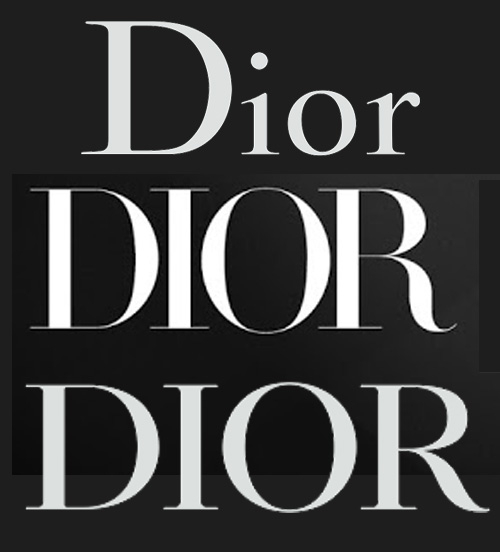
Really? I really like it. All they did was capitalize it, and I think this one tiny little move makes a stronger (visual) statement. When I walk past the store here, the new logo is the first thing that grabs my attention. I'd rather see this than the go-to Helvetica font that seems to be all the rage these days.I really hate the new logo. It's very her, i.e., boring, generic, and lacking in creativity and imagination. I think it looks strange and out of place in front of stores. It get's lost, especially when it's surrounded by decoration or like colors. I believe it was mistake to change it.
Really? I really like it. All they did was capitalize it, and I think this one tiny little move makes a stronger (visual) statement. When I walk past the store here, the new logo is the first thing that grabs my attention. I'd rather see this than the go-to Helvetica font that seems to be all the rage these days.
Oh, heavens no. But that image certainly is.Am I a joke to you?
They may have only capitalized the text, but the problem is that it was never designed to be presented in that format. I understand that after 75 years she would feel the need to "Reinvent" the logo, but in this case it was unnecessary.
I think the logo was shown for the very first time on the cover of the first issue of Dior Magazine during the tenure of Raf Simons so it's not a MGC's idea to do this rebranding.


