Maximilian Davis - Designer, Creative Director of Ferragamo

I think we can agree in hindsight that Hedi Slimane's Saint Laurent re-branding was a success, not only from a commercial perspective but also given that the brand is still working to a large part with the holistic aesthetical concept of the brand, years after his departure. Only a few artistic directors can pull through such a project with as much hands-on input as he did and I think the results show that all aspects were created in unison and with equal dedication. When I look at - for example Raf Simons' tenure at Dior, the fact that his input did not touch upon the graphic design and retail spaces (Peter Marino's interiors were pretty much the antithesis to Raf's fashion) resulted in an inconsistent vision to the outside, much as if it was already foreshadowing his tenure there to be short lived.

I'd say Ferragamo belongs to the tier of brands whose potential remains largely untapped, much like Loewe, has been before JWA. If the vision this new guy extends to all other aspects of the brand, I think it makes sense he'd change the logo, too.
For me i have always in mind that idea of making the brand stronger on a long term vision. It’s about serving the brand rather than just pleasing the creative director…

What Vaccarello is doing with the logo now was my fear when Hedi changed everything. If every creative director who takes a brand that kind of follow his/her sensibility and decides to change the logos and all, it’s going to be problematic.

But for me, it even goes beyond just the logos. It’s also about some products. I like to think that in the history of a brand, there’s more to the story than the creative director and the founder.

It’s always about long term for me. Galliano did very outrageous things at Dior that were far from the vision of the founder or the overall image of the house but, the logo remained unchanged and the store design was modern and classic. Karl never touched the Chanel logo, Margiela or Gaultier never touched the Hermes logo. It’s that thing to understand that you are part of a greater history.

Sometimes a change of logo is necessary but I also think that sometimes, it’s the duty of a creative director to get that the brand is bigger.
What will happen to Celine is the next creative director believes that his sensibility is closer to Phoebe than Hedi? Go back to the old logo?

And when we talk about Hedi. The problem is that not everybody is Hedi but as soon as someone gets a bit of responsability, he thinks he is Hedi. We saw that with Brioni and Justin O’Shea.

But we wait and see…
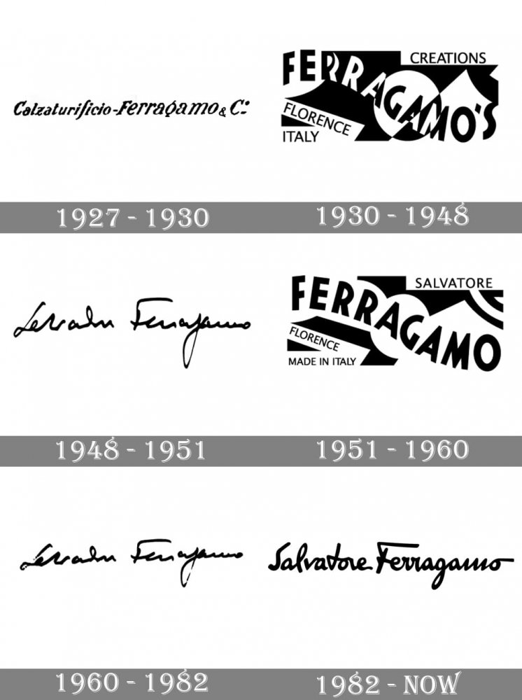
Again, it's unlikely it was Davis's whim to change the logo. The decision to change is rarely the lone decision of the creative director. And most things that can potentially raise or lower share prices are usually approved by a board.

And irregardless of Davis, unlike Chanel, Ferragamo has changed their logo many times over the last century:

Salvatore-Ferragamo-Logo-history.jpg
 
Again, it's unlikely it was Davis's whim to change the logo. The decision to change is rarely the lone decision of the creative director. And most things that can potentially raise or lower share prices are usually approved by a board.

And irregardless of Davis, unlike Chanel, Ferragamo has changed their logo many times over the last century:

View attachment 1216730
Yikes at most of them!:blink:
 
I have a feeling that they're going to use red as their branding colour:

We already have two brands that already use that colour: Valentino as a reference to the red carpet, and Diesel as a symbolic of youth aggression and rebellion.
 
I have a feeling that they're going to use red as their branding colour:

We already have two brands that already use that colour: Valentino as a reference to the red carpet, and Diesel as a symbolic of youth aggression and rebellion.

I have a feeling that they're going to use red as their branding colour:

We already have two brands that already use that colour: Valentino as a reference to the red carpet, and Diesel as a symbolic of youth aggression and rebellion.


That teaser is giving me doubts.

A red sequined sports car? Like, really?

"High octane glamour and glitz! Start your engines and get ready as the new Ferragamo goes from zero to sixty."

It's giving me that.
 
This is the official statement from the brand about the new logo:

At Ferragamo a new chapter is being written: a conversation between classic and contemporary, based on both heritage and a clear vision of the now.

Recognizing the importance of each of the elements in the whole, the journey of reinvention, the keen sense of elegance and respect for the craft, begins at the foundation: the letters that are used, the form that they take, the words that form.

The letter of the founder translates into a graceful, impressive, refined typeface, affirmative as evidence, in tense tension between classicism and modernity.

Ferragamo commissioned Peter Saville, the celebrated graphic designer, master of unexpected associations and a forcefully streamlined style, to create the new logo, for which he conceived a modernist take on a classic typeface, reminiscent of classic stone inscriptions. that inspired the artists of the Renaissance. Filtered through a decidedly reductive lens, it's loaded with a sense of history rather than loaded with the weight of history. All the references are stripped of an aura, impregnating an essence of the classic around the modernity of looking towards the future. A modernist and sensual intention is framed in a logo that seems to have always been there.

"The heritage of Florence is in the culture of the company: that led me to the choice of a classic font. The vision is demanding and modern. From there, the typeface is reduced and becomes modernist. On the other hand , the craftsmanship that is quintessentially Ferragamo, is condensed into the idea of an inscription etched in stone. In this tension lies the new logo and the complex balance it expresses," says Peter Saville.

"History is an immense treasure for a house that owns it. The new Ferragamo logo contains and amplifies both history and the present. Far from being just a logo, it is a program, which will frame and direct the new chapter that is about to come." be written" says Marco Gobbetti.
 
Why does anyone keep hiring Peter Saville for these rebrandings?
 
Poorly written and riddled with technical errors.

Anyways,

There's nothing wrong with Saville.

He works with the brief he gets. Although he doesn't strike me as especially proficient in typography. And yes, the last two fashion identity projects he did haven't really panned out.

So... maybe you guys have a point.

Anyways,

The reasoning and idea behind it makes a lot of sense and seems smart enough.

I like the idea of repositioning Ferragamo as a Florentine craftsman who continued in the tradition of the great Renaissance artists and doing it through typography.

Let's see how that idea plays out into the collection.
 
I like the new Ferragamo Logo for itself, but I think it doesn't fit to the brand, because of the heritage.

The reintroduction of the Saint Laurent "Rive Gauche" Logo is something different.
Hedis vision was to use the "Saint Laurent" Logo for Ready to wear.
He wanted to use the "Yves Saint Laurent" Logo by Cassandre for Couture. (as would be historically correct). Slimane wanted to work with both lines.
Slimane has bought a Building for the couture ateliers on 24 Rue de l'université in his YSL time. He has even modernized the building to have a new base for YSL.
Slimane's contract was prematurely terminated by Kering before he could implement his vision.
YSL-Couture was buried by Kering
This is also the reason why there are many misunderstandings about the "Saint Laurent" logo.
Don't forget:
Slimane had previously worked under Yves personally and was a friend of Pierre Bergé. He knew exactly how to manage the legacy.
 
Maximilian Davis dresses Michaela Coel for the Black Panther Wakanda Forever premiere.
 
A selection of the Spring'23 collection is available for purchase in flagship stores as well as the online store and Farfetch.
 
A selection of the Spring'23 collection is available for purchase in flagship stores as well as the online store and Farfetch.

The crystal stuff is sold out but I’m concerned regarding the bags. None of them is appealing…
 

Users who are viewing this thread

New Posts

Forum Statistics

Threads
212,589
Messages
15,190,106
Members
86,478
Latest member
amberkc
Back
Top
monitoring_string = "058526dd2635cb6818386bfd373b82a4"
<-- Admiral -->