
You are using an out of date browser. It may not display this or other websites correctly.
You should upgrade or use an alternative browser.
You should upgrade or use an alternative browser.
Raf Simons Mens F/W 2015.16 Paris
- Thread starter marcBarna
- Start date


Phuel
Well-Known Member
- Joined
- Feb 18, 2010
- Messages
- 5,434
- Reaction score
- 7,500
I swear, if his name wasn't attached to any of this, people would be rolling their eyes at the utter cheap, silly and pointlessness of these designs.
I liked him back in the 2000s, even bought a couple of jackets of his back in 2007. Now I'm convinced he's either colorblind and incapable of designing anything flattering and just wants to say he's different for the sake of being different-- or he's trolling the fashion world and having the last laugh. If it's the latter, I do admire him.
God, this stuff is the kind of joke that someone like Sasha Cohen's Bruno would wear. And people call Dolce and Dsquared2 tacky.
Thanks marc for the pics!
GIVENCHYlover
Active Member
- Joined
- Nov 5, 2011
- Messages
- 3,935
- Reaction score
- 61
Trash...it's not a compliment 
oliverforever
Member
- Joined
- Dec 26, 2012
- Messages
- 40
- Reaction score
- 0
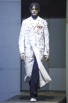
Raf "clothes with words and scribbles on them" Simons...
TREVOFASHIONISTO
Active Member
- Joined
- Jun 2, 2008
- Messages
- 15,363
- Reaction score
- 63
its an extremely weak collection from him. I do like the fit of the outerwear though
Lola701
Well-Known Member
- Joined
- Oct 27, 2014
- Messages
- 10,182
- Reaction score
- 19,095
The irony of him putting womens in his menswear show (even if they are wearing guys's clothes) when he is not able to create a desirable piece at Dior.
It's a very lazy collection but i feel like he is feeling the hype a little bit too much.
I don't feel like his menswear is leading anymore.
It's a very lazy collection but i feel like he is feeling the hype a little bit too much.
I don't feel like his menswear is leading anymore.
Steddycam91
Well-Known Member
- Joined
- Jan 18, 2015
- Messages
- 545
- Reaction score
- 462
The irony of him putting womens in his menswear show (even if they are wearing guys's clothes) when he is not able to create a desirable piece at Dior.
I see it as him grasping at straws: stick a model in a laboriously self-conscious and pretentious look, throw them onto the runway for either house he designs for (doesn't matter at this point), and just hope that something - anything, please - will stick.
Last edited by a moderator:
dior_couture1245
Fat Karl
- Joined
- Jan 30, 2006
- Messages
- 9,225
- Reaction score
- 4,737
I'm so sick of all this condescending fashion. It's over.
^sorry but how do you define condescending fashion? that somebody goes against the grain...does something different than the ideal. sorry but menswear can get tired and thank heavens raf continues to challenge the system.
i actually really love this. it does remind me a lot of his old days in a lot of ways...the deconstructed elements in the knitwear...the scribble pieces are very much like that DIY feel of his spring 2001....and his masterful tailoring is still very much on display.
i actually really love this. it does remind me a lot of his old days in a lot of ways...the deconstructed elements in the knitwear...the scribble pieces are very much like that DIY feel of his spring 2001....and his masterful tailoring is still very much on display.
Mutterlein
Well-Known Member
- Joined
- Mar 14, 2004
- Messages
- 4,893
- Reaction score
- 2,913
I swear, if his name wasn't attached to any of this, people would be rolling their eyes at the utter cheap, silly and pointlessness of these designs.
I liked him back in the 2000s, even bought a couple of jackets of his back in 2007. Now I'm convinced he's either colorblind and incapable of designing anything flattering and just wants to say he's different for the sake of being different-- or he's trolling the fashion world and having the last laugh. If it's the latter, I do admire him.
God, this stuff is the kind of joke that someone like Sasha Cohen's Bruno would wear. And people call Dolce and Dsquared2 tacky.
Thanks marc for the pics!
AGREED
He used to consistently have the best collections, but that's years ago at this point. I don't think he's had a solid collection in several seasons, not really since he started at Dior.
From what I hear he's a bit out of touch due to his rise in profile and the hype. It's all gone to his head. He needs to take a step back and remember what got him respect to begin with, it certainly wasn't clothes like these.
Mutterlein
Well-Known Member
- Joined
- Mar 14, 2004
- Messages
- 4,893
- Reaction score
- 2,913
I'm so sick of all this condescending fashion. It's over.
I'm over it too!
margielamike2004
Well-Known Member
- Joined
- May 2, 2005
- Messages
- 582
- Reaction score
- 148
I actually love this collection. For lack of a better word..it seems very "Belgian" to me....very old-school around the time from when he was working beside Veronique Branquinho. The presented a few collections together for Ruffo Leather.
What I like about this collection is...it's incredibly androgynous...and not very gender specific. Although, there is a touch of feminism being shown here.
I like that the pieces look very raw...deconstructed...an unfinished.
Many of the fabrics for this collection (especially the check coats with the leather-braided buttons) look very vintage...much like an old man would wear...but the proportions and volume of the cut is bigger and more generous...specifically the over-sized collars.
There's something very raw to the collection...not very polished and pretentious.
He did a collecttion a bit similar to this one..which I that was titled "Kinetic Youth" back in 1997?
margielamike2004
Well-Known Member
- Joined
- May 2, 2005
- Messages
- 582
- Reaction score
- 148
It's unfortunate that this collection has received so many bad reviews.
Personally, it reminds me of the old Raf Simons I knew of over 20 years ago. This is exactly how I remember Raf Simon's once being.
In regards to Raf being overwhelmed and consumed by his popularity....perhaps he's aware of it...and in this particular collection....I think he may have decided to go back to his roots...remembering his past...trying to run from his cult of personality that he's become.
margielamike2004
Well-Known Member
- Joined
- May 2, 2005
- Messages
- 582
- Reaction score
- 148
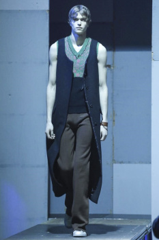
My favorite piece in this collection..are the sleeveless, no lapel, long coats.
Granted....anything sleeveless for winter....here in icy-cold New England is totally impractical...but regardless.
Granted....anything sleeveless for winter....here in icy-cold New England is totally impractical...but regardless.
margielamike2004
Well-Known Member
- Joined
- May 2, 2005
- Messages
- 582
- Reaction score
- 148
Review taken from Nowfasion.com By Jessica Michault
The invitation for the Raf Simons’s fall/winter 2014 menswear show, the designer had emblazoned the phrase “To the archives, No longer relevant.” It felt like a sartorial call to arms. To forget the past — abandon history. What has come before doesn’t matter; it is what we do now, in the present, that counts.
For anyone who has ever been, or is currently dealing with, a teenager, these raw and rebellious sentiments have a visceral ring of truth to them. At some point we have all railed against the world and the mistakes made by those who have come before us.
It was this feeling that prevailed at the Simons show late Wednesday night in a far-flung fashion show venue in the suburbs of Paris. On a raised catwalk (chest high for the audience, which was obliged to stand for the duration of the show) sullen-faced models, with their hair looking flat and greasy and parted in the middle as if not washed for quite a while, clomped by.
Their brooding nature communicated through their clothing. Because everyone knows that at some point teenagers stop talking all together. It is only their clothing and hygiene that give any real clue to their state of mind. So Simons sent out long sleeveless coats (perhaps yanked off in a fit of rage), jackets with shredded cuffs, raw edged knit pants, moth (or was it a washing machine?) eaten hole-filled sweaters and, most dramatically, white school lab coats covered in angst-filled artwork.
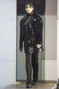
The long and lean silhouette, exaggerated by the off the ground catwalk, had a whiff of the 70s about it. A feeling heightened by the color palette, the chosen checked fabrics and glossy vinyl’s used for the outerwear. Oh, and the 1970 classic “Child in Time” by Deep Purple also helped seal the deal.
But as much as this show wanted to rebel, the fashion world, just like the parents of a disgruntled teenager, just wanted to embrace it with open loving arms.
The invitation for the Raf Simons’s fall/winter 2014 menswear show, the designer had emblazoned the phrase “To the archives, No longer relevant.” It felt like a sartorial call to arms. To forget the past — abandon history. What has come before doesn’t matter; it is what we do now, in the present, that counts.
For anyone who has ever been, or is currently dealing with, a teenager, these raw and rebellious sentiments have a visceral ring of truth to them. At some point we have all railed against the world and the mistakes made by those who have come before us.
It was this feeling that prevailed at the Simons show late Wednesday night in a far-flung fashion show venue in the suburbs of Paris. On a raised catwalk (chest high for the audience, which was obliged to stand for the duration of the show) sullen-faced models, with their hair looking flat and greasy and parted in the middle as if not washed for quite a while, clomped by.
Their brooding nature communicated through their clothing. Because everyone knows that at some point teenagers stop talking all together. It is only their clothing and hygiene that give any real clue to their state of mind. So Simons sent out long sleeveless coats (perhaps yanked off in a fit of rage), jackets with shredded cuffs, raw edged knit pants, moth (or was it a washing machine?) eaten hole-filled sweaters and, most dramatically, white school lab coats covered in angst-filled artwork.
The long and lean silhouette, exaggerated by the off the ground catwalk, had a whiff of the 70s about it. A feeling heightened by the color palette, the chosen checked fabrics and glossy vinyl’s used for the outerwear. Oh, and the 1970 classic “Child in Time” by Deep Purple also helped seal the deal.
But as much as this show wanted to rebel, the fashion world, just like the parents of a disgruntled teenager, just wanted to embrace it with open loving arms.
margielamike2004
Well-Known Member
- Joined
- May 2, 2005
- Messages
- 582
- Reaction score
- 148
Lyrics for the song..."Child In Time" by Deep Purple.
Sweet child in time you'll see the line
The line that's drawn between good and the bad
See the blind man shooting at the world
Bullets flying, taking toll
If you've been bad, lord I bet you have
And you've not been hit by flying lead
You'd better close your eyes
Bow your head
Wait for the ricochet
I wanna hear you scream
Sweet child in time you'll see the line
The line that's drawn between, good and the bad
See the blind man shooting at the world
Bullets flying, taking toll
If you've been bad, lord I bet you have
And you've not been hit by flying lead
You'd better close your eyes
Bow your head
Wait for the ricochet
I gotta hear you scream
Sweet child in time you'll see the line
The line that's drawn between good and the bad
See the blind man shooting at the world
Bullets flying, taking toll
If you've been bad, lord I bet you have
And you've not been hit by flying lead
You'd better close your eyes
Bow your head
Wait for the ricochet
I wanna hear you scream
Sweet child in time you'll see the line
The line that's drawn between, good and the bad
See the blind man shooting at the world
Bullets flying, taking toll
If you've been bad, lord I bet you have
And you've not been hit by flying lead
You'd better close your eyes
Bow your head
Wait for the ricochet
I gotta hear you scream
Similar Threads
- Replies
- 9
- Views
- 2K
- Replies
- 120
- Views
- 27K
Users who are viewing this thread
Total: 2 (members: 0, guests: 2)