You are using an out of date browser. It may not display this or other websites correctly.
You should upgrade or use an alternative browser.
You should upgrade or use an alternative browser.
tFS Fashion Photographers - Share Your Work. Before Posting, please read Post #1
- Thread starter pamelaz
- Start date
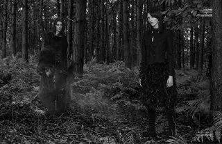
It worked. Nice stuff, Andrew. Love the lighting ... creates a sensuous, but somewhat sinister mood.
Thank you very much!

Hi Andrew! Some very nice shots, I love the mood. Colors fit perfectly to the scene.
Hi Lean13! Thank you for the kind words!
D
Deleted member 1957
Guest
Am a designer but I sometimes also photograph my work


CholoChic
Well-Known Member
- Joined
- Jan 10, 2008
- Messages
- 2,027
- Reaction score
- 585
About a boy who came back from the dead.


***Edited*** Please do not post links to your site, per the thread rules (see post #1).
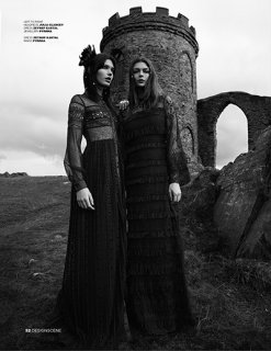
thanks for coment i am learning to make pictures and we had a vintage Christian Dior blazer so it was so nice.


***Edited*** Please do not post links to your site, per the thread rules (see post #1).
thanks for coment i am learning to make pictures and we had a vintage Christian Dior blazer so it was so nice.
Last edited by a moderator:
Bertrando3
Well-Known Member
- Joined
- Mar 22, 2010
- Messages
- 5,644
- Reaction score
- 2,431
You guyssssssssss I wanted to share a great news with our fashion community... I have just shot Brazilian supermodel Henrique Hansmann today for my magazine Cool Korea!!! It´s been one of the most thrilling experiences in my life: to work with a bonafide supermodel and have one of his agencies´support and my team was there and he was truly charismatic and fun and so eloquent.
I rarely say that and yeah it may sounds corny but of all the male models in the world, few have the x factor for becoming supermodels, we like them or something about them but some of them miss that magic element and this guy has it. He has the body, the height, face, knowledge, potential and is very polite and cool. Today has been a real treat to have him sincerely. As editor-in-chief of my own magazine and photographer, I feel very thankful and blessed to have worked with him. Keep checking the mag for the future editorial of this male supermodel )
)
I rarely say that and yeah it may sounds corny but of all the male models in the world, few have the x factor for becoming supermodels, we like them or something about them but some of them miss that magic element and this guy has it. He has the body, the height, face, knowledge, potential and is very polite and cool. Today has been a real treat to have him sincerely. As editor-in-chief of my own magazine and photographer, I feel very thankful and blessed to have worked with him. Keep checking the mag for the future editorial of this male supermodel
 )
)Bertrando3
Well-Known Member
- Joined
- Mar 22, 2010
- Messages
- 5,644
- Reaction score
- 2,431
Hey guys  As I told you over a few weeks ago my team and I got the amazing opportunity to work and shoot Brazilian famous supermodel Henrique Hansmann and we had a blast. He was really really down to earth, so funny and since some of you were interested in seeing the results then... HERE IS THE COVER! We went for a more demure look for our July 2015 cover because we were always showing off a lot of bodies recently and I wanted to show him as a strong and fierce man on the cover. He´s wearing Zara SS15 and we also shot him for a 14 pages editorial spread which I will post on my website because it´s forbidden to do self-promotion on the forum.

I would truly love to receive your guys´opinions, really. I have always been a big fan of magazine covers and this forum is my favorite place on the Internet, really. So I would like to hear from all of you your thoughts on the cover: even the worst ones lol because that´s the only way a good magazine grows up. From the coverlines to the photo itself or whatever you feel like commenting on.
Here is also a video preview of the covershoot :
:
https://www.youtube.com/watch?v=v8GtTDMrGv8
 As I told you over a few weeks ago my team and I got the amazing opportunity to work and shoot Brazilian famous supermodel Henrique Hansmann and we had a blast. He was really really down to earth, so funny and since some of you were interested in seeing the results then... HERE IS THE COVER! We went for a more demure look for our July 2015 cover because we were always showing off a lot of bodies recently and I wanted to show him as a strong and fierce man on the cover. He´s wearing Zara SS15 and we also shot him for a 14 pages editorial spread which I will post on my website because it´s forbidden to do self-promotion on the forum.
I would truly love to receive your guys´opinions, really. I have always been a big fan of magazine covers and this forum is my favorite place on the Internet, really. So I would like to hear from all of you your thoughts on the cover: even the worst ones lol because that´s the only way a good magazine grows up. From the coverlines to the photo itself or whatever you feel like commenting on.
Here is also a video preview of the covershoot
 :
:https://www.youtube.com/watch?v=v8GtTDMrGv8
KoV
The Fault in Our Czars
- Joined
- Sep 17, 2009
- Messages
- 6,421
- Reaction score
- 9,971
Is this magazine available in print or exclusively online/on your iPad? If it's not available in print, I think the "collector's edition" headline is a bit.... misused.
Overall, I don't think the cover seems very fashion-forward and doesn't feel very July, but it's also a million times better than anything I'd come up with, I'm sure. It stays true to the "darker and stronger" vibe mentioned on the cover. He looks intense, brooding, and I like the image, I just think I might have used lighter background colors and less text. But it's not my magazine, it's yours and I think you put together some good work! Looking forward to seeing your next cover.
Overall, I don't think the cover seems very fashion-forward and doesn't feel very July, but it's also a million times better than anything I'd come up with, I'm sure. It stays true to the "darker and stronger" vibe mentioned on the cover. He looks intense, brooding, and I like the image, I just think I might have used lighter background colors and less text. But it's not my magazine, it's yours and I think you put together some good work! Looking forward to seeing your next cover.
phungnam96
Well-Known Member
- Joined
- Jul 7, 2011
- Messages
- 1,245
- Reaction score
- 938
^ I agree, the cover looks great but I prefer the brighter background and less titles. But you did a good job 

dfl-001
Well-Known Member
- Joined
- Aug 16, 2005
- Messages
- 1,939
- Reaction score
- 1,246
I like your photography
It's not over produced with retouching. And that type of side lighting without a fill light can be super effective. I think it's done really well here.
I don't even find it too dark for a summer issue. reminds me of walking on a beach on a summer night.
I think you could have cropped the image even closer too really amp up the effect. Go tight!
Hope you're not offended if I edit your work to create a couple examples.
Tighter crops:


Images: from Bertrando3
It's not over produced with retouching. And that type of side lighting without a fill light can be super effective. I think it's done really well here.
I don't even find it too dark for a summer issue. reminds me of walking on a beach on a summer night.
I think you could have cropped the image even closer too really amp up the effect. Go tight!
Hope you're not offended if I edit your work to create a couple examples.
Tighter crops:


Images: from Bertrando3
Bertrando3
Well-Known Member
- Joined
- Mar 22, 2010
- Messages
- 5,644
- Reaction score
- 2,431
Is this magazine available in print or exclusively online/on your iPad? If it's not available in print, I think the "collector's edition" headline is a bit.... misused.
Overall, I don't think the cover seems very fashion-forward and doesn't feel very July, but it's also a million times better than anything I'd come up with, I'm sure. It stays true to the "darker and stronger" vibe mentioned on the cover. He looks intense, brooding, and I like the image, I just think I might have used lighter background colors and less text. But it's not my magazine, it's yours and I think you put together some good work! Looking forward to seeing your next cover.
The magazine is available in print, free online preview and on the iPad, we have our own app in the Apple store and kiosk and google play store. Ya I felt maybe we needed something fresher for the summer issue on the cover but since in Korea they love darker themes for the cover and the styling and all, that´s why I went with this aesthetic you know. Plus we always have multiple covers so others have a more summery vibe I guess, if you can check them out great
 Thank you very very much for your input.
^ I agree, the cover looks great but I prefer the brighter background and less titles. But you did a good job
I would have liked indeed less titles but then the more my team and I were making the cover try outs the more I felt we needed the coverlines somehow héhé. Thanks so much for your thoughts

I like your photography
It's not over produced with retouching. And that type of side lighting without a fill light can be super effective. I think it's done really well here.
I don't even find it too dark for a summer issue. reminds me of walking on a beach on a summer night.
I think you could have cropped the image even closer too really amp up the effect. Go tight!
Hope you're not offended if I edit your work to create a couple examples.
Tighter crops:


Images: from Bertrando3
No no don´t worry I loved that you played with the cover and gave me an option of what we could have done with my team actually. It´s brillant. There were so many good shots for the cover but we ended up picking up this one for the stand and the expression in his eyes but yeah a very tight close-up could have been cool too. The actual image is actually going to his knees
 so I cropped it but it wasn´t cropped enough for ya ahaha. For the amount of text the funny thing is that I´ve always been a defensor of less is more with the coverlines but the further we go with the shoots the more coverlines I want on the covers ahaha
If you get the chance to have a look at our editorial then if you like you can show me your thoughts or photo options about which other image would have made an equally eye-catching cover

Thank you guys so much and I´m in talk with 2 big models for the upcoming issues...


Similar Threads
- Replies
- 206
- Views
- 327K
- Replies
- 1K
- Views
- 307K
D
- Replies
- 11
- Views
- 5K
- Locked
- Replies
- 3K
- Views
- 673K
Users who are viewing this thread
Total: 1 (members: 0, guests: 1)
New Posts
-
-
-
-
-
Harper’s Bazaar Turkey December 2025: Alessandra Ambrosio by Stewart Shinning (4 Viewers)
- Latest: Zorka

