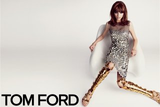
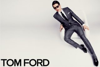
style.comThe ever-secretive Tom Ford (who, as it happens, is approaching Fall ’13 much less secretively with a full-on fashion show during London Fashion Week in February) has given Style.com a first look at his Spring ’13 campaign. As in seasons past, Ford lensed the ads himself. With an air of retro futurism, the shots are sleek, sexy, and sophisticated—not unlike the mirror dress and gold bondage shoes (yes, the same pair Anne Hathaway wore in vegan-friendly black to her Les Mis premiere) Karlina Caune dons in the ad. The men’s images feature Simon Van Meervenne sprawled out in a silver suit. Ford’s spring campaign will launch this week on his website, and hit magazines in March.
You are using an out of date browser. It may not display this or other websites correctly.
You should upgrade or use an alternative browser.
You should upgrade or use an alternative browser.
Tom Ford S/S 2013 : Karlina Caune & Simon Van Meervenne by Tom Ford
- Thread starter Flashbang
- Start date
Thefrenchy
Well-Known Member
- Joined
- Nov 13, 2006
- Messages
- 12,004
- Reaction score
- 1,239
Works better for the menswear I think...
Maximilian S
Active Member
- Joined
- Nov 13, 2012
- Messages
- 2,191
- Reaction score
- 2
Simon 


Melancholybaby
Well-Known Member
- Joined
- Aug 25, 2011
- Messages
- 14,117
- Reaction score
- 1,475
I really like the setting and her hair, they work perfectly for such a flashy outfit.
VogueDisciple93
Well-Known Member
- Joined
- Jun 24, 2011
- Messages
- 2,058
- Reaction score
- 782
Simon's shot is better. First campaign in a while I don't hate.
kostadinka
Member
- Joined
- Jul 31, 2011
- Messages
- 715
- Reaction score
- 3
karlina looks beautiful, but i don't like this campaign
jmrmartinho
Active Member
- Joined
- Aug 11, 2011
- Messages
- 2,645
- Reaction score
- 1
Way better than last season thats for sure.
HeatherAnne
Well-Known Member
- Joined
- Jan 24, 2008
- Messages
- 24,229
- Reaction score
- 975
The male shot is fantastically styled, while the female styling (or should I just say ugly Tom Ford clothes) is laughable.
ForChicSake
Active Member
- Joined
- Feb 2, 2009
- Messages
- 13,034
- Reaction score
- 11
better than last season, can't wait to see more
Legolas
Well-Known Member
- Joined
- Jan 12, 2010
- Messages
- 5,343
- Reaction score
- 435
Both models are perfect and refreshing for the brand. I really hope this is not they way we'll look at both ads on the magazines, the composition of both pictures is great indeed, but I don't like the models to be that close to the frames (Karlina's foot going out bothers me a lot), I need just a little bit more air for my eyes to rest (2cm of blank space on each frame would be enough I guess) and reduce the visual tension.
D
Deleted member 1957
Guest
lov it
Miss Dalloway
Well-Known Member
- Joined
- Mar 3, 2006
- Messages
- 25,704
- Reaction score
- 997
Both ads so far, fantastic! Love the precision, and styling of the images, wouldn't expect anything less from Tom.
Similar Threads
- Replies
- 51
- Views
- 14K
- Replies
- 47
- Views
- 11K
- Replies
- 25
- Views
- 7K
- Replies
- 13
- Views
- 5K
Users who are viewing this thread
Total: 2 (members: 0, guests: 2)


