You are using an out of date browser. It may not display this or other websites correctly.
You should upgrade or use an alternative browser.
You should upgrade or use an alternative browser.
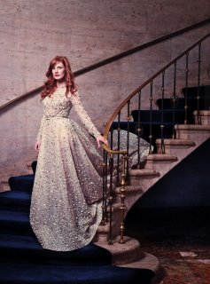
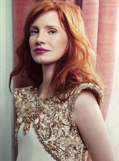
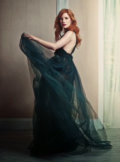
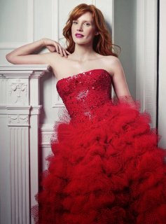
UK Harper's Bazaar November 2014 : Jessica Chastain by David Slijper
- Thread starter honeycombchild
- Start date
Miss Dalloway
Well-Known Member
- Joined
- Mar 3, 2006
- Messages
- 25,704
- Reaction score
- 997
^ Whoa, Arthur Elgort working for UK HB? I would LOVE to see more of that!
edenL
Member
- Joined
- Dec 10, 2012
- Messages
- 54
- Reaction score
- 0
more! stunning!!
source celeber.ru
source celeber.ru
Attachments
- Joined
- Jan 9, 2008
- Messages
- 35,316
- Reaction score
- 20,315
Mine came today
Mine eventually arrived this afternoon and doesn't seem as though I was missing out on a great lot. The only redeeming quality the issue has is the Shop Bazaar edit because the girl appears to have a hint of an attitude and darkness about her - something the Bazaar woman has been missing for ages. I also love the direction they've taken with the Bazaar Art supplement covers!
HQ Subscribers Cover & Bazaar Art Supplement:


scans by vogue28
Benn98
Well-Known Member
- Joined
- Aug 6, 2014
- Messages
- 42,530
- Reaction score
- 20,571
Mine eventually arrived this afternoon and doesn't seem as though I was missing out on a great lot. The only redeeming quality the issue has is the Shop Bazaar edit because the girl appears to have a hint of an attitude and darkness about her - something the Bazaar woman has been missing for ages. I also love the direction they've taken with the Bazaar Art supplement covers!
HQ Subscribers Cover & Bazaar Art Supplement:
They chose the worst shot for the sub cover, but I imagine the HB woman will relate to that image.
I love the HB Art supplement cover!! The font, painting. Will you please post the cover credit Vogue28? And how many pages? TIA!

- Joined
- Jan 9, 2008
- Messages
- 35,316
- Reaction score
- 20,315
^The Bazaar Art supplement is 74 pages long and comes in 6 different covers to choose from. As as subscriber I couldn't choose but I received the Howard Hodgkin one. I love the masthead used at the very top of the cover credits page, looks very December during the 50s and I hope (for once) subs get something with a real vintage feel for Christmas. Here's a scan of the cover credits page:

scan by vogue28

scan by vogue28
ellastica
Well-Known Member
- Joined
- Jul 7, 2010
- Messages
- 3,528
- Reaction score
- 341
vogue28, thanks for that lovely multi-cover scan.
as pleasing to the eye those covers are and as much I love vintage HB and it's incredibly rich design legacy, i can't help but wish the design team would've taken this to the next level by creating original typefaces unique to 2014 to go with these contemporary art pieces:
Erté for Harper's Bazar October 1936:

source: americanfashionmagazines.com
The best part of the Bloomsbury ed is, well the interior. All together it's sensory overload.
They covered the usual magazine gamut: celebrity cover edit, minimalist avant-gardian shape/textural edito, arty/vintage/boho eclecticism, the clean, Pop Art inspired spread, the designer feature with city scapes, the collectable covers.
Overall, a nice issue with lovely scans which I'm content with.
as pleasing to the eye those covers are and as much I love vintage HB and it's incredibly rich design legacy, i can't help but wish the design team would've taken this to the next level by creating original typefaces unique to 2014 to go with these contemporary art pieces:
Erté for Harper's Bazar October 1936:

source: americanfashionmagazines.com
The best part of the Bloomsbury ed is, well the interior. All together it's sensory overload.
They covered the usual magazine gamut: celebrity cover edit, minimalist avant-gardian shape/textural edito, arty/vintage/boho eclecticism, the clean, Pop Art inspired spread, the designer feature with city scapes, the collectable covers.
Overall, a nice issue with lovely scans which I'm content with.
Benn98
Well-Known Member
- Joined
- Aug 6, 2014
- Messages
- 42,530
- Reaction score
- 20,571
^The Bazaar Art supplement is 74 pages long and comes in 6 different covers to choose from. As as subscriber I couldn't choose but I received the Howard Hodgkin one. I love the masthead used at the very top of the cover credits page, looks very December during the 50s and I hope (for once) subs get something with a real vintage feel for Christmas. Here's a scan of the cover credits page:
[/SIZE]
Thanks Vogue28, luckily you've received one of my faves. I'm torn between Wolfgang Tillman's and Hodgkin's. Interesting concept, I always thought only HB Russia do these supplements.
vogue28, thanks for that lovely multi-cover scan.
as pleasing to the eye those covers are and as much I love vintage HB and it's incredibly rich design legacy, i can't help but wish the design team would've taken this to the next level by creating original typefaces unique to 2014 to go with these contemporary art pieces:
The best part of the Bloomsbury ed is, well the interior. All together it's sensory overload.
They covered the usual magazine gamut: celebrity cover edit, minimalist avant-gardian shape/textural edito, arty/vintage/boho eclecticism, the clean, Pop Art inspired spread, the designer feature with city scapes, the collectable covers.
Overall, a nice issue with lovely scans which I'm content with.
I hear what you're saying, but I do think that the vintage masthead type, especially for Hodgkin's cover, is very appropriate. It actually accentuates the abstract mood a lot and does indeed look very 50's. Besides, they've experimented somewhat with the masthead's of the other covers.
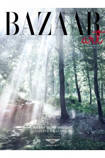
Here's another version by Harry Cory Wright which I stumbled across on their website:
View attachment 682849
Source: Harpersbazaar.co.uk
Attachments
ellastica
Well-Known Member
- Joined
- Jul 7, 2010
- Messages
- 3,528
- Reaction score
- 341
judging the magazines purely by their covers, which by the way i love to do, they're all indeed lovely. however, looking at these covers in a historical and design context, the design team were really rather lazy and by no means pushed their own creative boundaries.
the 1936 Bazaar cover in contrast still looks incredibly modern and radical and a thousand times more imaginative, original, and tells a story and captured a moment in time.
A time when imagination and a intense desire to imagine and explore the Future ruled.
However, harmonious the design or typefaces, I'd much more appreciate Bazaar covers ( and content) exploring and setting in motion Future fashion/ design trends

Similar Threads
- Replies
- 8
- Views
- 3K
- Replies
- 53
- Views
- 15K
- Replies
- 33
- Views
- 10K
- Replies
- 31
- Views
- 11K
- Replies
- 36
- Views
- 12K
Users who are viewing this thread
Total: 2 (members: 0, guests: 2)


