You are using an out of date browser. It may not display this or other websites correctly.
You should upgrade or use an alternative browser.
You should upgrade or use an alternative browser.
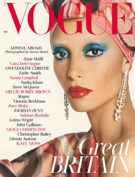
UK Vogue December 2017 : Adwoa Aboah by Steven Meisel
- Thread starter vogue28
- Start date
LastNight
Well-Known Member
- Joined
- Nov 11, 2013
- Messages
- 815
- Reaction score
- 874
This is so beautiful 
It looks like a vintage cover but there is something so fresh about it. Adwoa looks so glamorous! The colours, the lighting, the framing and the styling are all gorgeous; everything works perfectly together. It's not anywhere near what I was expecting from Edward's first issue but I'm in love with it.
The layout reminds me a little of Carine's Vogue Paris but I'm not mad at it, I loved that era. I'm excited to see inside and I can't wait to get my copy in the post!
Well done Edward and team, this is a really lovely debut cover.
Last edited by a moderator:
It's too retro for my liking. Like someone said before Fashion seems to be stuck at looking back. There's hardly any images created these days that are not referencing another era. Who or what is creating the iconic 2017 images that will be referenced ten years from now?
Even though most people hate her, Kim Kardashian and Rihanna have done that while fashion has not. Decades from now people will be able to reference the Kim or Rihanna look as indicative of this decade. Fashion has been unable to created truly iconic looks.
Even though most people hate her, Kim Kardashian and Rihanna have done that while fashion has not. Decades from now people will be able to reference the Kim or Rihanna look as indicative of this decade. Fashion has been unable to created truly iconic looks.
Last edited by a moderator:
testinofan
███████████████
- Joined
- Aug 24, 2004
- Messages
- 7,396
- Reaction score
- 85
The cover look very 80’ i dont loke the layout and is not a super cover very safe to me
dodencebt
Well-Known Member
- Joined
- Sep 11, 2010
- Messages
- 5,227
- Reaction score
- 2,919
Woah, it's actually really beautiful and glamorous. I thought he'd go down the W route but I'm glad he's creating a new language for Vogue UK, albeit a reference to past times.
I naturally don't care for Adwoah but in front of Meisel's lens she looks like a goddess.
I naturally don't care for Adwoah but in front of Meisel's lens she looks like a goddess.
fierrousa
Member
- Joined
- Aug 27, 2005
- Messages
- 58
- Reaction score
- 20
Amazing! Love the retro glam look, even I like Adwoa in this. Finally Meisel shows up after a months being ausent from magazines. I wish his collaboration with UK Vogue will be regular and become his new playground for his talent. After saying all this, I wish the cover were a more striking image. Edward new chapter should have been more poweful and goundbreaking.
Phuel
Well-Known Member
- Joined
- Feb 18, 2010
- Messages
- 5,726
- Reaction score
- 8,722
Maybe the story will look more inspiring than the covers alludes to…
Too retro and flat for my taste. Very vintage-y-looking. Reminds me of the The Face-wannabe short-lived Blitz Magazine from the 90s. “Great Britain” would have created an impact; the namedropping is just an eyesore. With such weak art direction, hoping the fashion will be something worthy of the new era.
Thanks vogue28
youarearockstar
utterly superfluous
- Joined
- Oct 4, 2005
- Messages
- 9,714
- Reaction score
- 75
This is incredible - simple as that.
Valentine27
Well-Known Member
- Joined
- Jan 4, 2010
- Messages
- 12,667
- Reaction score
- 1,489
I don't care about Adwoa but this cover looks sensational. Wonderful make up!
Miss Dalloway
Well-Known Member
- Joined
- Mar 3, 2006
- Messages
- 25,704
- Reaction score
- 997
Now THAT is how you usher in new era of Vogue!! BRAVO Edward, its sublime, and everything i hoped for, but feared won't be delivered!
StockholmFW
Well-Known Member
- Joined
- Feb 11, 2017
- Messages
- 3,928
- Reaction score
- 531
It looks just like a Vogue cover from the 70’s. Gorgeous!
GivenchyAddict
Well-Known Member
- Joined
- Feb 5, 2012
- Messages
- 2,169
- Reaction score
- 5,122
Expected something different and this is too close of the marc jacobs beauty campaign but it is a beautiful cover...
Similar Threads
- Replies
- 32
- Views
- 13K
- Replies
- 80
- Views
- 13K
D
- Replies
- 109
- Views
- 42K
Users who are viewing this thread
Total: 2 (members: 0, guests: 2)
New Posts
-
-
-
-
W Magazine China ‘The Great Performances’ Issue 2024 : Michelle Yeoh by Szilveszter Mako (7 Viewers)
- Latest: svpernova
-


