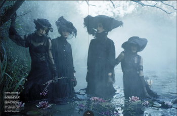
It's like I'm looking at supplement covers. There's no WOW Factor at each of them. This could pass for W Korea. There's no cohesiveness in the covers. Vogue Italia is indeed a disaster without Meisel (considering Meisel himself is a disaster lately). My goodness. And what have they done with Kate Moss? Are you honestly telling me that THAT is the BEST shot from the editorial? If that is any indication, then count me out.
I don't understand Vogue Italia and their CHEAP layout. My goodness. What colors are they using for their masthead. The font, size, placement. And this is a major magazine? What's with the fascination of putting the name of the photographer? It shouldn't be about them right? It should be about the clothes because it's still a fashion magazine right? They might as well have included the entire crew and entire masthead of VI.
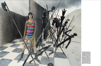
To be serious, these make Gigi's disaster a delight.

")

 ink:
ink:


 Jonathan Anderson - Designer, Creative Director of JW Anderson & Christian Dior (11 Viewers)