UK Vogue - The Cover Archive

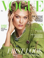
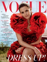
I was really into the new Vogue but looking at the covers side by side... I hate most of them lol. Gigi/Bella, Gugu and Saffron are the standouts for me. Oh, and those subscriber's Ariana and Rihanna covers. Those were better than the newsstand versions.
 
Apart from February & July which i totally despise this was such a great debut year for Edward. You have diversity, you have high commercial gloss Fashion, you have refreshing model choices, and FOUR cover stars aged , 44, 47, 51 and 64!! So here for this, not to mention the issues were consistatly well edited, and full of good content with further celebration of all kinds of women, and men!

So excited to see what Edward's next year brings, there is room for improvement, of course (art direction of the magazine, especially). But no wonder his is the hottest Vogue at the moment that everyone is after! Now i fully get why those rumors of him taking over US Vogue, he will be the PERFECT successor for WIntour!
 
Fran and Adut getting two covers in a year...that is something probably only Kate Moss can manage in Alex's era.
 
I've really enjoyed this year of Vogue UK! Apart from that outrageous February cover of course. As far as for the Beckham, Ariana and Rihanna ones I much prefer the subscribers' versions.

Cara and Adut's covers are my favourite!
 
Edwards first year has definitely some highs; Rihanna September (subscribers cover more so), Fran Summers November, Gigi March and December with Adut & Saffron.

And some lows; the nightmarish February cover, Oprah’s subscribers cover and the overall Beckham ‘Experience’.

One thing that is for sure is that Glamour has made a come back and that Juergen Teller needs to stay away from covers.

I look forward to what Edward is going to bring in 2019!
 
Saffron single handedly beat all everyone. That cover is gorgeous! It made me buy a UK Vogue issue after years! (that FEBRUARY shared cover was, and will always be, a disgrace). No Vogue Editor belonging to the Top 4 should ever do that.

Glamour is indeed back in UK Vogue (Except Adut’s cover). That is one thing that I very much appreciate. However, I’m still having a hard time seeing identity. Covers are slightly distinguishable from Alexandra, but the contents, same old. My problem is, these covers still seem to scream W Magazine. There’s something about it that looks like W. Maybe its the studio?

Overall, this is not a terrible set of covers, but very calculated, unimaginative, and borderline lazy.
 
Regardless of the image used on the front of any particular issue, I find the cover design to be poor - there's no instinct whatsoever to create cover lines that make an impact, and more often than not, they're actually hard to read. At best, I would describe the wording as 'tidy'.

It makes me have more appreciation for various editions of Harper's Bazaar, the ones which draw on that magazine's visual heritage of seeing text as an art form in itself.
 
So true, @tigerrouge There's an art behind not only wording but laying out the text in a cover and most of the time Harper's (bar the US edition) actually gets it right. I'm just surprised at British Vogue. They're already getting pointers from you and whoever else on what to put on the cover, and how to word it. So surely that must mean more attention can be paid to layout?

If you stand a meter away from the covers, can you read the main headline? No! Because very often the colour is too muted and blends in with the image. And that's partly due to the thin illegible arm of his fonts. Case in point - Margot, Gigi, Bella, Oprah, Rihanna and Adut.

And that just goes to show what kind of Editor he is tbh. It’s foolish to think that what makes a cover is just a beautiful image. Nope. A cover is judged by its totality. The most beautiful image can be killed by a rowdy text placement, the reverse is true.
 
I'm just thinking about that: No Kate Moss this year!
 
A very big year for British Vogue with Edward Enninful bringing out the big guns to implement his first year as EIC, which I just have to admire him for. Given the current state of the print industry it's either go big or go home - and he went big!

My ultimate favorite has to have been the cover with Cara Delevingne by Steven Meisel, followed by those Gigi & Bella Hadid covers, then onto Oprah and then the Adut and Saffron covers from this month.

The darkest moment was that dreadful shared cover feature from February with Margot Robbie & Nicole Kidman (which I'm fearful of us getting again in 2019) and the Gugu Mbatha-Raw cover fell completely flat on me too.

Despite a few flops this year, I'm excited to see what Edward gives us throughout 2019!
 
2019

January: Dua Lipa by Nadine Ijewere
February: Emma Stone by Craig McDean
March: Naomi Campbell by Steven Meisel
April: Naomi Scott by Nick Knight
May: Kate Moss by Mikael Jansson, Jamie Hawkesworth & Inez & Vinoodh
June: Madonna by Mert Alas & Marcus Piggott
July: Zoe Kravitz by Steven Meisel
August: Karlie Kloss by Steven Meisel
September: Adwoa Aboah, Adut Akech, Ramla Ali, Jacinda Ardern, Sinéad Burke, Gemma Chan, Laverne Cox, Jane Fonda, Salma Hayek Pinault, Francesca Hayward, Jameela Jamil, Chimamanda Ngozi Adichie, Yara Shahidi, Greta Thunberg & Christy Turlington by Peter Lindbergh
October: Kaia Gerber by Steven Meisel
November: Jourdan Dunn by Nick Knight
December: Emma Watson by Alasdair McLellan


vogue.co.uk

That Madonna cover :lol:
 
I like the Meisel and Knight covers, although Karlie by Meisel was so random.

The Madonna cover is the worst, followed by September and November.
 
Nothing connect...

Totally! I think this is Edward's main Achilles heel; he veers between different styles from commercial to edgier and both from the perspective of a stylist and EIC this fails to nail down a distinct visual point of view. Although Meisel's covers really stand out (sad I can't say the same for Steven's editorials!) here, particularly the studio ones. The other photographers can't really compete in the conditions outlined above.

I still have a soft spot for Naomi's in particular. It has a Baron-esque feel to it, plus that issue was easily the best one Edward's produced.
 
You forgot Lizzo's. Loved the Meisel ones, hated the Moss fest, Dua Lipa and Madonna (with black masthead and less text that one was pretty good).
 
Its all over the place. Indiviually they may have looked great, but collectively, I still see no direction.

The stand outs were Naomi S., Zoe, Kaia, Jourdann, and Lizzo.

The rest felt like a generic W magazine cover.

5/12 for me.
 
Last edited:
Many of the covers were nice, but I only bought the issue with Kaia this year. They would need to do something about their cover material, as the gloss get scratched off so easily.

Anyway, all I can think of when I am looking at Edward's Vogue is globalization. While these covers would be chic in almost every part of the world, there is a lack of ''Britishness'' which was there while Alexandra was in charge (and which is present in the British Bazaar). Maybe it's due to the fact Edward spent his recent years styling a US magazine, or maybe the times simply changed. Who knows.
 

Users who are viewing this thread

New Posts

Forum Statistics

Threads
210,541
Messages
15,118,239
Members
84,192
Latest member
Yams Yamborghini
Back
Top
monitoring_string = "058526dd2635cb6818386bfd373b82a4"