Xenforo is upgrading us to version 2.3.7 on Thursday Aug 14, 2025 at 01:00 AM BST. This upgrade includes several security fixes among other improvements. Expect a temporary downtime during this process.
More info here
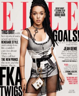
Hahahaha, I'd also like to know! Why not call her 'the thinking man's Rihanna'. Actually liked her music before she became so overexposed. I hope she cuts her ties with Matthew Stone! His work is sacred, and must remain as such. No need for it to go through some chaff grinder in order to appeal to the masses, because I can see that happening. I'm surprised a big fashion house hasn't propositioned her yet.
Look, it's an unexpeced choice which is very usual for Elle, I like that about them. A more muted layout may have enhanced this cluttered Prada look, but everything looks terribly claustrophobic here!
I hope they continue with the coverstar intro, even though I disagree with what's being said here, lol.
So FKA Twigs, Allure, Elle....Vogue or W doesn't seem too far off, although I expect we'll see her on Interview soon.
I don't really care about her but the real reason I wouldn't buy this is the text, next to the text, then there's a little text and finally more text. The layout is horrible, I don't care who is on the cover, this never works. What were they thinking, seriously?
She looks like a cartoon character. I'm not mad at her getting the cover - I think it's fantastic. But, they've done wrong by her with this pic and this terrible layout.
This site uses cookies to help personalise content, tailor your experience and to keep you logged in if you register.
By continuing to use this site, you are consenting to our use of cookies.


 ink:
ink:


