-
Announcing... The WINNERS of the 2025 theFashionSpot Awards:
Designer of the Year
Ready-to-Wear Collection of the Year
Haute Couture Collection of the Year
Model of the Year
Photographer of the Year
Stylist of the Year
Magazine Cover of the Year
Ad Campaign of the Year
Congratulations to ALL of our worthy winners! Thank you to our tFS forum members who voted and participated.
You are using an out of date browser. It may not display this or other websites correctly.
You should upgrade or use an alternative browser.
You should upgrade or use an alternative browser.
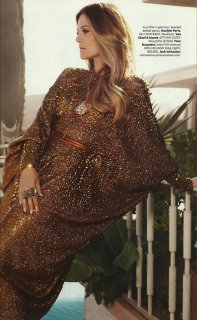
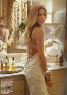
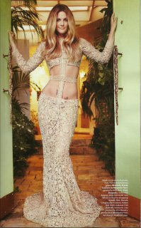
US Harper's Bazaar October 2010 : Drew Barrymore by Mark Seliger
- Thread starter t-rex
- Start date
I have always said that I like Bazaar because of the way it presents fashion. It does it in a simple, straightforward way that appeals to the modern woman who wants to know what's fashionable. If you want dreams and escapism you have other magazines, valuable magazines indeed but Bazaar has that special place in my heart.
that earring on the cover has been super-imposed.....HA it looks so faux.
your so right! i dint even notice until you said that, but it totally looks fake
ColorScreams
Member
- Joined
- Aug 4, 2009
- Messages
- 330
- Reaction score
- 1
tentalicious
Active Member
- Joined
- Mar 24, 2010
- Messages
- 6,494
- Reaction score
- 15
^that elegant Givenchy dress fit her like a glove!
Platinum Blonde
Active Member
- Joined
- Jan 18, 2006
- Messages
- 2,658
- Reaction score
- 1
The two covers and editorial are so gorgeous and glamourous! There is only one thing that dislike and that is that one of the dresses has holes but besides that I think that dress is very beautiful. Her hair, makeup, clothes, the setting and photography are so gorgeous. The picture I love the most is when she is holding a mirror and looking back. Thanks a lot for all the pictures.
flyme2themoon
In other words
- Joined
- Jul 25, 2005
- Messages
- 3,243
- Reaction score
- 7
flyme2themoon
In other words
- Joined
- Jul 25, 2005
- Messages
- 3,243
- Reaction score
- 7
flyme2themoon
In other words
- Joined
- Jul 25, 2005
- Messages
- 3,243
- Reaction score
- 7
- Joined
- Jan 9, 2008
- Messages
- 36,984
- Reaction score
- 25,136
Lagerfeld's editorial is a disappointment. It's not Abbey, because she looks beautiful. I do love the second shot with Sebastian.
Maybes its the styling, it looks thrown together. There is just something missing.
Samantha's editorial looks nice. Typical Camilla Akrans, very safe. Thanks for scanning flyme2themoon!
Maybes its the styling, it looks thrown together. There is just something missing.
Samantha's editorial looks nice. Typical Camilla Akrans, very safe. Thanks for scanning flyme2themoon!
mikel
Well-Known Member
- Joined
- Sep 30, 2005
- Messages
- 26,887
- Reaction score
- 6,249
Again a mediocre issue. Ad is a joke. The styling is good, but the desert setting makes Samantha look ridiculous in her glam 70's clothing.
And I said it before, but I can't stress it enough: the new typography and layout are hideous!
And I said it before, but I can't stress it enough: the new typography and layout are hideous!
Deleted member 116957
New/Inactive Member
- Joined
- Apr 4, 2009
- Messages
- 13,697
- Reaction score
- 15,826
Does anybody have any idea how well Harper's Bazaar sells up against Elle, Vogue and other mainstream American fashion magazines? I can't figure out what is going on with this magazine.
Similar Threads
- Replies
- 30
- Views
- 7K
- Replies
- 16
- Views
- 5K
- Replies
- 9
- Views
- 5K
- Replies
- 94
- Views
- 18K
- Replies
- 71
- Views
- 15K
Users who are viewing this thread
Total: 1 (members: 0, guests: 1)
New Posts
-
Jonathan Anderson - Designer, Creative Director of JW Anderson & Christian Dior (11 Viewers)
- Latest: bc collector
-
-
-
Harper's Bazaar France December 2025/January 2026 : Jacqui Hooper by Drew Vickers (6 Viewers)
- Latest: Lola701
-


