Huh?

Is Versus a sub brand of Versace designed by Christopher Kane, every season or just this one? I really love the sexy cut out block colour mini dress's of last season, but I agree with just about everyone. This collection is a little too granny.
")
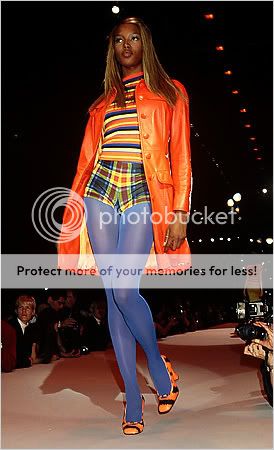
I like the shoes though.
PS: Thanks to everyone who takes time to post the HQ's and details. Your so nice.

I'm coming back to this collection via the excerpt that Lisa so kindly posted for us. I guess I remain intrigued by it and this question of how I receive Kane's work across the two collections. I agree that the shoes do seem the best aspect at present.
It's interesting Whippie that you should read 'granny'. That's not an association I immediately have here. Would you like to say more about why that's your perception?
Could be the small floral print - perhaps that leads us to associate 'granny' but I'm wondering if it might be that fresh in the collective consciousness is Prada's use of plaid for AW10/11 within a collection that did undoubtedly have an aspect of 'granny chic' albeit twisted. And that therefore plaid has picked up a 'granny' association. A strange place to arrive perhaps but such is the influence of Miuccia.
And that thought led me to another - that you can read this as a sort of 'engagement' with Prada AW10/11.
Whilst Prada's looks drew the eye to the bust as focal point, here Kane undoubtedly draws the eye to the hip as the focal point for the most part. The casting didn't universally lead that way but then neither was Miuccia's casting entirely on one note.
And whilst Prada drew out the womanly, here, particularly in the use of the playground set, Kane seems to be speaking more to the girl. Which is of course what we'd expect from the brand. Even though he doesn't do that in an entirely obvious way with the clothes. But who wants obvious.
So I'm getting the impression that Kane may well have in mind a response to, a dialogue with, a partial deconstruction and reversal of Prada AW10/11.
To attempt a dialogue with Miuccia, to look to be on a level playing field npi with her is quite a risk particularly if your work fails to flatter the form and turns out as badly received as SS11 Versus currently seems to be but I now feel that maybe somewhere there's a key to unlocking this collection that I haven't quite grasped yet.
Anyone able to hand me that key or should I just return to my initial impression that it's awful and beyond redemption. Again, can Kane really be so good and so bad in the same season?