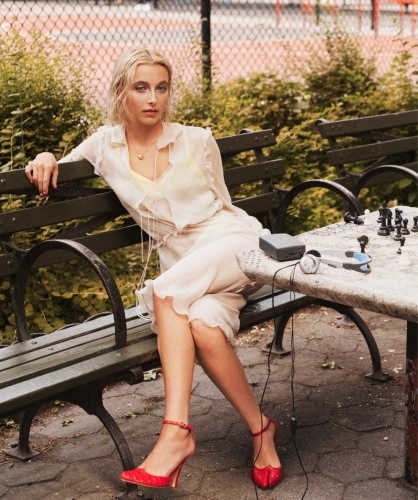
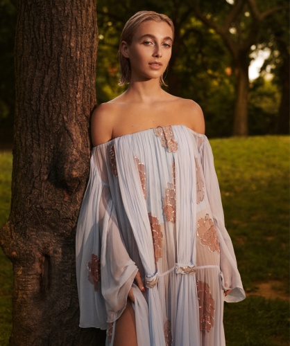
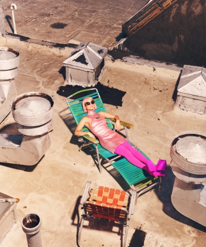
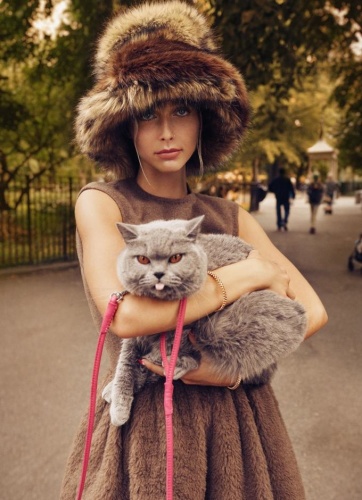
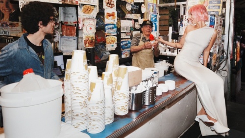
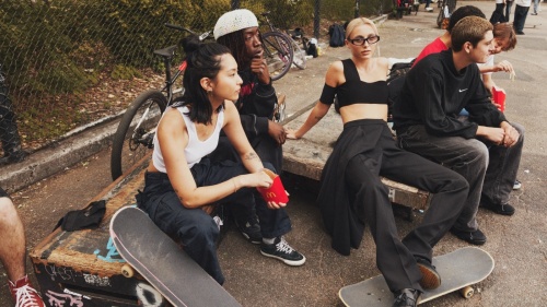
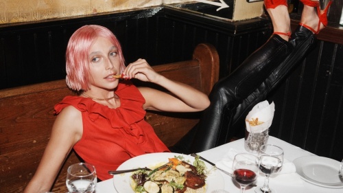
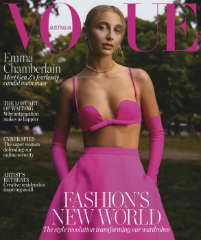
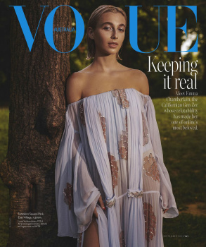
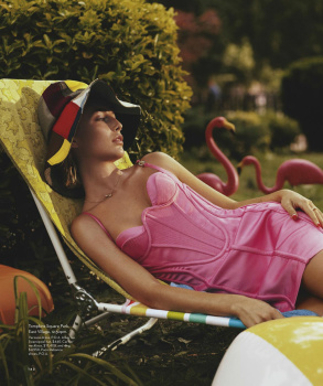
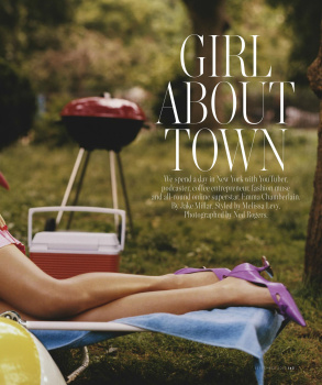
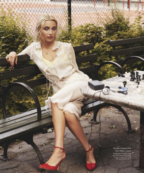
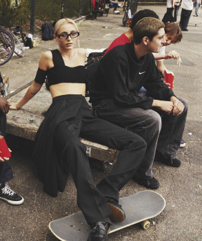
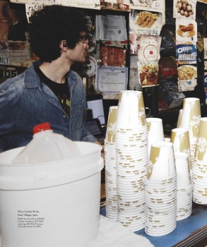
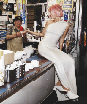
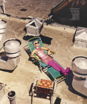
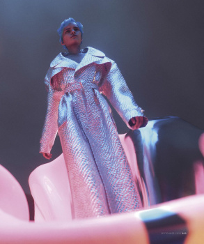
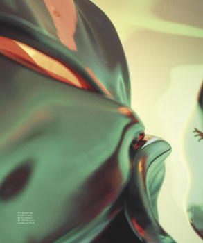
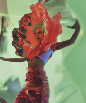
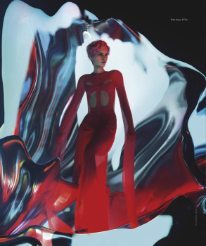
Xenforo Cloud will be upgrading us to version 2.3.5 on March 12th at 12 AM GMT. This version has increased stability and fixes several bugs. We expect downtime for the duration of the update.
Hated the pink on the runway and hate it everywhere. The pink looks terrible against the green and the masthead is cheap as hell. Her expression plus the retouching is tragic, she looks more like a vogue cover girl in the Valentino fashion show pics than on this cover. Editorial is equally uninspiring.
it's funny how much users hated that pink and the season just started...lol....
I do like the pink but the design of the layout it's bland....i would have place that pink in a neutral background to give a little punch...also the photograph on the cover lacks something....and i would add a long coat on her shoulders too....
I found her a fun person watching the MET gala videos, but the editorial it’s totally go girl give us nothing, especially the image of her on a bench chair is worst, shorten legs, shrunk body, one arm missing…
Our 'fearlessly candid main muse' gives us nothing here. The photographer tried to evoke the aesthetic of Testino's US Vogue in the early 2010s, but it really isn't interesting to look at. At least it isn't a complete wreck, I guess.
1) ˝Bright Young Thing˝, 3 pages - an article about Australian rising star Markella Kavenagh with two photographs by Ellen Virgona
2) ˝Joining Forces˝, 6 pages - Vogue Beauty, reprinted images of Paloma Elsesser by Nadine Ijewere from the April(!!) issue of Spanish Vogue
3) ˝Fashion's New World˝, 22 pages
4) ˝The Collector˝, 4 pages - interview with Alessandro Michele on Gucci's high jewelry
5) ˝Forever and a Day˝, 12 pages - Sam Rock's global models portfolio
There are two or three more articles near the end of the issue, couple pages each.
This site uses cookies to help personalise content, tailor your experience and to keep you logged in if you register.
By continuing to use this site, you are consenting to our use of cookies.